Sherwin-Williams Blue Horizon (SW 6497) is a tranquil, airy blue that evokes the sense of standing on a shoreline, gazing out at the endless expanse of sky and sea. Perfectly balanced between soft sophistication and casual elegance, this hue offers a refreshing aesthetic that complements a variety of interior styles, from coastal chic to modern minimalism. Its calming presence makes it ideal for creating serene spaces that encourage relaxation and rejuvenation.
Blue Horizon is a soft, medium-light blue with subtle gray undertones. These gray undertones help the color feel grounded and sophisticated, preventing it from leaning overly bright or pastel. The muted nature of Blue Horizon ensures it maintains a timeless appeal, effortlessly blending into both contemporary and traditional designs. The undertones also give it a versatile quality, as it pairs beautifully with cool and warm tones alike.
When exposed to natural light, Blue Horizon can shift slightly depending on the time of day and the direction of the light source. In bright, sunlit spaces, it may appear lighter and airier, while in dimmer settings, the gray undertones may deepen, giving the space a more intimate, cocoon-like feel.
Sherwin-Williams Blue Horizon pairs effortlessly with a variety of complementary and contrasting colors. Whether you’re aiming for a layered monochromatic palette or want to introduce bold accents, this hue provides endless possibilities. Below are some coordinating color suggestions:
Blue Horizon’s versatile nature makes it a favorite choice for a wide range of interior applications. Its soothing quality lends itself particularly well to spaces where relaxation and tranquility are key, but its adaptability allows it to shine in other contexts as well.
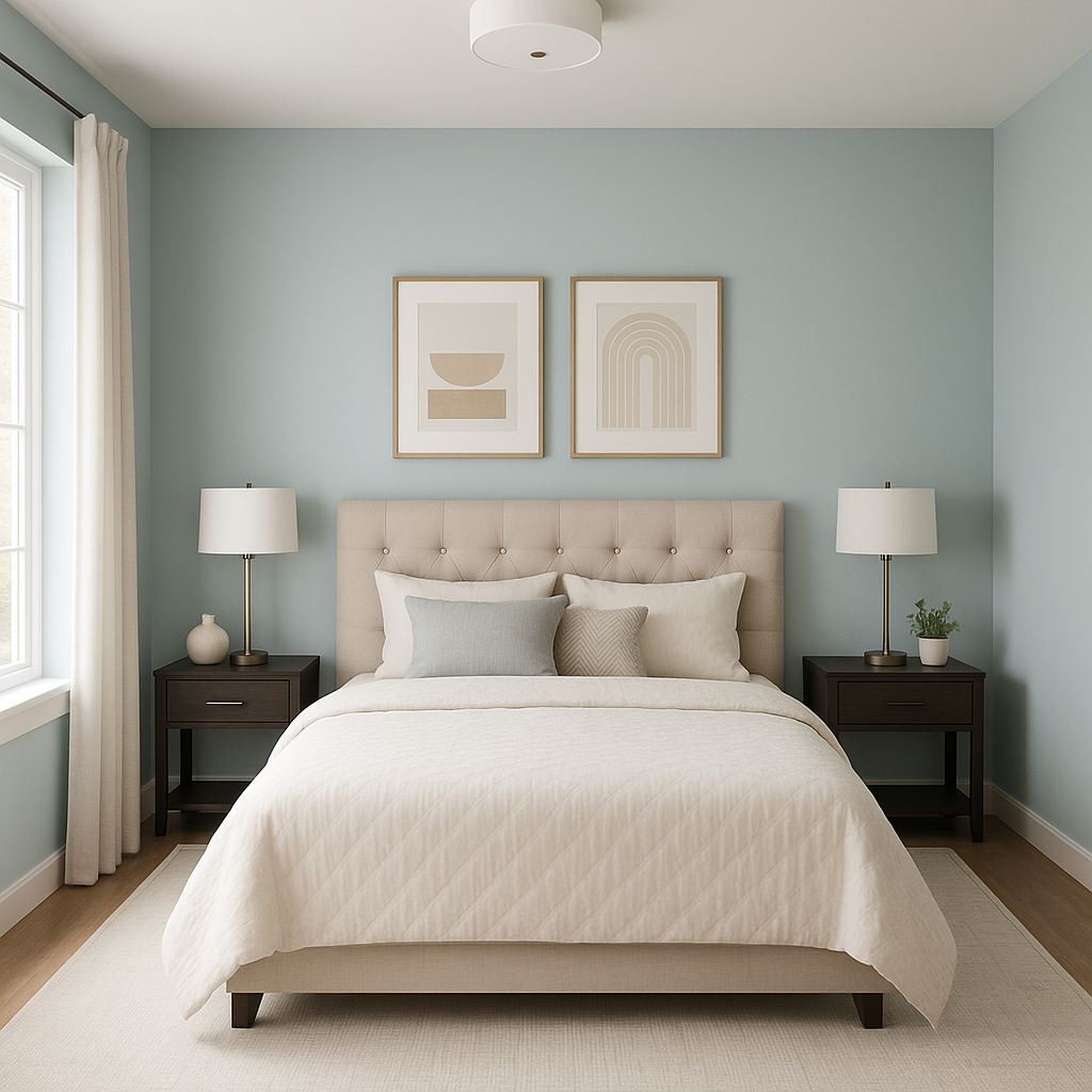
Blue Horizon is the epitome of a restful escape, making it perfect for bedrooms and bathrooms. Pair it with crisp white trim and soft linens for a spa-like retreat. In bathrooms, it works beautifully with white subway tiles, brushed nickel fixtures, and natural wood accents for a modern coastal vibe.
Create a welcoming living room atmosphere by using Blue Horizon as the main wall color. Pair it with neutral furniture, woven textures, and pops of greenery for a fresh, nature-inspired look. Add navy accents or metallic finishes for a more polished feel.
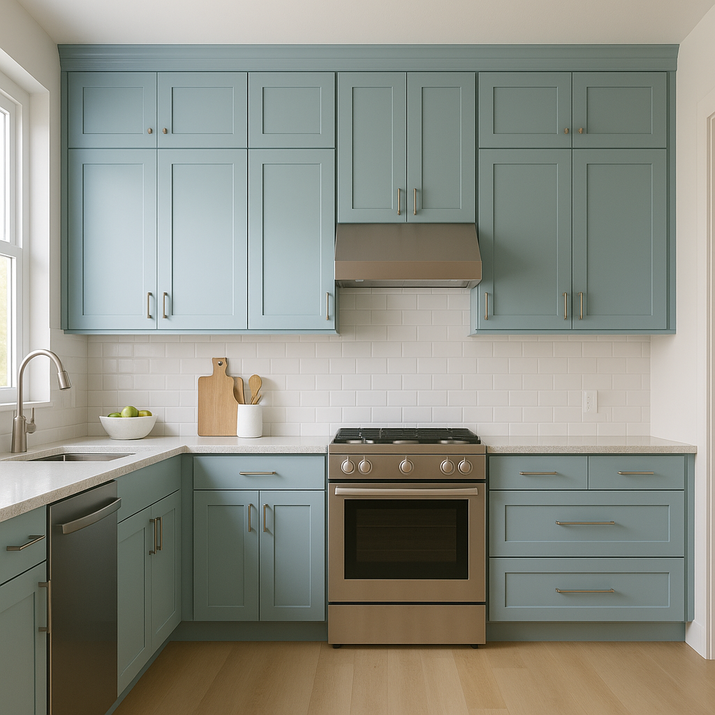
Blue Horizon can bring a breath of fresh air to kitchen spaces, especially when paired with white cabinets, light wood floors, and brass or matte black hardware. For an elegant touch, consider incorporating marble countertops or a subway tile backsplash.
This soft blue is also a great choice for a child’s room or nursery. Its soothing tones create a calming environment, while its timeless appeal ensures it will grow with the child and remain stylish over the years.
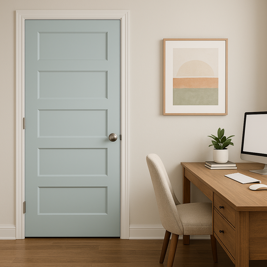
If you’re not ready to commit to Blue Horizon for an entire room, try using it as an accent wall. It pairs wonderfully with neutral walls like beige or gray, adding depth and personality without overwhelming the space.
Blue Horizon isn't just for interiors—it can also be used to refresh outdoor spaces. Consider it for porch ceilings, shutters, or patio furniture to create a breezy, coastal-inspired exterior.
Sherwin-Williams Blue Horizon (SW 6497) is a versatile, calming shade that brings a sense of serenity and timeless elegance to any space. Its subtle gray undertones make it adaptable across different styles and lighting conditions, while its ability to coordinate beautifully with a wide range of colors ensures it can meet the needs of any design vision. Whether you’re transforming a tranquil retreat or adding a fresh, coastal touch to your home, Blue Horizon offers the perfect balance of softness and sophistication.
Note: These images were all generated with AI, there may be inaccurate color results. Please only use a general reference to get a rough idea of what a color may look like, we will continue to generate new images to improve accuracy.
View Colors Only by Brand (No Imagery):
Sherwin-Williams
|
Benjamin-Moore
|
Behr
|
Valspar
Live on the Eastern Slope of Colorado and looking for a local painting professional, check out all our painting services and reach out for a free estimate.
Copyright © 2026 : Wild Fox Painting Inc. : 12435 Mead Way, Littleton, CO 80125


