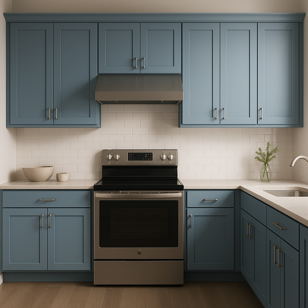
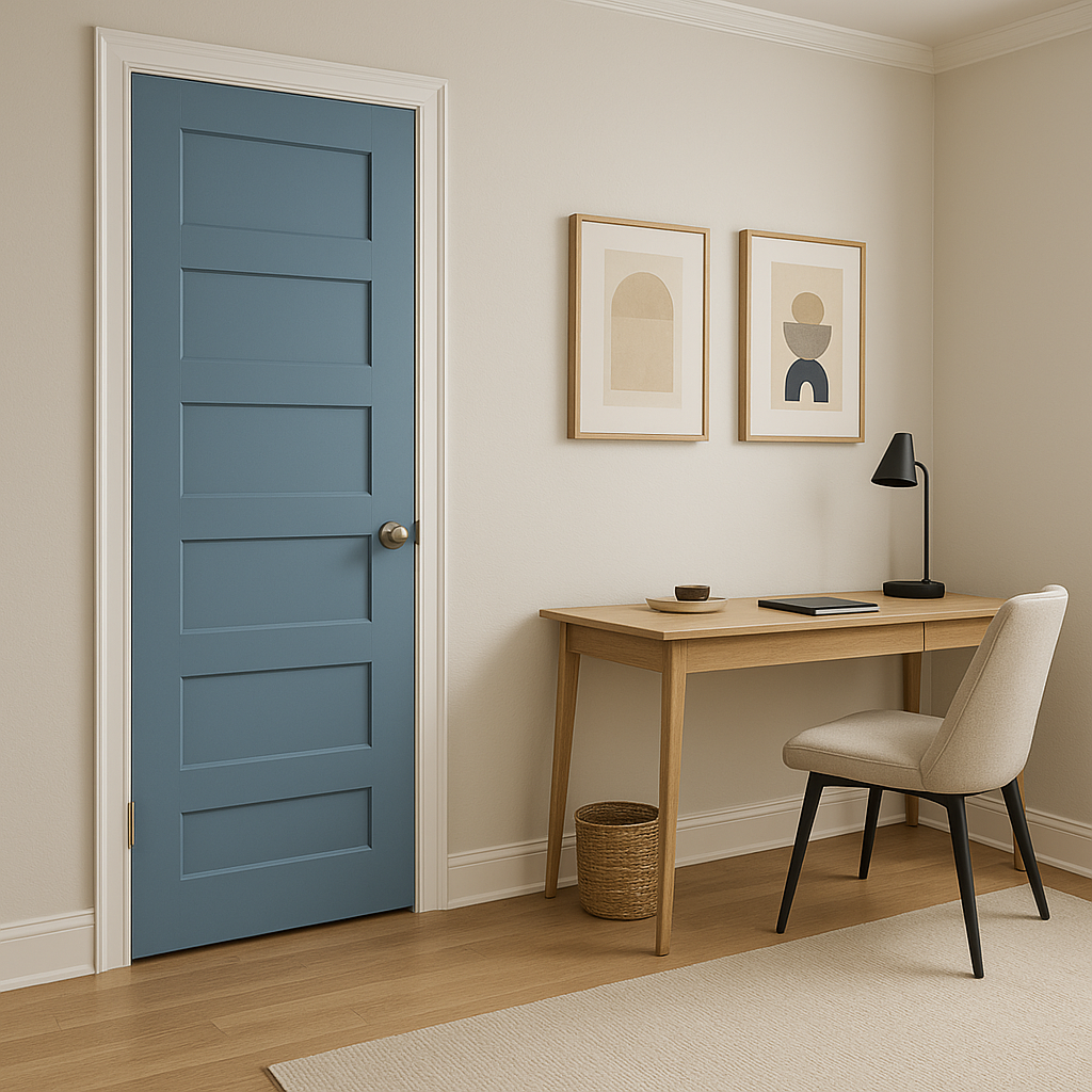
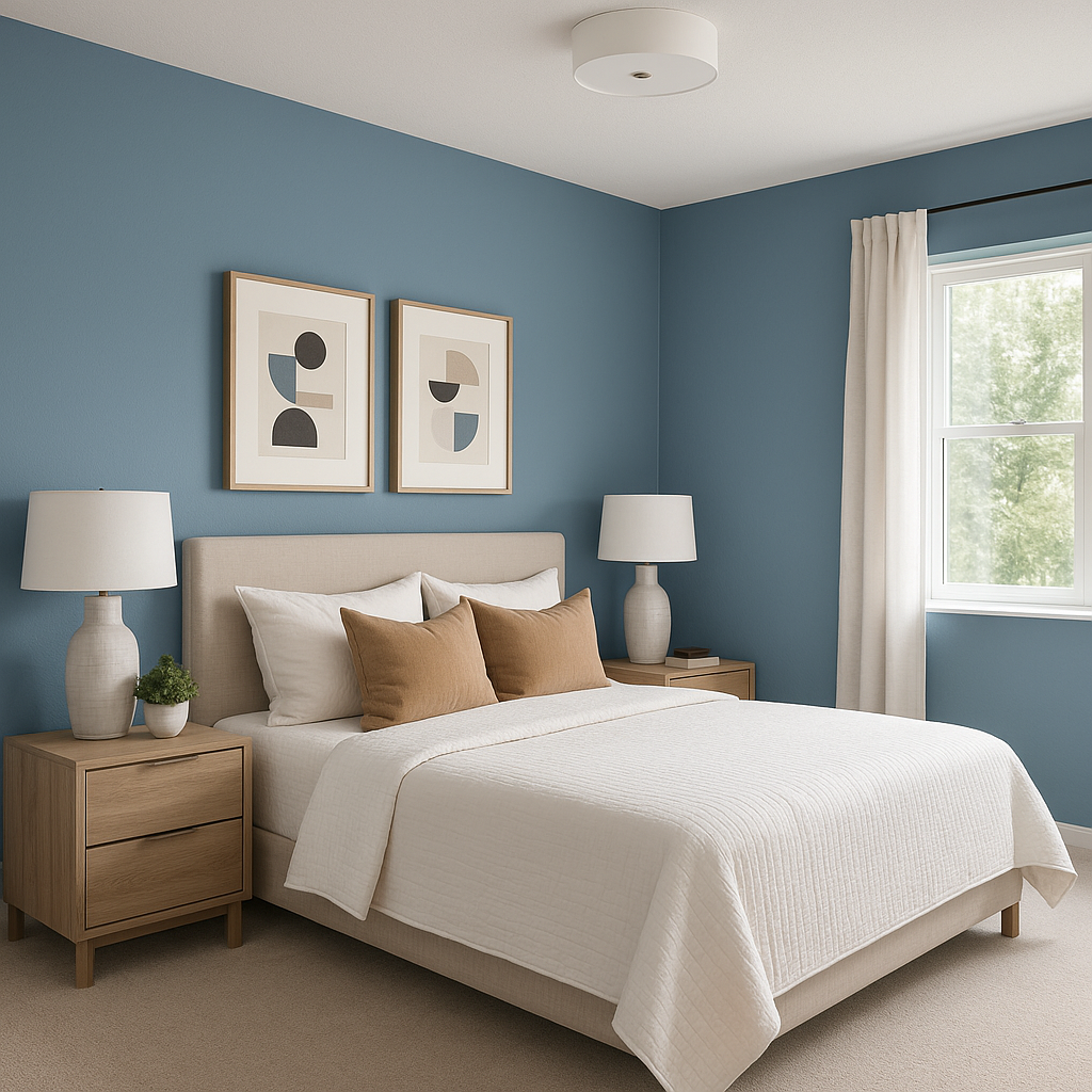
Sherwin-Williams Manitou Blue (SW 6501) is a striking paint color that captures the essence of tranquility and depth, reminiscent of serene coastal waters or the sky at dusk. This rich, medium-toned blue offers a perfect balance of boldness and calm, making it a versatile choice for various design styles. Whether you're looking to create a coastal retreat, a contemporary living space, or add a pop of color to an accent wall, Manitou Blue is a sophisticated and timeless option.
Manitou Blue carries subtle cool undertones that lean toward gray, giving it a refined and modern edge. These undertones help soften the vibrancy of the blue, making it adaptable to a wide range of lighting conditions. In spaces with natural light, the color appears fresh and airy, while in darker or artificial lighting, the gray undertones lend a moody and dramatic quality. This versatility makes Manitou Blue ideal for both bright, open interiors and cozy, intimate spaces.
Manitou Blue pairs beautifully with a variety of complementary hues, allowing for endless design possibilities. Some stunning coordinating colors include:
For a grounding accent, consider incorporating natural wood tones or rich, earthy hues like taupe or chocolate brown. Metallic finishes, such as brushed brass or polished nickel, work well to add a touch of glamour to spaces featuring Manitou Blue.
Manitou Blue is an incredibly versatile color that can be used in various applications throughout your home or office. Here are some ideas to inspire your design:
Manitou Blue works well in a variety of design aesthetics, including:
Sherwin-Williams Manitou Blue (SW 6501) is a color that invites creativity and evokes a sense of calm. Its versatility, timeless appeal, and ability to adapt to different lighting and design styles make it a standout choice for any space in your home or office.
Note: These images were all generated with AI, there may be inaccurate color results. Please only use a general reference to get a rough idea of what a color may look like, we will continue to generate new images to improve accuracy.
View Colors Only by Brand (No Imagery):
Sherwin-Williams
|
Benjamin-Moore
|
Behr
|
Valspar
Live on the Eastern Slope of Colorado and looking for a local painting professional, check out all our painting services and reach out for a free estimate.
Copyright © 2026 : Wild Fox Painting Inc. : 12435 Mead Way, Littleton, CO 80125


