Sherwin-Williams Leisure Blue SW 6515 is a captivating shade that combines the calming essence of blue with a touch of warmth for a well-balanced, versatile color. This medium-toned blue strikes the perfect balance between tranquility and sophistication, making it an ideal choice for a variety of interior and exterior spaces. Its timeless appeal ensures it remains a favorite for designers and homeowners alike.
Leisure Blue carries subtle green undertones that lend a soft, earthy quality to the color. These undertones give it a refined depth, making it neither too cool nor overly warm. This unique balance allows Leisure Blue to adapt beautifully to different lighting conditions, providing a soothing ambiance in both natural and artificial light.
In brighter spaces, the green undertones may become slightly more pronounced, evoking a coastal or nature-inspired aesthetic. In dimmer settings, the blue deepens, creating a cozy and intimate atmosphere. These undertones make it a versatile choice for a variety of design styles, from coastal and cottage to modern and transitional.
Sherwin-Williams Leisure Blue pairs effortlessly with a wide array of colors, giving you the flexibility to create cohesive and visually appealing designs. Here are some excellent coordinating options:
Neutral Pairings:
To keep the focus on Leisure Blue and create a balanced look, pair it with warm neutrals like Creamy SW 7012 or Accessible Beige SW 7036. These shades provide a soft, grounding backdrop without overwhelming the blue.
Crisp Whites:
For a fresh and clean contrast, use whites like Pure White SW 7005 or Snowbound SW 7004. These whites highlight the blue's subtle undertones, making it pop while maintaining an airy feel.
Earthy Accents:
Enhance the natural vibe of Leisure Blue by introducing earthy tones like Softer Tan SW 6141 or Sage Green SW 2860. These shades complement the green undertones while adding warmth to the palette.
Bold Contrasts:
For a dramatic and modern look, pair Leisure Blue with deep, moody colors like Iron Ore SW 7069 or Tricorn Black SW 6258. This creates stunning contrast and adds a sense of sophistication to the space.
Leisure Blue’s versatility allows it to shine in a variety of applications, whether you’re designing a cozy retreat or a bold statement space. Here are some suggestions for its use:
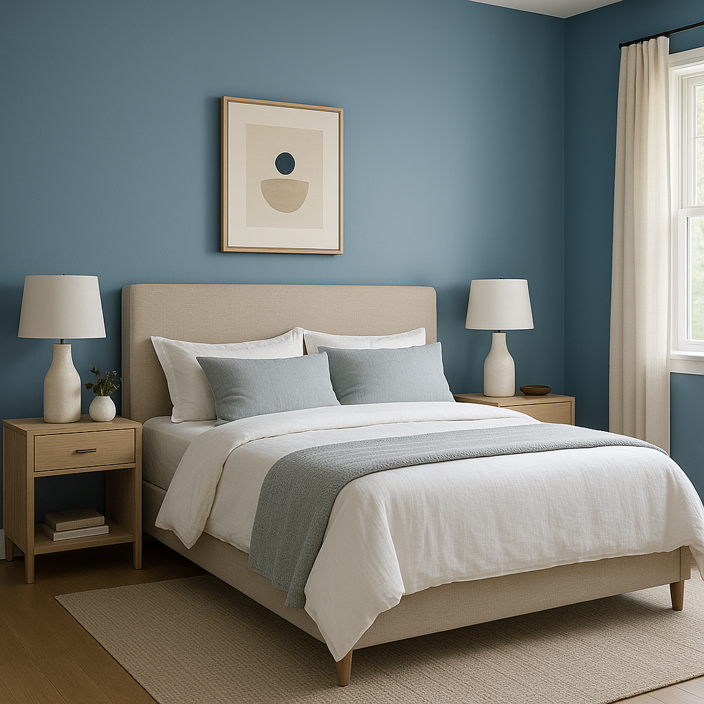
Leisure Blue is perfect for creating serene and relaxing living rooms or bedrooms. Its calming nature makes it an ideal wall color for spaces meant to unwind. Pair it with soft furnishings in neutral tones or incorporate textures like linen and wood for a cozy, inviting atmosphere.
Blue is a classic bathroom color, and Leisure Blue takes it a step further with its subtle green undertones. It evokes a spa-like ambiance, especially when paired with crisp white trim and natural stone accents. Add brushed nickel or chrome fixtures to enhance the room’s fresh, clean feel.
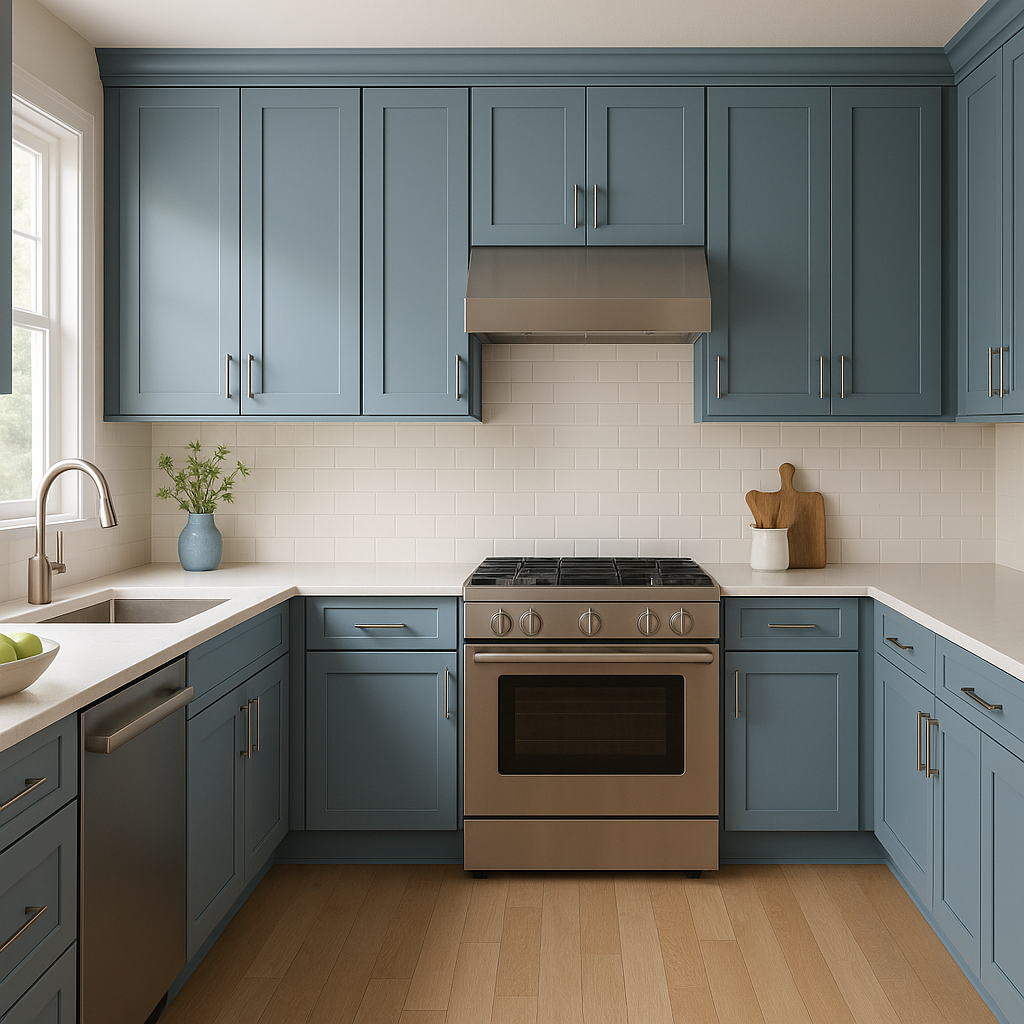
For a modern and unexpected twist, use Leisure Blue on cabinetry or a kitchen island. This pop of color livens up the space without being overpowering, especially when paired with white or light gray countertops and backsplash tiles.
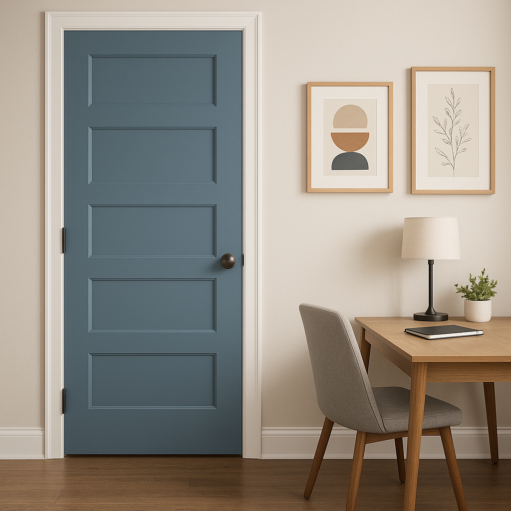
Leisure Blue makes a stunning statement as an accent wall, whether in a home office, dining room, or entryway. Its medium depth draws the eye while maintaining a harmonious balance with the surrounding decor.
On exteriors, Leisure Blue provides a timeless and welcoming look.
Note: These images were all generated with AI, there may be inaccurate color results. Please only use a general reference to get a rough idea of what a color may look like, we will continue to generate new images to improve accuracy.
View Colors Only by Brand (No Imagery):
Sherwin-Williams
|
Benjamin-Moore
|
Behr
|
Valspar
Live on the Eastern Slope of Colorado and looking for a local painting professional, check out all our painting services and reach out for a free estimate.
Copyright © 2026 : Wild Fox Painting Inc. : 12435 Mead Way, Littleton, CO 80125


