Sherwin-Williams Down Pour (SW 6516) is a striking and invigorating shade of blue that instantly commands attention. This charismatic color is perfect for those who want to make a bold statement while infusing their space with a sense of modern sophistication. Its rich saturation and energetic intensity make it a versatile choice for a variety of design styles, from contemporary to coastal-inspired aesthetics.
Down Pour is a vibrant blue with cool undertones that lean slightly toward teal. These subtle undertones give the color depth and complexity, allowing it to adapt beautifully to different lighting conditions. In spaces with ample natural light, Down Pour takes on a crisp and lively appearance, while in dimmer environments, it reveals a more tranquil and introspective character. The cool undertones ensure that it feels refreshing rather than overwhelming, making it an excellent option for creating a dynamic yet balanced atmosphere.
Pairing Down Pour with complementary hues can enhance its beauty and create a cohesive color palette. Some excellent coordinating colors include:
These combinations allow you to tailor the mood of your space, whether you’re aiming for a striking contrast or a harmonious blend of tones.
Down Pour is a versatile color that can be used in various ways to make a statement or set the tone for your space. Here are some ideas for incorporating this bold blue into your home:
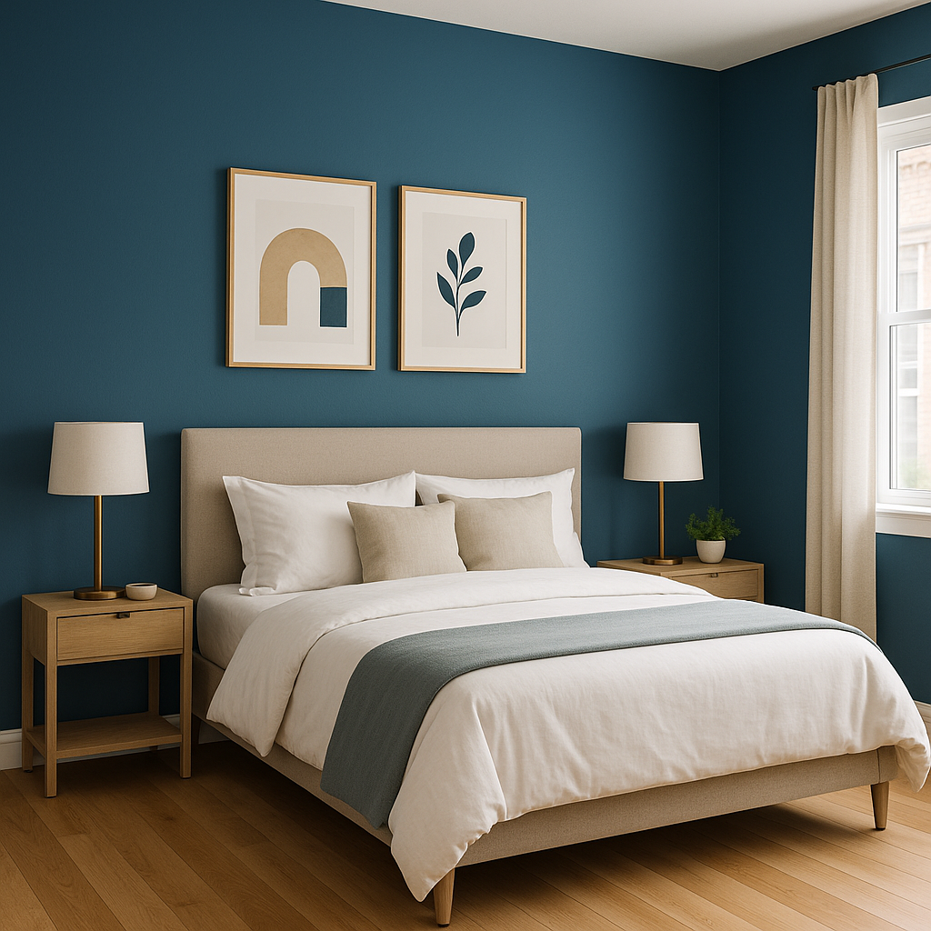
Transform a room by using Down Pour on an accent wall. Its dramatic effect can serve as a focal point, especially in living rooms, dining areas, or bedrooms. Pair it with neutral walls and furnishings to let the color shine without overwhelming the space.
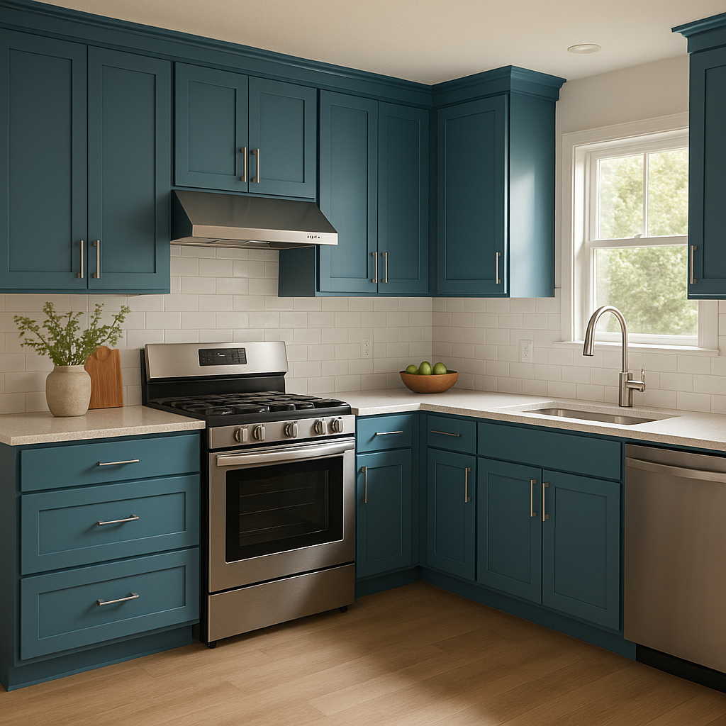
For a contemporary twist, consider painting kitchen or bathroom cabinets with Down Pour. Its bold presence can breathe fresh life into your cabinetry, making them the star of the room. Similarly, it works beautifully on furniture pieces like dressers, bookshelves, or even a statement desk.
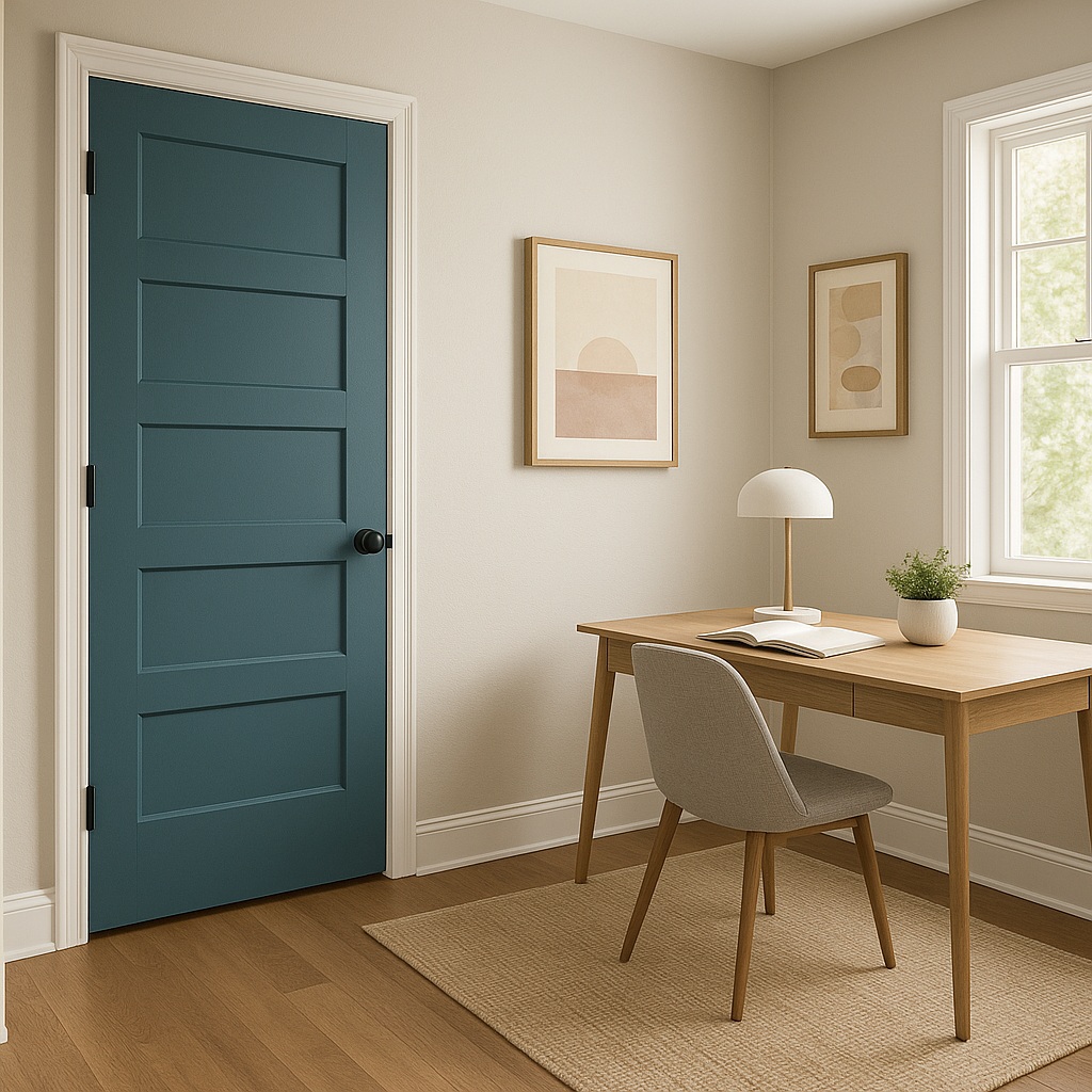
Down Pour is an inspired choice for a front door or exterior accents. Its vibrant energy will give your home instant curb appeal, creating a welcoming and unforgettable first impression. Pair it with neutral siding or brick for a balanced yet eye-catching look.
The playful and energetic qualities of Down Pour make it an excellent choice for children's spaces or playrooms. Pair it with lighter pastel accents to create a fun and creative environment.
Down Pour’s cool undertones lend themselves beautifully to coastal or nautical-inspired designs. Combine it with crisp whites, sandy beiges, or soft greens to evoke the calming essence of the ocean.
For spaces where creativity and focus are key, Down Pour can inspire productivity while giving the room a modern edge. Pair it with sleek metallic finishes or minimalist décor for a professional yet vibrant aesthetic.
The dynamic nature of Down Pour means it will look slightly different depending on your lighting. In bright, natural light, the color feels vibrant and refreshing, while in artificial or dim lighting, it takes on a deeper, moodier tone. To get the most out of this color, test it in your space under different lighting conditions before committing.
Sherwin-Williams Down Pour (SW 6516) is more than just a paint color—it’s a bold design choice that adds personality and energy to any room. Whether you’re looking to create a dramatic accent, curate a coastal-inspired oasis, or make a lasting impression with your exterior, Down Pour is a versatile and impactful hue that delivers timeless style.
Note: These images were all generated with AI, there may be inaccurate color results. Please only use a general reference to get a rough idea of what a color may look like, we will continue to generate new images to improve accuracy.
View Colors Only by Brand (No Imagery):
Sherwin-Williams
|
Benjamin-Moore
|
Behr
|
Valspar
Live on the Eastern Slope of Colorado and looking for a local painting professional, check out all our painting services and reach out for a free estimate.
Copyright © 2026 : Wild Fox Painting Inc. : 12435 Mead Way, Littleton, CO 80125


