Sherwin-Williams Majestic Purple (SW 6545) is a bold and dramatic shade that epitomizes elegance and grandeur. This deeply saturated purple offers a sense of luxury, making it an excellent choice for creating statement-making interiors. Whether used sparingly or as the centerpiece of your palette, Majestic Purple delivers a regal atmosphere that feels timeless and refined.
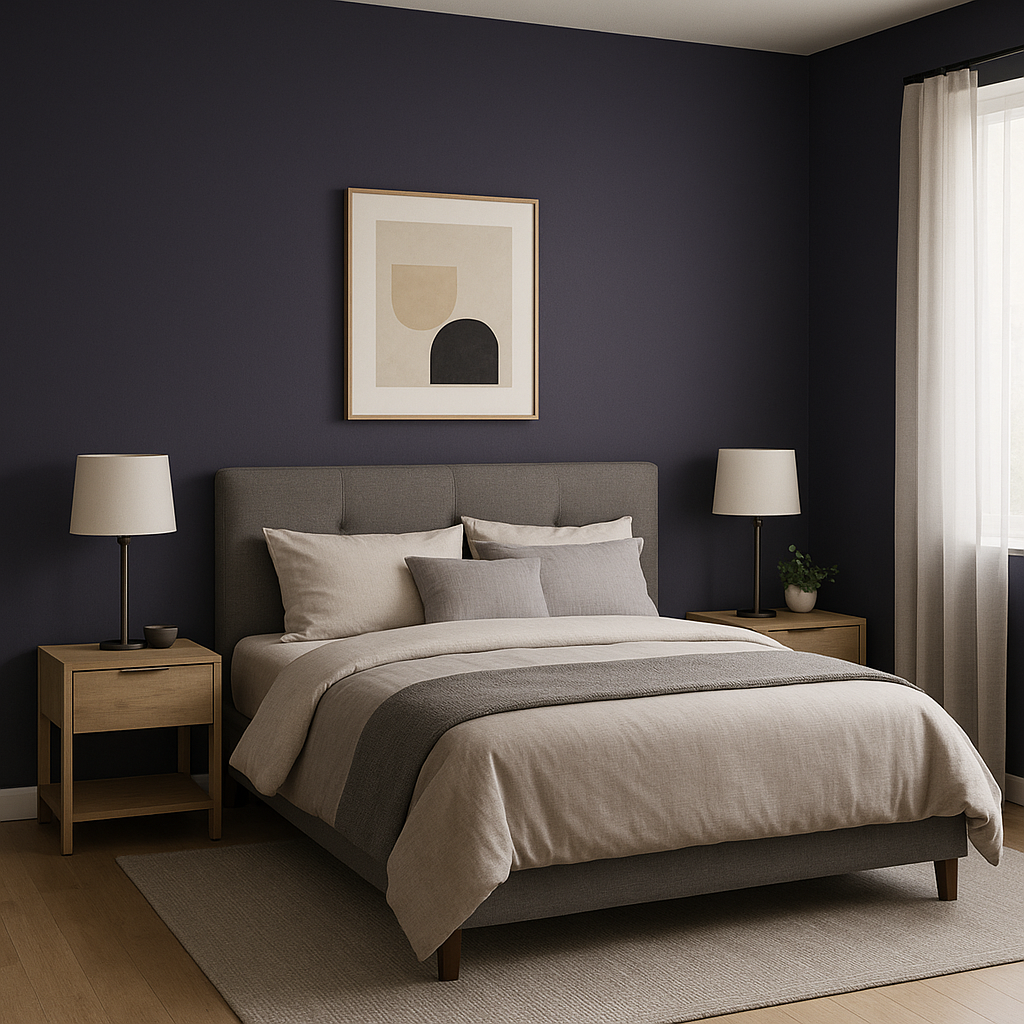
Majestic Purple is a deep violet shade with rich, jewel-like undertones that lean toward blue, giving it a cool and sophisticated edge. These blue undertones soften the intensity of the color, allowing it to exude a calm yet commanding presence. Unlike warmer purples that can feel playful or overly sweet, Majestic Purple carries a mature and contemplative energy, making it suitable for spaces that demand a touch of drama without sacrificing sophistication.
This hue works beautifully in rooms with ample natural light, where its depth can truly shine. In dimmer spaces, it transforms into a moody, cocoon-like color that’s perfect for cozy retreats, libraries, or intimate dining areas.
Majestic Purple pairs effortlessly with both neutral and complementary tones, allowing for a wide range of design possibilities. Here are some suggestions for coordinating colors to create harmonious palettes:
For a monochromatic scheme, pair Majestic Purple with lighter or darker shades within the purple family, such as SW 6825 Forward Fuchsia or SW 6543 Soulful Blue, to create a layered, tone-on-tone look.
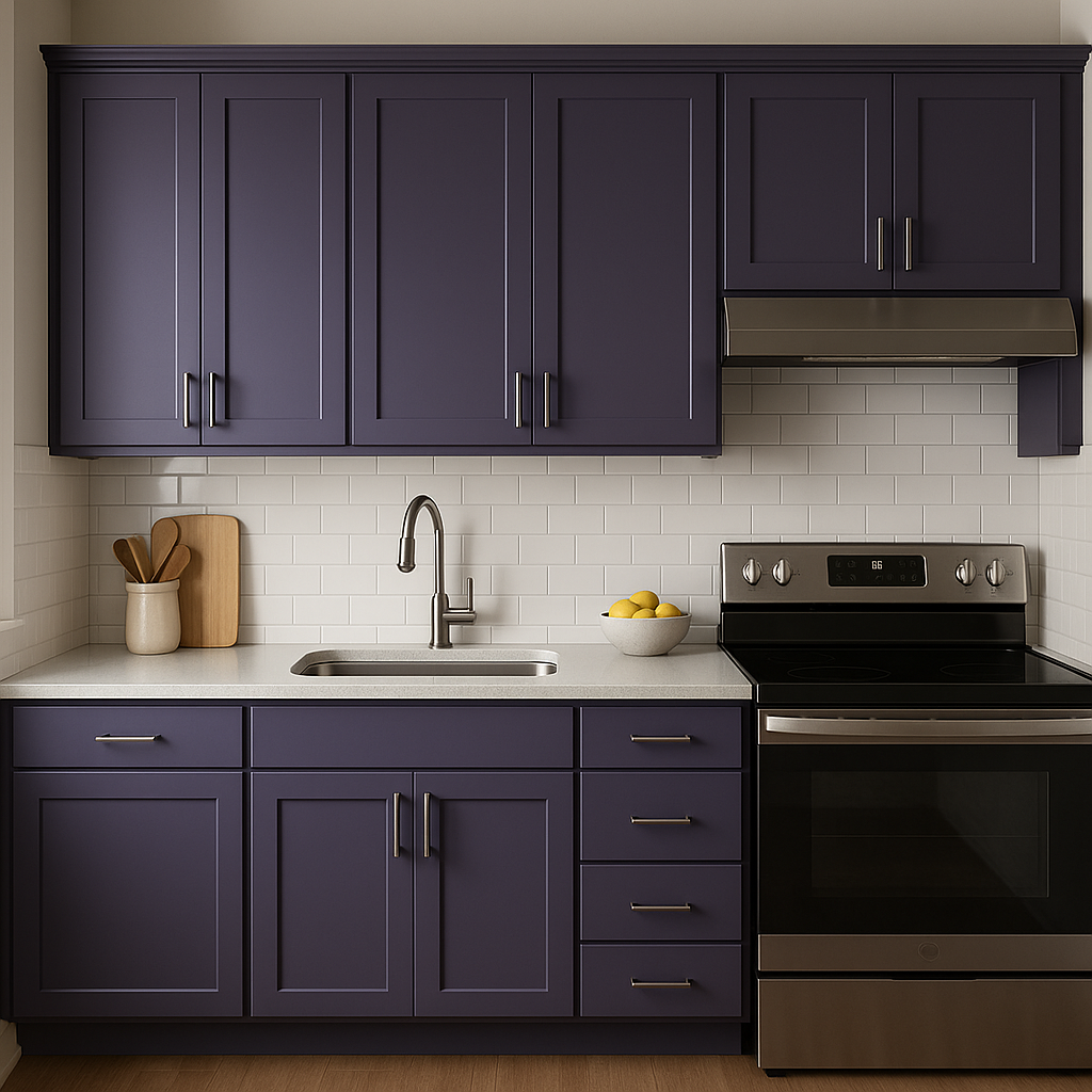
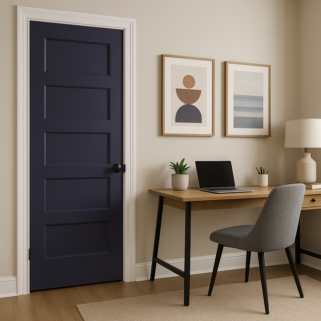
Majestic Purple is an incredibly versatile color that can elevate a variety of spaces. Its boldness makes it ideal for accent walls, furniture, or cabinetry, while its depth allows it to work as a primary color in rooms where drama and sophistication are desired.
In living rooms, Majestic Purple can establish a sense of opulence, especially when paired with rich textures like velvet or silk. For bedrooms, it creates a calming yet luxurious retreat, especially when juxtaposed with soft whites or neutral bedding.
Majestic Purple is perfect for dining rooms, where its rich tones can create a warm and inviting atmosphere. Pair it with metallic accents like gold or brass to amplify its regal qualities.
This color works beautifully in creative spaces such as art studios, music rooms, or reading nooks, where its depth encourages imagination and introspection.
For a high-end spa-like feel, use Majestic Purple in bathrooms alongside marble surfaces, matte black fixtures, or metallic finishes.
The appearance of Majestic Purple can shift dramatically based on lighting conditions. In bright, natural light, the color reveals its cooler, blue undertones, offering a fresh and vibrant feel. In low lighting, it deepens into a rich plum-like shade that feels intimate and cozy. To make the most of this hue, consider the direction of light in the space and use accent lighting to highlight its complexity.
Sherwin-Williams Majestic Purple (SW 6545) is far more than a color—it’s a statement. Whether you’re designing a space that radiates luxury, comfort, or creativity, this shade brings unmatched depth and sophistication to any room.
Note: These images were all generated with AI, there may be inaccurate color results. Please only use a general reference to get a rough idea of what a color may look like, we will continue to generate new images to improve accuracy.
View Colors Only by Brand (No Imagery):
Sherwin-Williams
|
Benjamin-Moore
|
Behr
|
Valspar
Live on the Eastern Slope of Colorado and looking for a local painting professional, check out all our painting services and reach out for a free estimate.
Copyright © 2026 : Wild Fox Painting Inc. : 12435 Mead Way, Littleton, CO 80125


