Sherwin-Williams Dewberry (SW 6552) is a deeply enchanting and luxurious shade that embodies sophistication and dramatic flair. This rich, jewel-toned purple evokes feelings of elegance and mystery, making it an ideal choice for anyone looking to create a bold yet refined atmosphere in their space. Whether used as an accent or as the star of your design palette, Dewberry effortlessly commands attention and transforms interiors into works of art.
Dewberry boasts a stunning balance of cool and warm undertones, which makes it versatile while maintaining its bold personality. Its primary undertones lean toward a deep red-violet base, lending it warmth and richness that feels inviting. At the same time, subtle cool blue undertones give the color depth and sophistication, ensuring that it doesn’t feel overly dramatic or heavy. This duality in undertones makes Dewberry adaptable to a range of lighting conditions, from soft, diffused natural light to warm, ambient artificial lighting.
To make Sherwin-Williams Dewberry shine, pairing it with complementary or contrasting hues is essential. Its deep purple tone lends itself well to a variety of palettes, including:
Sherwin-Williams Dewberry is a versatile color that works beautifully across a variety of design styles—from traditional and regal to contemporary and daring. Here are some inspiring ways to incorporate this stunning hue into your space:
Dewberry is the perfect choice for an accent wall, adding depth and drama to living rooms, bedrooms, or dining areas. Pair it with neutral walls and furnishings to make it the focal point of your space.
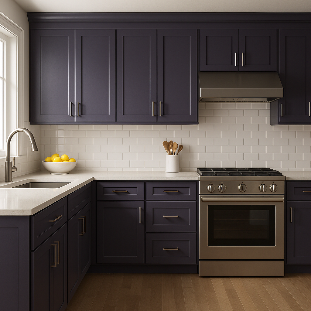
For an unexpected pop of color, consider using Dewberry on furniture or cabinetry. A painted console table, kitchen island, or built-ins in this hue can elevate the overall design and create a sense of artistry.
If you’re bold enough to experiment, Dewberry can be used on ceilings to create a chic and dramatic effect that draws the eye upward. Pair it with lighter-colored walls to prevent the room from feeling too enclosed.
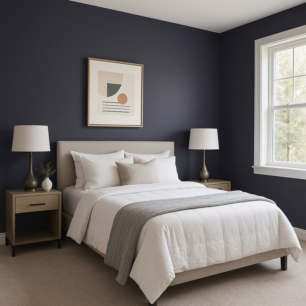
Dewberry’s rich and soothing qualities make it an excellent choice for bedrooms. Pair it with soft golds, creamy whites, or deep navy blues for a regal and relaxing retreat.
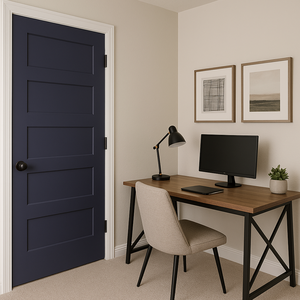
This color can inspire creativity and focus, making it an excellent choice for home offices or studios. Pair it with metallic accents like gold or brass to enhance the sense of sophistication.
Lighting plays a key role in how Sherwin-Williams Dewberry is perceived. In spaces with ample natural light, Dewberry will appear slightly lighter, showcasing its vibrant undertones. When paired with warmer artificial lighting, the color takes on a richer, cozier feel, making it ideal for evening entertaining or intimate gatherings.
Sherwin-Williams Dewberry (SW 6552) is a true gem in the world of interior design, offering depth, drama, and elegance in equal measure. Whether you’re creating a bold statement or adding subtle touches of sophistication, this captivating shade is guaranteed to make an unforgettable impression.
Note: These images were all generated with AI, there may be inaccurate color results. Please only use a general reference to get a rough idea of what a color may look like, we will continue to generate new images to improve accuracy.
View Colors Only by Brand (No Imagery):
Sherwin-Williams
|
Benjamin-Moore
|
Behr
|
Valspar
Live on the Eastern Slope of Colorado and looking for a local painting professional, check out all our painting services and reach out for a free estimate.
Copyright © 2026 : Wild Fox Painting Inc. : 12435 Mead Way, Littleton, CO 80125


