Sherwin-Williams Plummy (6558) is a striking, deep purple hue that exudes richness and sophistication. This dramatic color is perfect for making a bold statement in any interior or exterior space, offering a timeless blend of elegance and personality. Its luxurious depth and rich tone make it a versatile choice for those looking to add a touch of drama and warmth to their home or commercial spaces.
Plummy’s beauty lies in its complex undertones, which give it a dynamic and versatile quality. This color leans heavily into the purple family but carries subtle red undertones that add warmth and intensity. These red undertones help balance the richness of the purple, making it a welcoming and approachable shade rather than one that feels overly cool or stark. Depending on the lighting, Plummy can appear as a deep berry or a muted plum, giving it a chameleon-like nature that adapts beautifully to its surroundings.
When designing with Plummy, selecting coordinating colors is key to creating a harmonious palette. Here are some excellent choices that complement the depth and richness of this shade:
Plummy is a versatile color that can be used in various applications to create different moods and effects. Here are some ideas to inspire you:
The richness of Plummy makes it an excellent choice for formal spaces like dining rooms or living rooms. Use it on walls to create an intimate and luxurious atmosphere, or pair it with metallic accents like gold or brass for an opulent, chic aesthetic.
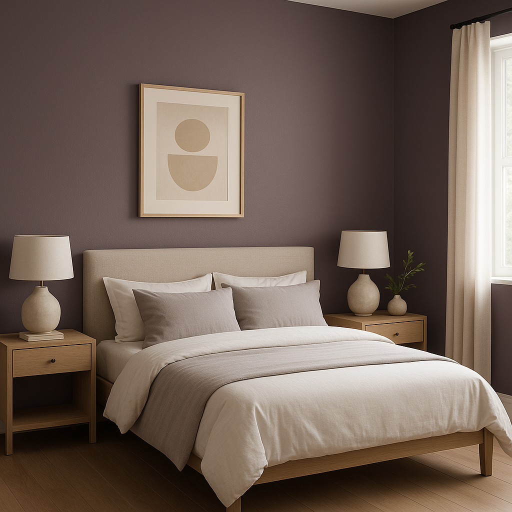
Plummy’s warm undertones make it a comforting and cocooning color, perfect for bedrooms. Consider using it as an accent wall behind the bed, paired with soft linens in neutral tones like cream or gray for a serene and sophisticated retreat.
Powder rooms are the perfect place to experiment with bold colors, and Plummy is no exception. Its dramatic hue can turn a small space into a jewel box of design, especially when paired with striking fixtures and finishes.
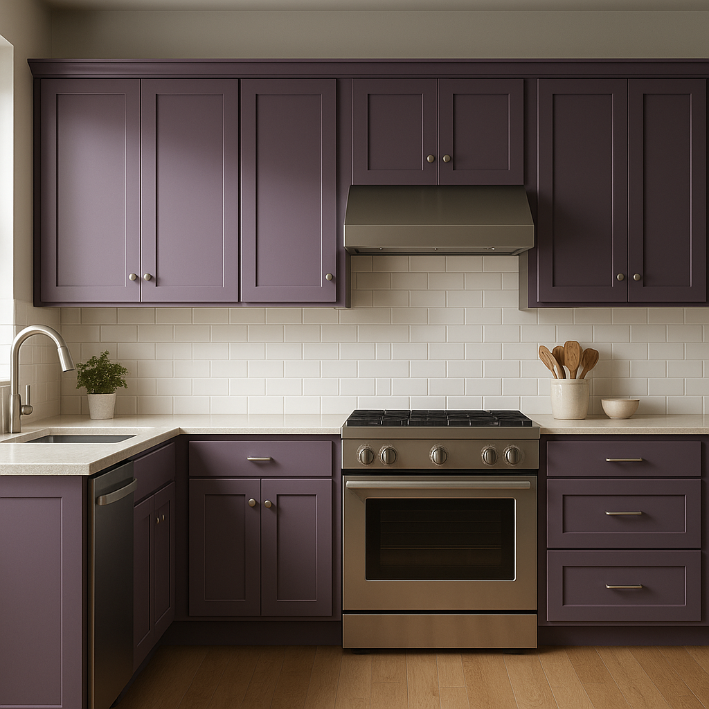
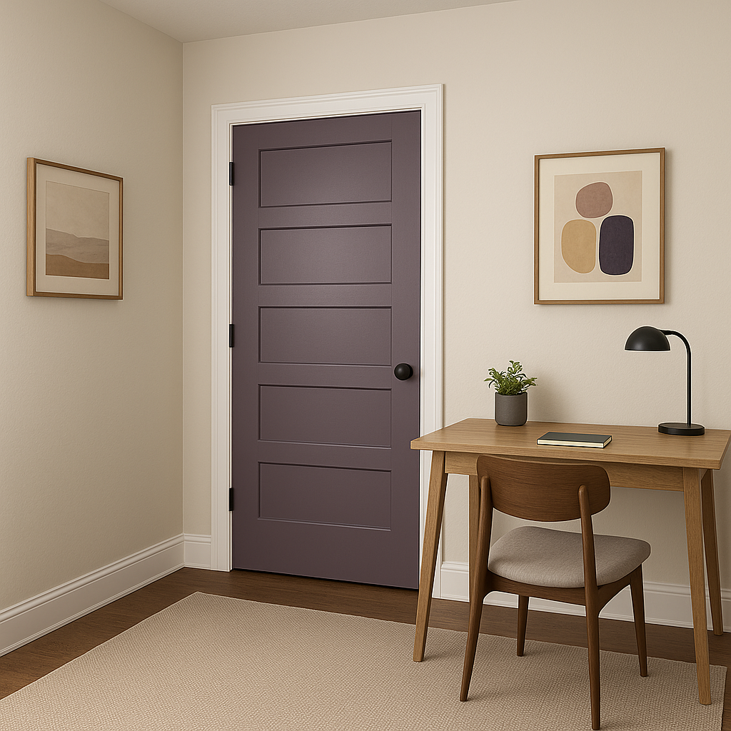
If a full room of Plummy feels too daring, consider using it in smaller doses. It’s a fantastic choice for cabinetry, built-ins, or even as a front door color to add a touch of unexpected drama. Pair it with crisp white trim for a sharp, clean look.
Plummy isn’t just for interiors—it can also be stunning on home exteriors. Use it as a statement color for shutters, doors, or even siding, paired with neutral tones like taupe or gray for a balanced and sophisticated façade.
The appearance of Sherwin-Williams Plummy (6558) can vary dramatically depending on the lighting conditions. In natural light, the red undertones may become more pronounced, giving the color a warm, berry-like quality. In artificial or low light, the shade appears deeper and moodier, leaning into its sophisticated plum essence. Always test a sample in your space to see how it interacts with the lighting throughout the day.
Sherwin-Williams Plummy (6558) is a rich and versatile hue that can transform any space with its bold elegance. Whether used as a primary wall color, an accent, or a small pop of color, it offers endless opportunities for creative expression while maintaining a polished and timeless appeal.
Note: These images were all generated with AI, there may be inaccurate color results. Please only use a general reference to get a rough idea of what a color may look like, we will continue to generate new images to improve accuracy.
View Colors Only by Brand (No Imagery):
Sherwin-Williams
|
Benjamin-Moore
|
Behr
|
Valspar
Live on the Eastern Slope of Colorado and looking for a local painting professional, check out all our painting services and reach out for a free estimate.
Copyright © 2026 : Wild Fox Painting Inc. : 12435 Mead Way, Littleton, CO 80125


