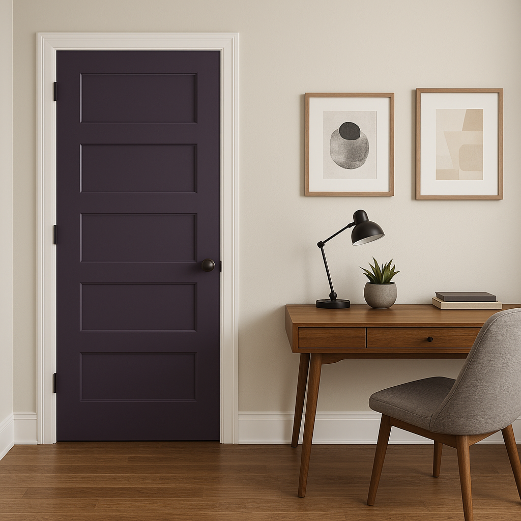
Sherwin-Williams Concord Grape (SW 6559) is a deep, velvety purple that exudes sophistication and elegance. This luxurious shade balances boldness and refinement, making it a standout color for anyone looking to add drama and depth to their interiors. Its rich, saturated tone brings a sense of creativity and confidence to any space, while its versatility ensures it can be used in a variety of design styles, from traditional to contemporary.
Concord Grape is a complex hue with subtle undertones that contribute to its allure. This color leans toward a blue base, giving it a cool and moody edge. However, it also carries just enough red to add warmth and richness without tipping into overly vibrant territory. These nuanced undertones make it adaptable, depending on the lighting and surrounding colors. In natural light, it may appear cooler and more subdued, while under artificial lighting, the red undertones can emerge, creating a cozy and inviting atmosphere.
To create a harmonious palette with Concord Grape, consider pairing it with the following coordinating colors:
Soft Neutrals:
Delicate shades like Sherwin-Williams Alabaster (SW 7008) or Snowbound (SW 7004) provide a clean, crisp contrast to the drama of Concord Grape. These light neutrals help balance the intensity of the purple, making it feel more approachable and grounded.
Earthy Greens:
Complementary greens like Sherwin-Williams Rosemary (SW 6187) or Evergreen Fog (SW 9130) bring out the natural richness in Concord Grape. These organic hues create a harmonious, nature-inspired palette.
Metallic Accents:
Incorporate metallics, such as gold or brushed brass, to enhance Concord Grape's luxurious quality. These accents can be introduced through fixtures, furniture, or decorative accessories.
Soft Pinks and Mauves:
For a romantic and feminine aesthetic, pair Concord Grape with muted tones like Sherwin-Williams Malted Milk (SW 6057) or Mellow Coral (SW 6324). These shades echo the warmth of the purple and create a cohesive, monochromatic look.
Concord Grape is a versatile color that can be used in a variety of ways to suit different spaces and moods:
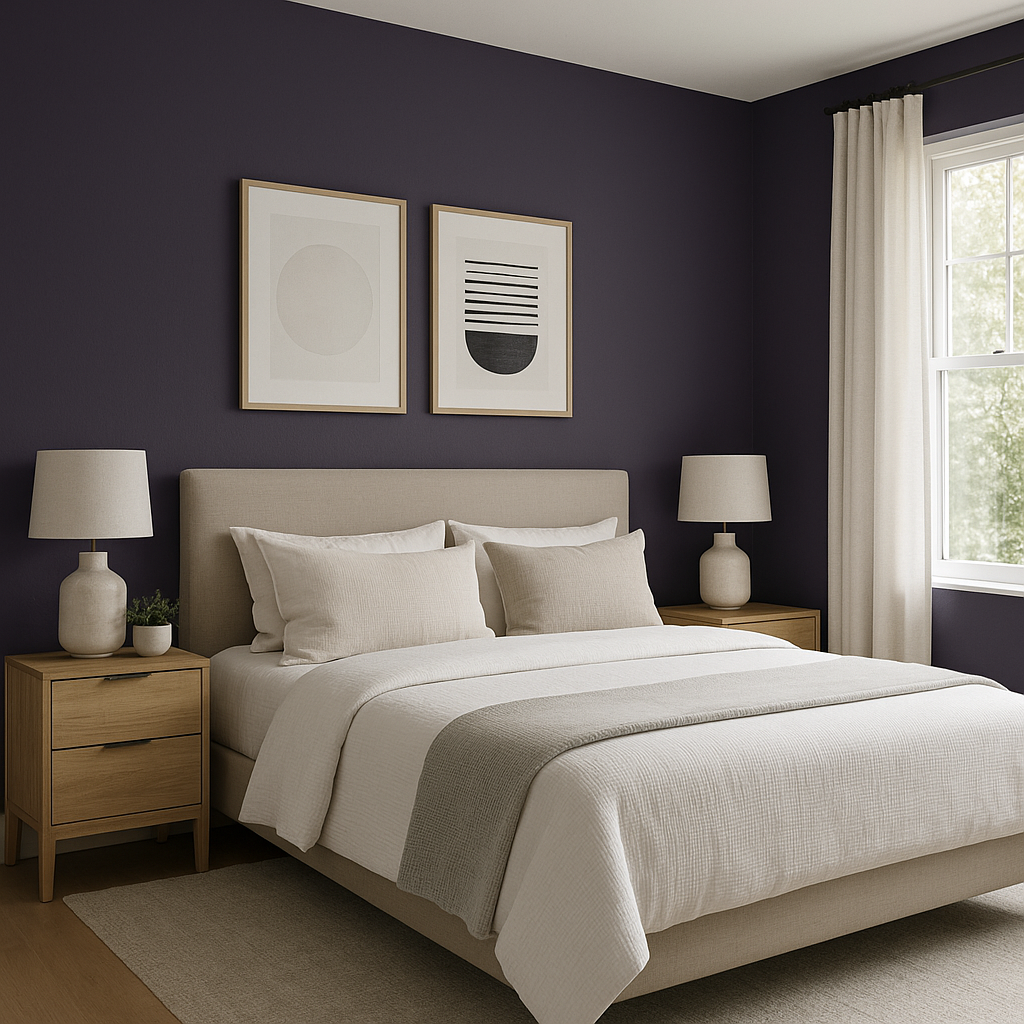
For those who want to make a bold statement without overwhelming a room, Concord Grape is an excellent choice for an accent wall. It works particularly well in living rooms, dining areas, or bedrooms, where it can serve as a focal point that draws the eye.
Elevate your interior design game by using Concord Grape on the ceiling. This unexpected application creates a cocooning effect, perfect for intimate spaces like a library, home office, or powder room.
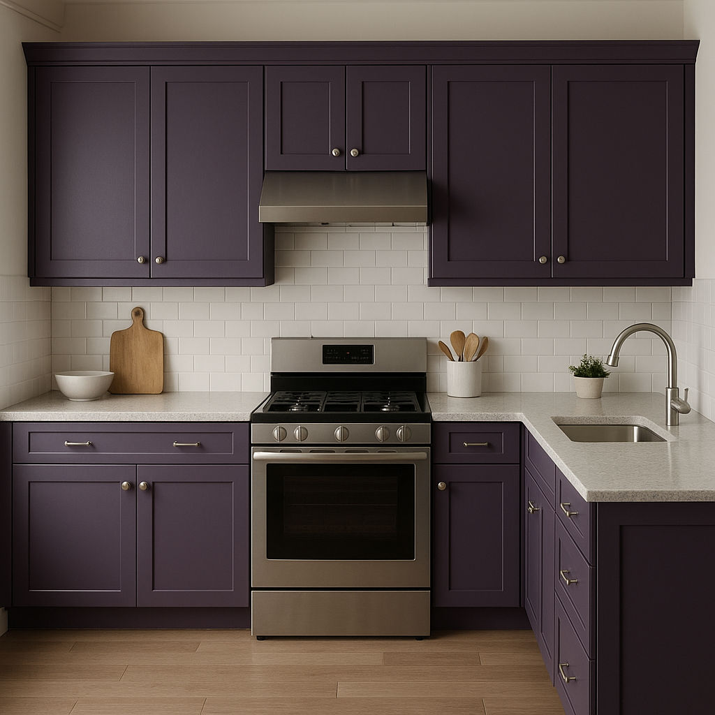
Breathe new life into cabinetry or furniture by painting them in Concord Grape. Kitchens, bars, or vanities painted in this shade bring a unique sense of style and sophistication to the space.
For a dramatic effect, use Concord Grape as the main wall color and layer it with lighter shades of purple, lavender, or mauve in textiles and decor. This creates a cohesive, dreamy environment ideal for bedrooms or lounges.
In retail or hospitality settings, Concord Grape can be used to create a striking and memorable brand identity. Its luxurious tone is particularly well-suited to boutique hotels, spas, or upscale restaurants.
As with any deep, saturated hue, lighting plays a crucial role in how Concord Grape appears in a space.
Note: These images were all generated with AI, there may be inaccurate color results. Please only use a general reference to get a rough idea of what a color may look like, we will continue to generate new images to improve accuracy.
View Colors Only by Brand (No Imagery):
Sherwin-Williams
|
Benjamin-Moore
|
Behr
|
Valspar
Live on the Eastern Slope of Colorado and looking for a local painting professional, check out all our painting services and reach out for a free estimate.
Copyright © 2026 : Wild Fox Painting Inc. : 12435 Mead Way, Littleton, CO 80125


