Sherwin-Williams Teaberry (SW 6561) is a soft and refined pink that exudes warmth and sophistication. This shade strikes the perfect balance between femininity and maturity, making it an ideal choice for spaces that aim to feel inviting, cozy, and effortlessly elegant. Whether used as a feature wall or throughout an entire room, Teaberry brings a gentle touch of color without overwhelming the senses.
Teaberry is a delicate pink with subtle red undertones, lending it a muted yet warm appearance. Unlike bold or overly saturated pinks, this hue carries a refined softness that feels approachable and versatile. The red undertones give it a grounded quality, ensuring it doesn’t skew too pastel or too powdery. When paired with different lighting conditions, Teaberry can appear warmer or cooler, giving it a dynamic versatility that adapts beautifully to various environments.
The versatility of Sherwin-Williams Teaberry allows it to pair seamlessly with a wide range of colors, from neutrals to deeper hues. Some coordinating colors to consider include:
These coordinating colors can help you craft a harmonious palette, whether you’re designing a serene bedroom, a chic living room, or a playful yet refined nursery.
Teaberry’s gentle sophistication lends itself to a variety of design applications, making it a versatile choice for homeowners and designers alike:
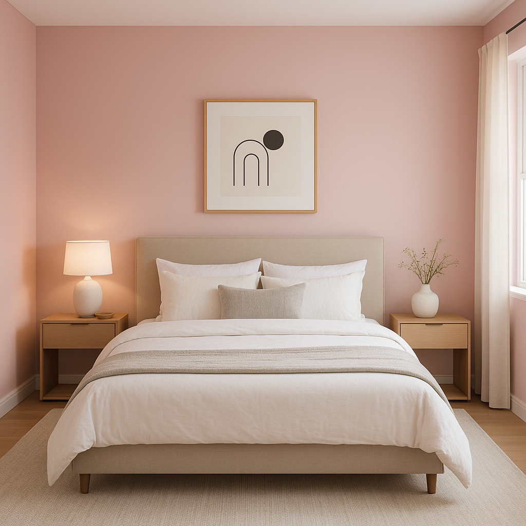
This hue is ideal for creating serene and comforting sleeping spaces. Pair it with crisp whites, soft grays, or muted blues to design a tranquil retreat. Opt for luxurious textiles like linen or velvet in coordinating shades to elevate the ambiance.
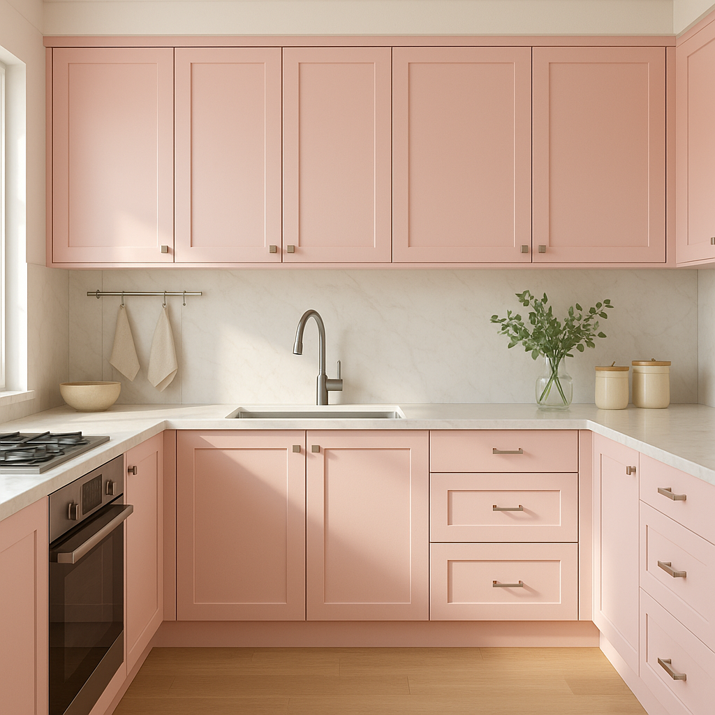
Teaberry can bring warmth and charm to living spaces without overpowering. Combine it with neutral furniture and metallic accents in gold or bronze for an elevated yet approachable vibe.
For those seeking a sophisticated alternative to traditional pastel pinks, Teaberry offers a perfect middle ground. Pair it with whimsical patterns or playful accessories to create a cheerful yet timeless space.
In smaller spaces like bathrooms, Teaberry can be paired with crisp whites and polished chrome fixtures to create a chic and refreshing atmosphere.
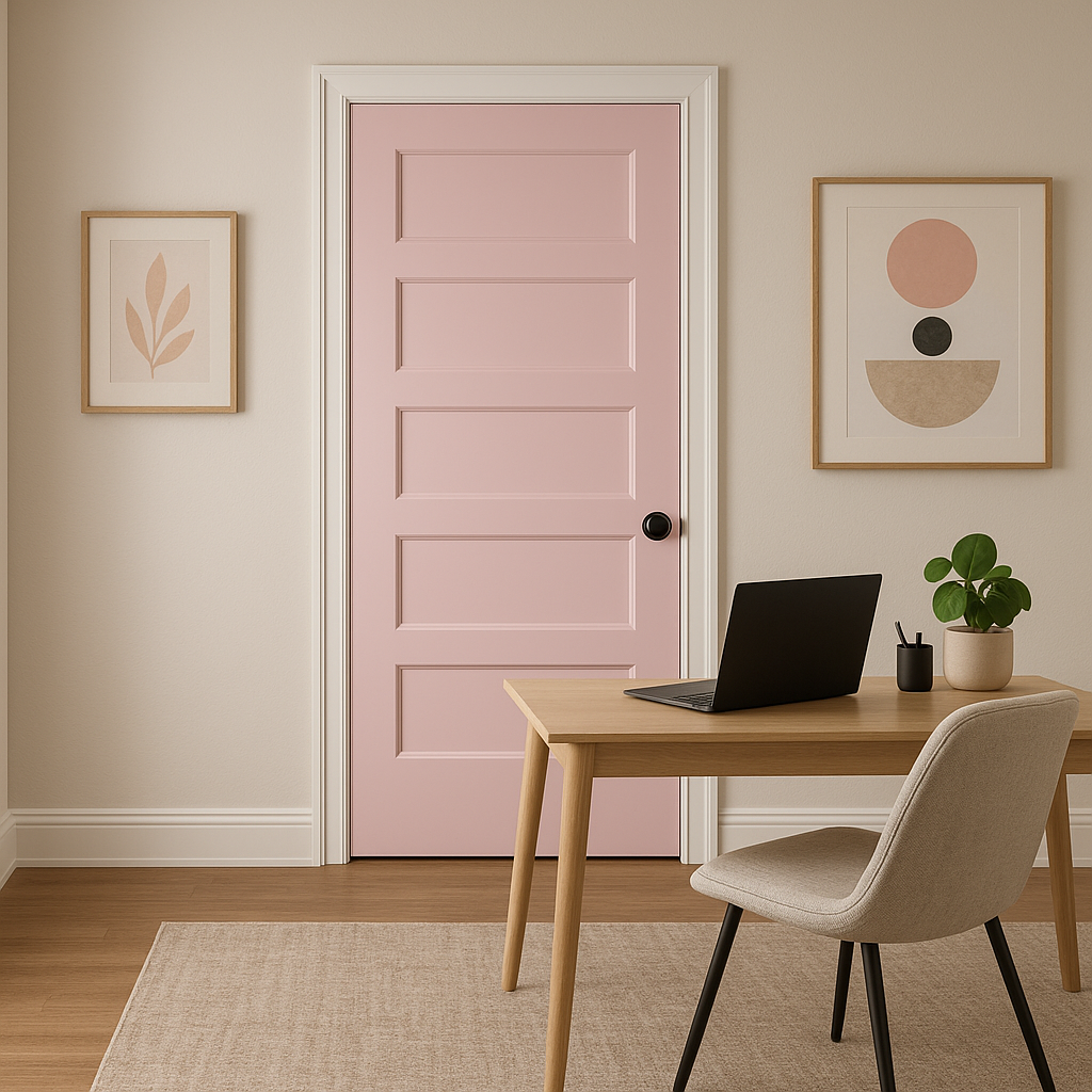
Use Teaberry as an accent color to add personality to spaces without committing to an all-over pink. It works beautifully behind a bed, sofa, or shelving to draw attention and create depth.
Teaberry’s warm undertones make it a unique option for dining rooms. Pair it with dark wooden furniture and soft lighting for a cozy yet sophisticated dining experience.
Teaberry’s appearance can vary depending on lighting conditions. In spaces with ample natural light, the color appears bright and cheerful. In dimmer settings, its red undertones become slightly more pronounced, lending a cozy and intimate feel. To ensure your design vision aligns with the color’s behavior, test samples in the intended space before committing.
Sherwin-Williams Teaberry is the ideal paint color for anyone looking to incorporate a subtle yet statement-making pink into their home. Its versatility, warm undertones, and ability to pair with a wide range of coordinating colors make it a favorite among interior designers. Whether you’re designing a modern, transitional, or traditional space, Teaberry serves as a beautiful foundation or accent to bring your vision to life.
Note: These images were all generated with AI, there may be inaccurate color results. Please only use a general reference to get a rough idea of what a color may look like, we will continue to generate new images to improve accuracy.
View Colors Only by Brand (No Imagery):
Sherwin-Williams
|
Benjamin-Moore
|
Behr
|
Valspar
Live on the Eastern Slope of Colorado and looking for a local painting professional, check out all our painting services and reach out for a free estimate.
Copyright © 2026 : Wild Fox Painting Inc. : 12435 Mead Way, Littleton, CO 80125


