Sherwin-Williams Irresistible (SW 6562) is an alluring and bold paint color that effortlessly combines elegance and drama. Its rich berry tone exudes sophistication, making it a perfect choice for spaces where you want to create a sense of intimacy or elevate the overall ambiance. Whether used as a statement color or an accent, Irresistible brings a sense of warmth and personality to any interior design style.
Irresistible is a vibrant shade with deep red and purple undertones, giving it a warm, berry-like appearance. These undertones add complexity to the color, balancing its boldness with a subtle softness. Depending on the lighting, Irresistible can shift slightly between a rich magenta-inspired hue and a deep plum-like tone, making it a dynamic choice for your walls. This versatility allows it to work beautifully in both bright, well-lit spaces and cozy, dimly lit areas.
Pairing Sherwin-Williams Irresistible with complementary or coordinating colors can help you achieve a harmonious and polished look. Here are some suggestions:
Neutrals:
To balance the drama of Irresistible, consider pairing it with neutral tones like Snowbound (SW 7004) or Pure White (SW 7005). These crisp whites offer a fresh contrast, allowing the berry hue to shine without overwhelming the space.
Soft Grays:
If you prefer a more understated pairing, light grays like Repose Gray (SW 7015) or Silver Strand (SW 7057) can create a sophisticated and calming color palette.
Earthy Greens:
Irresistible pairs beautifully with muted greens such as Evergreen Fog (SW 9130) or Artichoke (SW 6179) for a nature-inspired look that feels grounding and elegant.
Golds and Mustards:
To add warmth and a touch of luxury, consider pairing Irresistible with golden shades like Goldenrod (SW 6677) or Honeycomb (SW 6375). These colors amplify the richness of the berry hue while adding an element of opulence.
Irresistible is a versatile color that can be used in various areas of your home, depending on the atmosphere you want to create. Here are some ideas for incorporating this stunning hue:
Accent Walls:
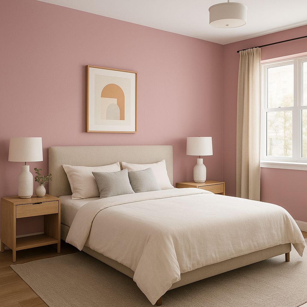
Irresistible is perfect for creating a focal point in living rooms, dining areas, or bedrooms. An accent wall painted in this color can instantly transform the space, making it feel more intimate and luxurious.
Bedrooms:
The warm undertones of Irresistible make it an excellent choice for bedrooms, where you want to create a cozy and inviting retreat. Pair it with soft linens and neutral decor for a balanced look.
Dining Rooms:
Berry tones like Irresistible evoke a sense of richness and warmth, making them ideal for dining spaces. They can enhance the dining experience by creating a dramatic yet welcoming ambiance.
Powder Rooms:
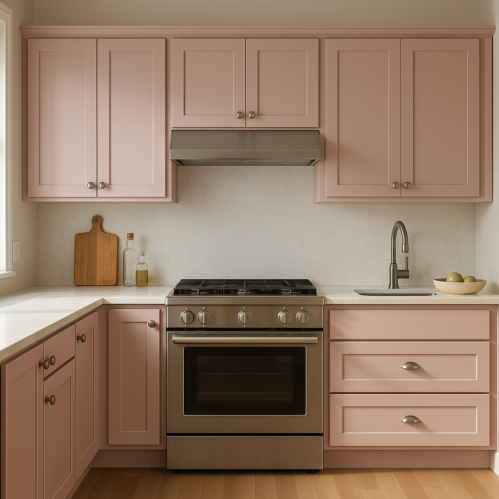
For a high-impact look in small spaces, use Irresistible in a powder room or bathroom. The boldness of the color adds character and charm, especially when paired with metallic fixtures or accessories.
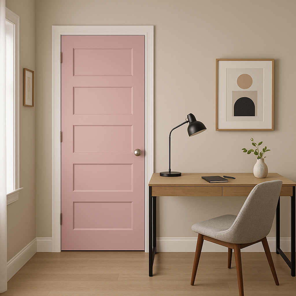
Creative Spaces:
If you have a studio or home office, Irresistible can inspire creativity and productivity. It’s a color that feels energizing yet grounded, making it perfect for spaces where imagination flourishes.
Irresistible’s dynamic nature means it will look different depending on the lighting conditions. In spaces with ample natural light, its red undertones will feel more vivid and energetic. In rooms with softer or artificial lighting, the purple undertones become more pronounced, creating a deeper, moodier vibe. Testing this color in various lighting scenarios is key to ensuring it complements your space as intended.
Sherwin-Williams Irresistible (SW 6562) is more than just a paint color; it’s a design statement. Its rich berry tones and nuanced undertones provide endless possibilities for creating a space that feels luxurious, intimate, and undeniably stylish. Whether paired with soft neutrals, earthy greens, or glamorous golds, Irresistible is sure to live up to its name, transforming your home into a masterpiece of color.
Note: These images were all generated with AI, there may be inaccurate color results. Please only use a general reference to get a rough idea of what a color may look like, we will continue to generate new images to improve accuracy.
View Colors Only by Brand (No Imagery):
Sherwin-Williams
|
Benjamin-Moore
|
Behr
|
Valspar
Live on the Eastern Slope of Colorado and looking for a local painting professional, check out all our painting services and reach out for a free estimate.
Copyright © 2026 : Wild Fox Painting Inc. : 12435 Mead Way, Littleton, CO 80125


