Sherwin-Williams Framboise (6566) is an alluring and confident shade that commands attention. This rich, deep berry hue blends sophistication with a sense of drama, making it the perfect choice for spaces where you want to create impact and evoke emotion. Whether you’re designing a luxurious dining room, an intimate bedroom, or a bold accent wall, Framboise offers versatility and elegance that transcends trends.
Framboise is a vibrant yet refined color with distinct red and purple undertones. These undertones lend it a velvety, jewel-like quality that feels both romantic and artistic. The slight purple notes give Framboise a cool edge, making it ideal for pairing with complementary tones to create balance and depth. Additionally, its rich pigmentation ensures that the color remains bold without feeling overpowering, especially when used thoughtfully within a space.
To enhance the beauty of Sherwin-Williams Framboise (6566), pairing it with complementary or neutral shades can help create a cohesive and polished look. Below are some coordinating colors that work harmoniously with Framboise:
Neutral Pairings:
Complementary Colors:
Accent Colors:
Sherwin-Williams Framboise (6566) is a versatile color that can be used in a variety of applications to bring personality and charm to any interior design project. Here are some ideas for incorporating Framboise into your home or workspace:
Make a bold statement by using Framboise on an accent wall. Whether it’s in a living room, bedroom, or entryway, this hue draws the eye and creates a focal point that anchors the space. Pair it with neutral tones like Extra White or Repose Gray on surrounding walls to ensure the accent wall stands out without overwhelming the room.
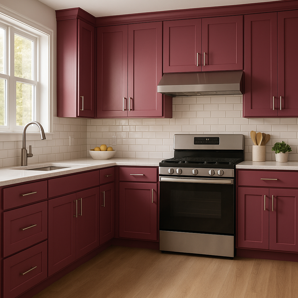
Framboise is a wonderful choice for dining rooms, as its richness evokes warmth and intimacy—perfect for hosting dinner parties or enjoying family meals. Combine it with metallic finishes like gold or brass for an elevated look, and complement it with deep wood tones for a cozy yet luxurious vibe.
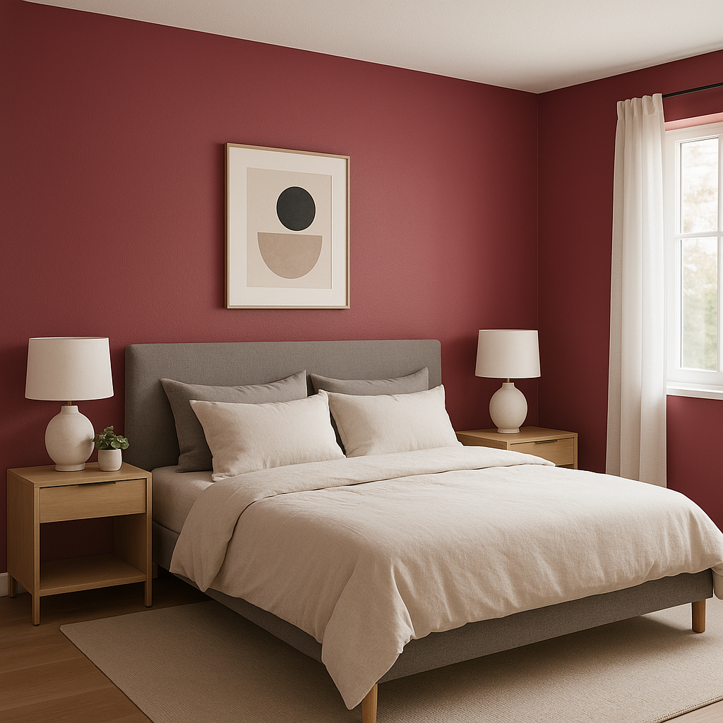
Infuse romance and drama into your bedroom by incorporating Framboise as a wall color or through textiles like bedding or curtains. Pair it with soft, muted tones like Crushed Ice or Repose Gray for a serene atmosphere, or go bold with a mix of jewel tones like Naval and Goldfinch for a glamorous retreat.
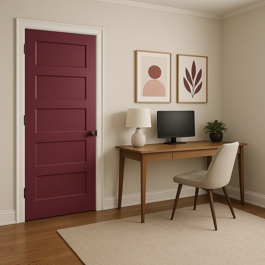
Framboise’s artistic undertones make it a natural fit for creative spaces like home offices, studios, or libraries. Its energy inspires creativity, while its depth lends a sense of focus. Pair it with Urbane Bronze or Naval for a sophisticated color palette that encourages productivity and imagination.
If you’re not ready to commit to painting walls, Framboise can be introduced through furniture, artwork, or decorative accents. A velvet sofa in Framboise can become a stunning centerpiece, while throw pillows, rugs, or vases in this hue can add pops of color to neutral spaces.
Sherwin-Williams Framboise is more than just a paint color—it’s a statement. Its rich berry tone, balanced undertones, and versatility make it ideal for creating spaces that are memorable and unique. Whether used as the star of the show or as part of a curated color palette, Framboise stands out for its ability to transform interiors into works of art.
With its ability to pair beautifully with neutrals, complementary shades, and accents, Framboise offers endless possibilities for creating impactful designs. Whether you’re looking to design a cozy corner or an entire room, this bold hue will reignite your love for color and elevate your space to new heights.
Note: These images were all generated with AI, there may be inaccurate color results. Please only use a general reference to get a rough idea of what a color may look like, we will continue to generate new images to improve accuracy.
View Colors Only by Brand (No Imagery):
Sherwin-Williams
|
Benjamin-Moore
|
Behr
|
Valspar
Live on the Eastern Slope of Colorado and looking for a local painting professional, check out all our painting services and reach out for a free estimate.
Copyright © 2026 : Wild Fox Painting Inc. : 12435 Mead Way, Littleton, CO 80125


