Sherwin-Williams Priscilla 6575 is a delicate, romantic shade of soft blush pink that evokes a sense of warmth and sophistication. This color is perfect for creating spaces that feel inviting and serene, with a touch of understated elegance. Whether you're designing a cozy retreat or an airy, feminine space, Priscilla 6575 offers a versatile and timeless appeal.
Priscilla 6575 is a warm blush with subtle peachy undertones, making it a versatile choice for both modern and traditional interiors. The peachy undertones give the color a gentle, sunlit glow, offering a sense of comfort and charm. These undertones also help balance the pink hue, ensuring it doesn’t feel overly sweet or saccharine.
This color has a soft sophistication that works beautifully in spaces where you want to create a sense of relaxation and intimacy. Its understated warmth makes it a perfect backdrop for layering textures and tones.
Priscilla 6575 pairs wonderfully with both neutral and bold hues, making it a flexible choice for various design styles. Here are some coordinating colors to consider:
This flexibility in pairing allows you to create a variety of moods, from soft and romantic to bold and contemporary.
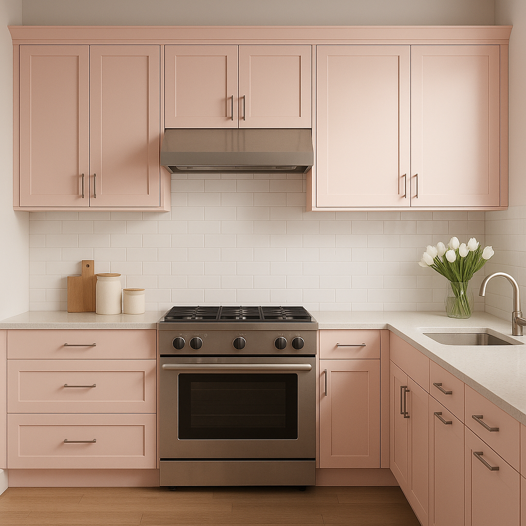
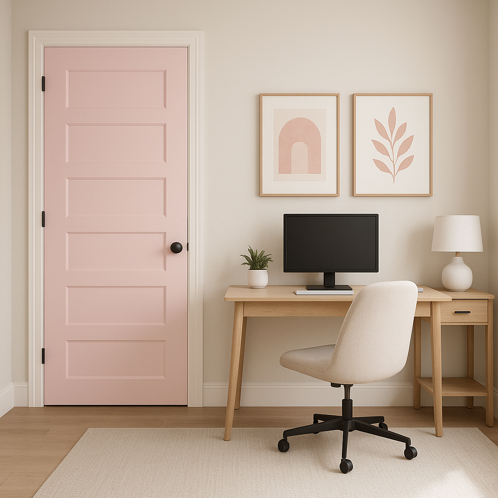
Priscilla 6575 is an excellent choice for a wide range of applications, thanks to its versatile and comforting nature. Here are some ideas for incorporating this shade into your space:
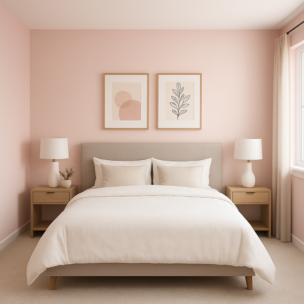
The warm blush tones of Priscilla 6575 are an ideal choice for bedrooms, offering a calming and serene ambiance. Pair it with crisp white bedding and soft, layered textiles for a dreamy, romantic retreat.
Priscilla 6575 can create a cozy yet sophisticated living room space. Use it on the walls and complement it with neutral furniture and metallic accents for a touch of glamour.
This soft pink is a popular option for nurseries, as it feels nurturing and soothing without being overpoweringly bright. Add whimsical décor and gentle lighting for a space that feels magical and inviting.
For a spa-like effect, use Priscilla 6575 in bathrooms. Pair it with white marble countertops, gold or brass fixtures, and soft gray or beige tiles for a luxurious, feminine vibe.
If you’re hesitant to commit to an all-over blush tone, Priscilla 6575 works beautifully as an accent wall color. Use it to highlight architectural features or to define a cozy reading nook.
This color can bring a touch of elegance to dining spaces, especially when paired with dark wood furniture and statement lighting. The warmth of Priscilla 6575 makes it a welcoming choice for entertaining guests.
Note: These images were all generated with AI, there may be inaccurate color results. Please only use a general reference to get a rough idea of what a color may look like, we will continue to generate new images to improve accuracy.
View Colors Only by Brand (No Imagery):
Sherwin-Williams
|
Benjamin-Moore
|
Behr
|
Valspar
Live on the Eastern Slope of Colorado and looking for a local painting professional, check out all our painting services and reach out for a free estimate.
Copyright © 2026 : Wild Fox Painting Inc. : 12435 Mead Way, Littleton, CO 80125


