Sherwin-Williams Impatiens Petal (6582) is a delicate and romantic hue that effortlessly brings a soft, feminine touch to any space. This light, airy pink has a subtle warmth that feels inviting and serene, making it an excellent choice for creating spaces that evoke comfort and tranquility. Its understated elegance and versatility make it a standout option for both modern and traditional interiors.
Impatiens Petal has gentle peach undertones that infuse the pink with warmth, preventing it from feeling overly cool or sterile. The peachy base enhances its ability to work harmoniously with a variety of coordinating colors, while its muted quality ensures it doesn’t overwhelm a space. This is a pink that whispers rather than shouts, making it ideal for creating soothing, lived-in environments.
When designing with Impatiens Petal, carefully chosen coordinating shades can elevate its charm and create a cohesive look. Consider pairing it with the following Sherwin-Williams colors:
Impatiens Petal is a versatile color that works well across a variety of design styles and spaces. Here are some inspired ways to incorporate this soft pink into your home:
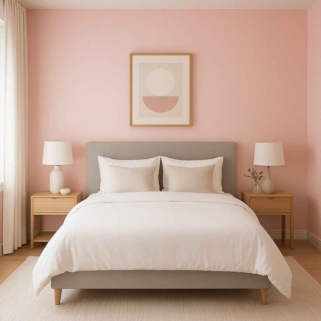
Create a romantic and restful retreat by using Impatiens Petal as the main wall color. Pair it with crisp white bed linens, soft gray throws, and subtle metallic accents for a serene yet sophisticated vibe. The peach undertones lend a cozy warmth that’s perfect for unwinding at the end of the day.
This gentle pink is a natural choice for nurseries. It’s sweet and playful without being overly bright or saccharine. Combine it with pastel greens, soft blues, or creamy whites to create a nurturing haven for your little one.
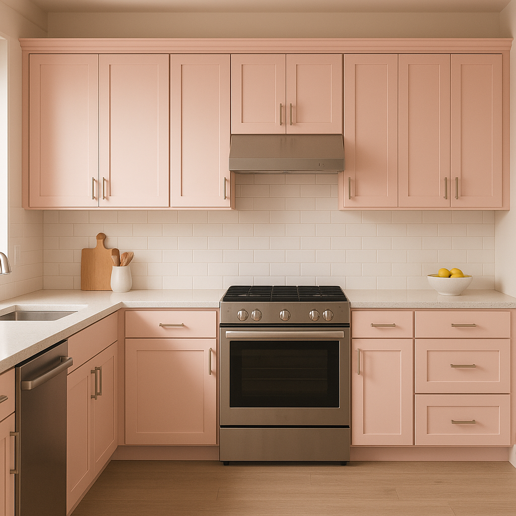
In living spaces, Impatiens Petal can act as an accent wall or a full-room color to add character and charm. Pair it with neutral furniture and natural textures like wood and linen for a refined yet approachable aesthetic.
Transform your bathroom into a spa-like sanctuary with Impatiens Petal. Use it on walls or cabinetry and complement it with sleek white subway tiles, brushed gold fixtures, and lush green plants for a refreshing and elegant look.
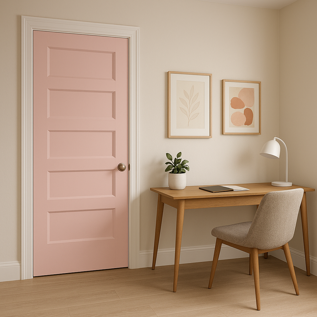
For a workspace that inspires creativity and calm, Impatiens Petal provides the perfect backdrop. Pair it with minimalist furniture and soft lighting to enhance focus while adding a touch of personality.
Sherwin-Williams Impatiens Petal (6582) is more than just a paint color—it’s a mood. Its soft, peachy pink undertones and versatile nature make it an excellent choice for spaces that need a touch of warmth and charm. Whether you’re designing a cozy bedroom, a chic living room, or a playful nursery, this color adds just the right amount of character without overpowering the space.
Bring your vision to life with Sherwin-Williams Impatiens Petal, and let its gentle elegance transform your home into a haven of beauty and serenity.
Note: These images were all generated with AI, there may be inaccurate color results. Please only use a general reference to get a rough idea of what a color may look like, we will continue to generate new images to improve accuracy.
View Colors Only by Brand (No Imagery):
Sherwin-Williams
|
Benjamin-Moore
|
Behr
|
Valspar
Live on the Eastern Slope of Colorado and looking for a local painting professional, check out all our painting services and reach out for a free estimate.
Copyright © 2026 : Wild Fox Painting Inc. : 12435 Mead Way, Littleton, CO 80125


