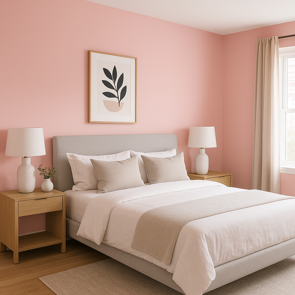
Sherwin-Williams In the Pink 6583 is a delightful, soft pink that exudes charm, warmth, and a sense of playfulness. This versatile shade captures the essence of a blush pink, making it an ideal choice for spaces that need a touch of femininity or a lighthearted, welcoming ambiance. Whether you're designing a nursery, refreshing a bedroom, or adding a pop of color to an accent wall, In the Pink 6583 offers an opportunity to infuse your interiors with a cheerful and romantic vibe.
In the Pink 6583 carries subtle peachy undertones, which give it a warm and lively character. These undertones prevent it from feeling overly saccharine or cold, ensuring that the color remains approachable and versatile. The peach influence also makes it an excellent complement to both neutral and warm palettes, as it harmonizes beautifully with earthy tones and soft whites.
When viewed under different lighting conditions, In the Pink 6583 may shift slightly. In natural light, its peach undertones become more pronounced, radiating a soft glow. Under artificial lighting, the pink may lean cooler, offering a more subdued blush tone. This chameleon-like quality makes it essential to test the color in your specific space to see how it interacts with your lighting.
To make the most of Sherwin-Williams In the Pink 6583, pairing it with complementary and coordinating colors is key. Here are some suggestions to help you create a cohesive and polished color palette:
Soft Neutrals: Pair In the Pink with whites like Sherwin-Williams Alabaster (SW 7008) or Pure White (SW 7005) for a clean and timeless look. These soft neutrals balance the warmth of the pink and create a serene atmosphere.
Earthy Tones: Colors like Accessible Beige (SW 7036) or Latte (SW 6108) enhance the peach undertones of In the Pink, creating a cozy and grounded aesthetic.
Muted Greens: Shades like Evergreen Fog (SW 9130) or Sea Salt (SW 6204) offer a subtle contrast, bringing a fresh, botanical feel to the palette. The green tones work beautifully with the warmth of the pink, creating a balanced and inviting space.
Deeper Accents: For a more dramatic effect, consider pairing In the Pink with jewel tones like Naval (SW 6244) or Tricorn Black (SW 6258). These deep hues provide striking contrast and sophistication, making the pink stand out even more.
Sherwin-Williams In the Pink 6583 is a versatile color that can be used in a variety of interior design applications, offering endless creative possibilities:
Nurseries and Children's Rooms: This soft pink is the perfect choice for creating a nurturing and whimsical environment for little ones. Pair it with light neutrals and playful accents for a magical space.
Bedrooms: In the Pink brings a sense of romance and tranquility to bedrooms. Use it as the main wall color or as an accent behind the headboard for a cozy, serene retreat.
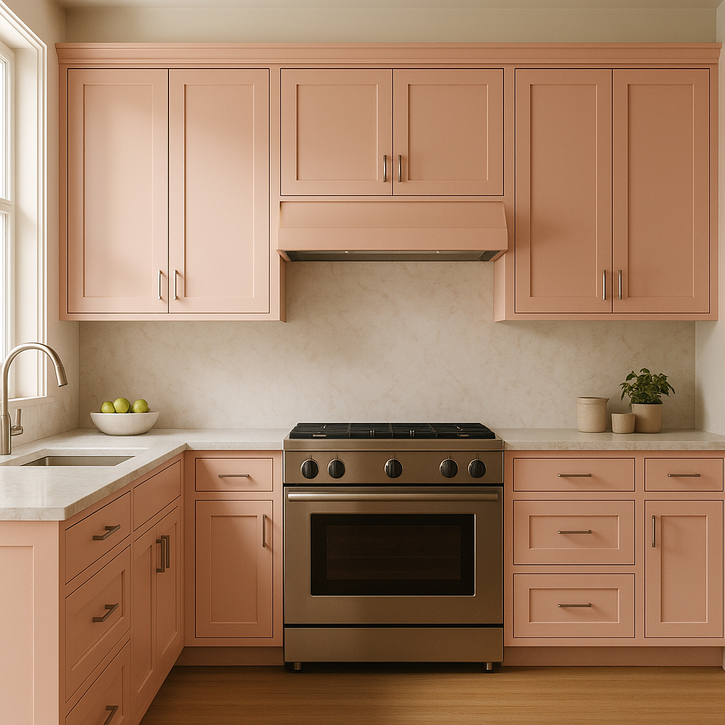
Living Rooms: Add warmth and personality to your living space by incorporating In the Pink on an accent wall or within built-in shelving. Pair it with neutral furniture and metallic accents for a balanced and modern look.
Bathrooms: For a spa-like atmosphere, consider using In the Pink in a powder room or bathroom. Complement it with white tile, brass fixtures, and soft lighting for a luxurious and inviting space.
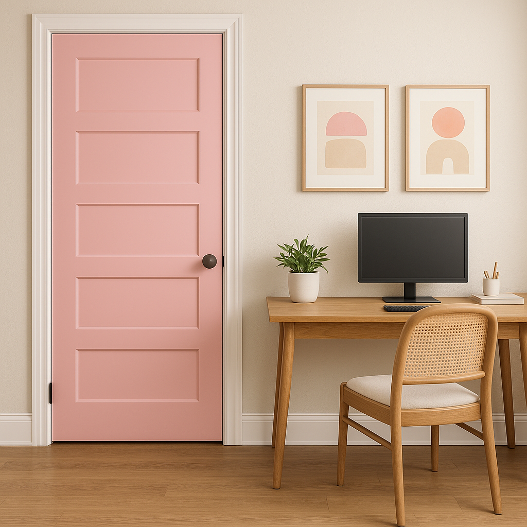
Accent Pieces: If painting an entire wall feels like too much, use In the Pink on furniture,
Note: These images were all generated with AI, there may be inaccurate color results. Please only use a general reference to get a rough idea of what a color may look like, we will continue to generate new images to improve accuracy.
View Colors Only by Brand (No Imagery):
Sherwin-Williams
|
Benjamin-Moore
|
Behr
|
Valspar
Live on the Eastern Slope of Colorado and looking for a local painting professional, check out all our painting services and reach out for a free estimate.
Copyright © 2026 : Wild Fox Painting Inc. : 12435 Mead Way, Littleton, CO 80125


