Sherwin-Williams Valentine (6587) is a striking and sophisticated color that instantly infuses any space with energy, passion, and elegance. This bold and romantic shade of pink is both playful and refined, making it a versatile choice for creating statement walls, accent pieces, or entire rooms with a vibrant flair. With its rich pigmentation and timeless appeal, Valentine is ideal for homeowners and designers seeking to craft spaces that evoke warmth, creativity, and a sense of individuality.
Valentine (6587) is a rich, saturated pink with subtle red undertones that give it depth and warmth. While undeniably bold, it avoids feeling overly bright or juvenile, thanks to its sophisticated balance of pigment. This nuanced undertone allows Valentine to feel romantic and inviting without overwhelming a space. The red undertones make it a perfect choice for areas where you want to spark joy and energy, and its presence can be softened or amplified depending on the lighting and surrounding decor.
When used in natural light, Valentine tends to appear slightly softer, showcasing its warm and rosy charm. In artificial lighting, especially under incandescent or warm-toned bulbs, the color intensifies, revealing its deeper, more dramatic red undertones.
Sherwin-Williams Valentine pairs beautifully with a range of complementary and contrasting colors. Whether you're aiming for a playful and modern aesthetic or a more traditional and romantic vibe, Valentine can adapt to your vision effortlessly. Below are some coordinating color suggestions:
Valentine’s versatility allows it to shine in a variety of design contexts, from bold contemporary spaces to romantic traditional settings. Here are some of the best uses for this vibrant hue:
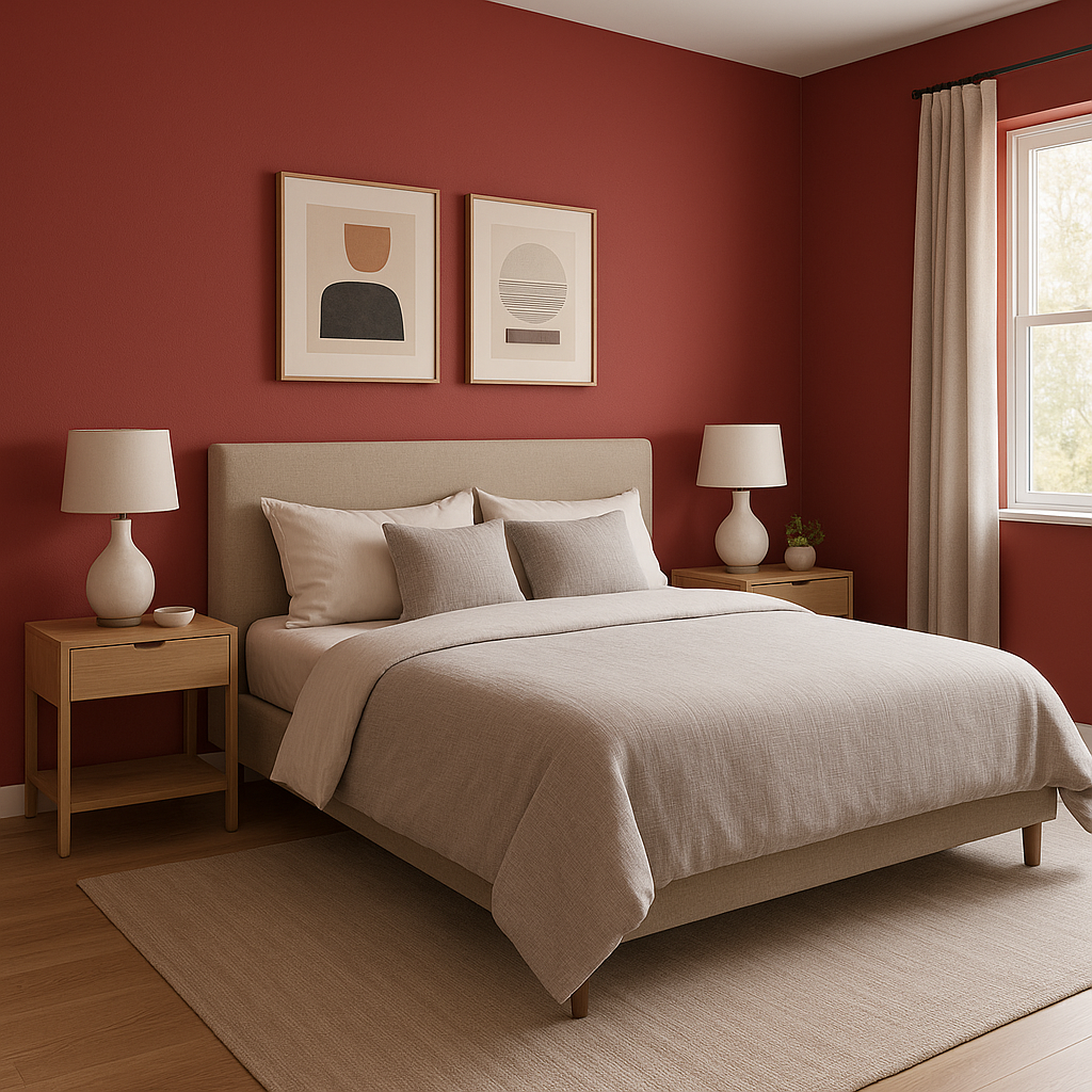
Create a dramatic focal point in living rooms, bedrooms, or dining areas by using Valentine on an accent wall. Pair it with neutral furniture and decor to balance its vibrancy, or enhance its energy with bold accessories.
Valentine’s romantic undertones make it an excellent choice for bedrooms, especially when paired with soft whites or muted grays. Add plush linens and metallic accents for a serene yet luxurious sanctuary.
This lively pink is perfect for home offices, craft rooms, or children’s play areas. Its energetic vibe encourages creativity and focus.
Turn your powder room into a show-stopping space with Valentine on the walls, paired with sleek black fixtures and white marble finishes for a glamorous touch.
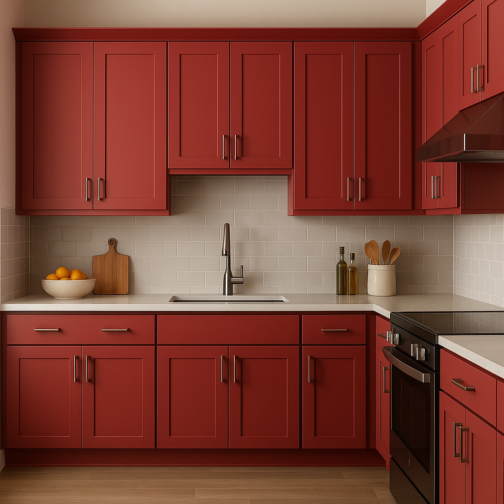
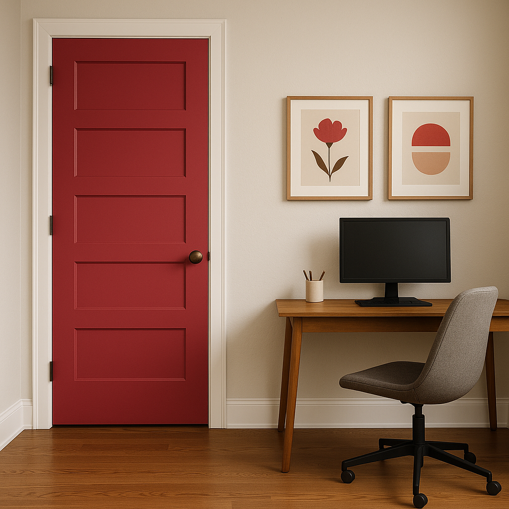
Add pops of color to your space by incorporating Valentine into furniture pieces, cabinetry, or decor like throw pillows or artwork. Its bold presence can elevate even the simplest designs.
The way Valentine appears can shift depending on the lighting in your space. To optimize the color’s impact:
Sherwin-Williams Valentine (6587) is a vibrant, energetic hue that blends romance with sophistication. Whether used as the star of your palette or as a supporting accent, this bold pink brings life, personality, and charm to any interior design project.
Note: These images were all generated with AI, there may be inaccurate color results. Please only use a general reference to get a rough idea of what a color may look like, we will continue to generate new images to improve accuracy.
View Colors Only by Brand (No Imagery):
Sherwin-Williams
|
Benjamin-Moore
|
Behr
|
Valspar
Live on the Eastern Slope of Colorado and looking for a local painting professional, check out all our painting services and reach out for a free estimate.
Copyright © 2026 : Wild Fox Painting Inc. : 12435 Mead Way, Littleton, CO 80125


