Sherwin-Williams Grenadine (SW 6592) is a striking and energetic crimson-red paint color that exudes passion, warmth, and sophistication. Perfect for making a statement, Grenadine invites you to embrace boldness while maintaining a sense of refined elegance. Whether used as an accent or a primary color, this rich hue is sure to infuse your space with a dynamic and lively atmosphere.
Grenadine boasts warm undertones of red with subtle hints of berry and orange, making it a versatile shade that feels both vibrant and inviting. These undertones impart a sense of warmth, making it ideal for rooms where energy and connection are desired. Unlike cooler reds that lean into purples or blues, Grenadine’s warm base makes it feel approachable and full of life.
To achieve a harmonious design that complements Sherwin-Williams Grenadine, consider pairing it with both neutral and contrasting shades:
Neutrals:
Contrasting Colors:
Grenadine’s versatile yet commanding presence makes it suitable for a variety of applications, from intimate spaces to bold accent features:
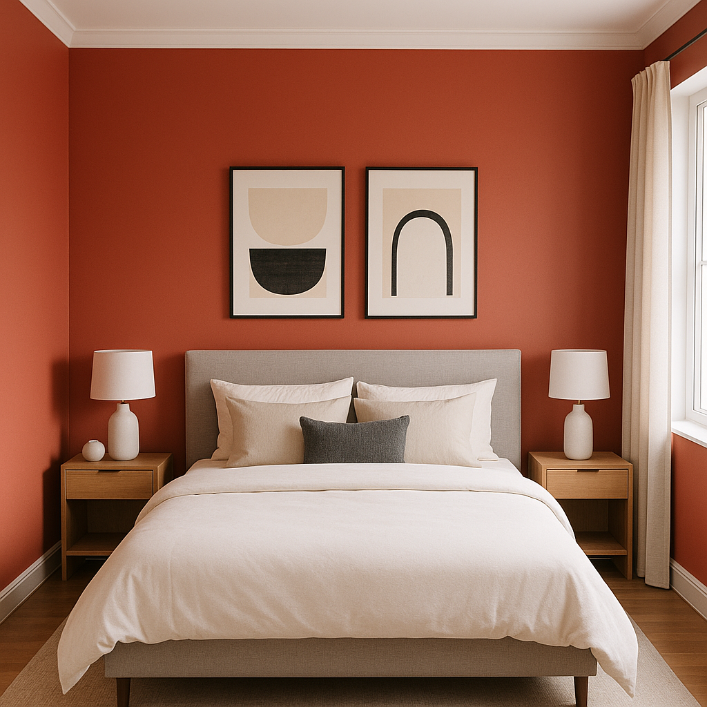
Grenadine is an excellent choice for accent walls in living rooms, dining spaces, or bedrooms. Its bold nature instantly draws the eye and creates a focal point, especially when paired with lighter, neutral walls for balance.
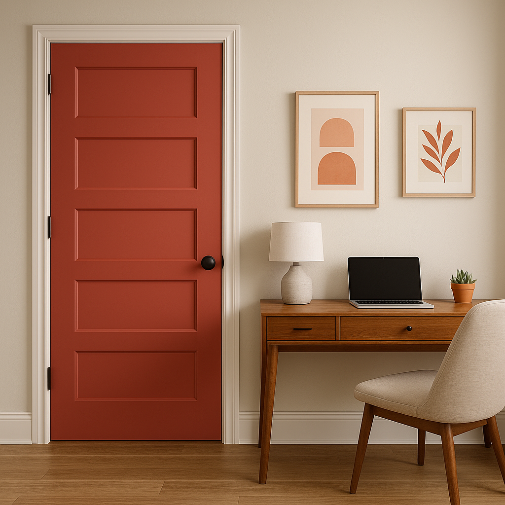
For homes seeking curb appeal, Grenadine makes a stunning front door color. Its rich, warm tone conveys a sense of welcome and personality while standing out beautifully against neutral exteriors like white, gray, or beige.
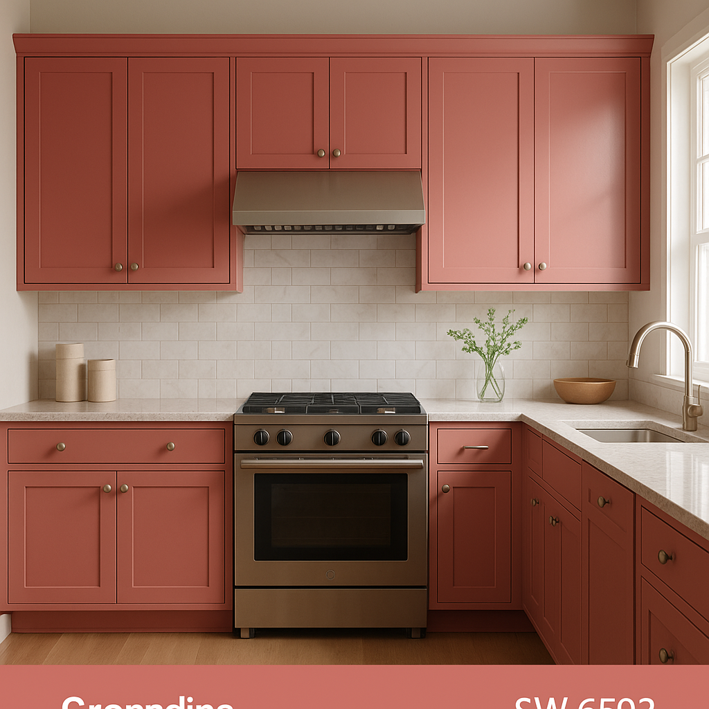
In kitchens or bathrooms, Grenadine can add a pop of personality to cabinetry or furniture pieces. Pair it with gold or matte black hardware for a luxurious touch.
Grenadine is perfect for spaces that spark creativity and energy, such as home offices, studios, or playrooms. Its lively tone encourages inspiration and focus.
Red hues like Grenadine are traditionally associated with stimulating appetite and conversation, making it an ideal color for dining rooms. Pair it with wood accents or metallics for a polished look.
Sherwin-Williams Grenadine (SW 6592) is the epitome of bold sophistication. Its rich undertones, versatile pairing options, and dynamic uses make it a must-consider for anyone looking to create spaces that inspire energy, warmth, and connection. Whether you’re designing a cozy corner or a statement-making feature, Grenadine is sure to deliver timeless vibrancy.
Note: These images were all generated with AI, there may be inaccurate color results. Please only use a general reference to get a rough idea of what a color may look like, we will continue to generate new images to improve accuracy.
View Colors Only by Brand (No Imagery):
Sherwin-Williams
|
Benjamin-Moore
|
Behr
|
Valspar
Live on the Eastern Slope of Colorado and looking for a local painting professional, check out all our painting services and reach out for a free estimate.
Copyright © 2026 : Wild Fox Painting Inc. : 12435 Mead Way, Littleton, CO 80125


