Sherwin-Williams Poinsettia (6594) is a striking red hue that exudes energy, passion, and sophistication. This rich, saturated color is perfect for creating bold, eye-catching spaces that leave a lasting impression. Whether you’re looking to design a dramatic accent wall or add a pop of color to a room, Poinsettia delivers an impactful statement that elevates your interior design.
Poinsettia (6594) carries warm undertones, making it feel inviting and dynamic rather than stark or cold. Beneath its vibrant red surface lies subtle hints of orange, which lend the color depth and dimension. These undertones ensure that Poinsettia remains versatile, pairing well with other warm shades while providing a cozy and welcoming ambiance.
Sherwin-Williams Poinsettia (6594) pairs beautifully with a range of coordinating colors, allowing you to create a harmonious and balanced design. Here are some ideal companions:
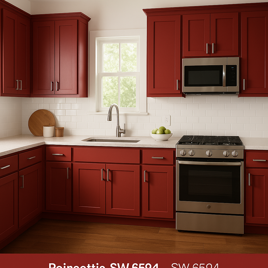
Sherwin-Williams Poinsettia (6594) is a versatile shade that can transform a variety of spaces, from modern and eclectic to classic and traditional. Here are some inspiring ways to use this color in your home or commercial projects:
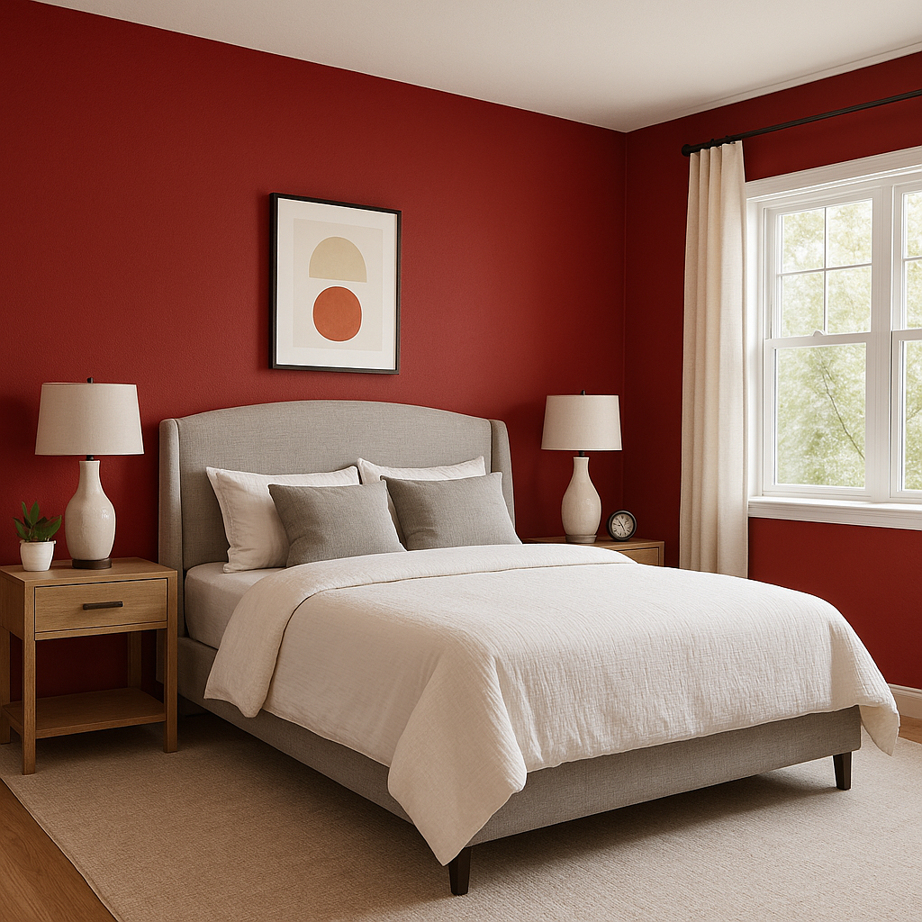
Poinsettia is a perfect choice for creating a focal point in a room. Use it on an accent wall in your living room, dining room, or bedroom to add vibrancy and personality. Pair the accent wall with neutral furniture and decor for a balanced look.
Red tones are known to stimulate appetite and conversation, making Poinsettia an excellent choice for dining areas. Whether you paint the entire room or use it sparingly on cabinetry or trim, this shade sets a warm, inviting tone for memorable meals.
Make a bold first impression with Poinsettia in your entryway. This rich red creates a welcoming vibe and sets the tone for the rest of your home. Pair it with brass or gold accents for an elegant finish.
The energetic nature of Poinsettia makes it ideal for rooms designed to spark creativity and imagination. Use it in a playroom, craft space, or art studio to inspire energy and innovation.
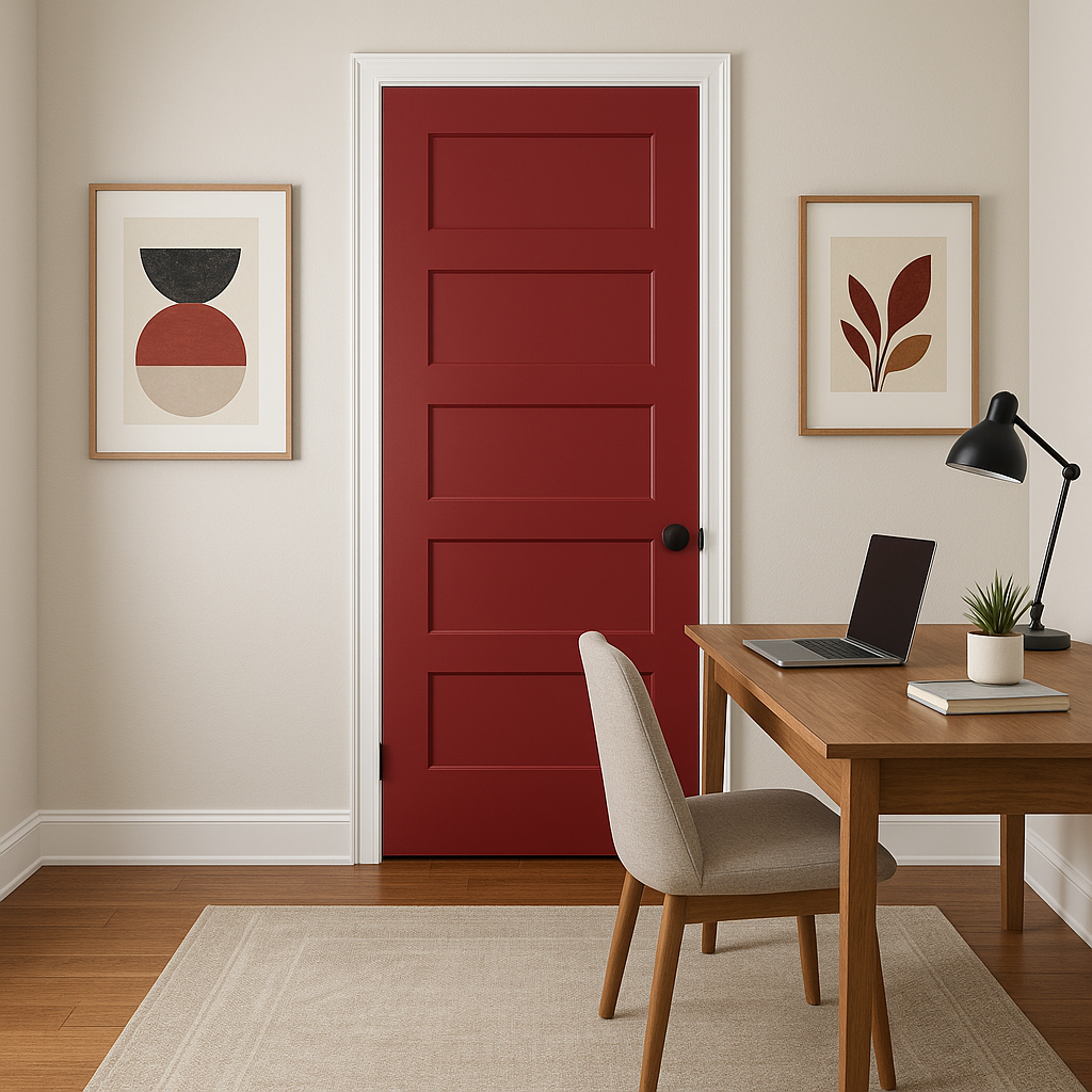
If painting an entire wall or room feels too bold, consider incorporating Poinsettia through furniture, shelving, or decor elements. A red bookshelf, chair, or picture frame can add a playful touch to your design while maintaining balance.
The appearance of Sherwin-Williams Poinsettia (6594) can vary depending on lighting conditions. In rooms with ample natural light, the color may appear brighter and more vibrant, while in spaces with artificial lighting or lower light levels, the warm undertones become more pronounced. Consider testing the color in different areas of your room to ensure it complements your lighting setup.
Sherwin-Williams Poinsettia (6594) is more than just a paint color; it’s a statement. Its boldness inspires confidence, while its warm undertones keep it approachable and versatile. Whether you’re designing a cozy dining room, a dramatic accent wall, or an inviting entryway, Poinsettia’s vibrant charm makes it a standout choice for any space.
Note: These images were all generated with AI, there may be inaccurate color results. Please only use a general reference to get a rough idea of what a color may look like, we will continue to generate new images to improve accuracy.
View Colors Only by Brand (No Imagery):
Sherwin-Williams
|
Benjamin-Moore
|
Behr
|
Valspar
Live on the Eastern Slope of Colorado and looking for a local painting professional, check out all our painting services and reach out for a free estimate.
Copyright © 2026 : Wild Fox Painting Inc. : 12435 Mead Way, Littleton, CO 80125


