Sherwin-Williams Quite Coral (SW 6614) is a lively and uplifting shade that infuses spaces with warmth and energy. This rich coral hue balances the vibrancy of orange with the softness of pink, making it a versatile choice for interiors that need a dose of personality and charm. Whether you're creating a bold accent wall, brightening up a living room, or adding flair to a small space, Quite Coral brings sophistication and playfulness in equal measure.
Quite Coral has distinct warm undertones that lean toward a peachy-orange base, complemented by subtle pink notes. These undertones make the color feel inviting and approachable, yet not overly saturated or heavy. The warm nature of the hue ensures it pairs well with both neutral tones and other vibrant colors, offering flexibility in design schemes. The coral's brightness feels cheerful without veering into overwhelming territory, striking a perfect balance for spaces needing a fresh, dynamic touch.
Sherwin-Williams Quite Coral can be beautifully paired with a variety of complementary shades to create a cohesive and stylish palette. Here are a few suggestions for coordinating colors:
Soft Neutrals: Pair Quite Coral with Sherwin-Williams Alabaster (SW 7008) or Pure White (SW 7005) for a clean and balanced look. These creamy whites provide a grounding contrast to the coral's vibrancy.
Earthy Browns and Beiges: For a natural, grounded feel, consider teaming Quite Coral with Sherwin-Williams Accessible Beige (SW 7036) or Tony Taupe (SW 7038). These shades enhance the coral’s warmth while creating a cozy atmosphere.
Cool Blues and Greens: Add a refreshing touch by pairing Quite Coral with Sherwin-Williams Sea Salt (SW 6204) or Rainwashed (SW 6211). The cool undertones of these hues offer a striking contrast to the warmth of coral, resulting in a balanced and harmonious look.
Bold Accents: If you're looking for a dramatic pairing, try Sherwin-Williams Naval (SW 6244) or Tricorn Black (SW 6258). These deeper tones create a bold, high-contrast aesthetic that makes Quite Coral pop.
Quite Coral is a versatile shade that works well in various applications and spaces, depending on the vibe you're aiming to achieve:
This color adds a welcoming and cheerful atmosphere to communal areas like living rooms and family spaces. Use it as an accent wall or pair it with neutral furniture to create a warm, inviting environment that encourages relaxation and socializing.
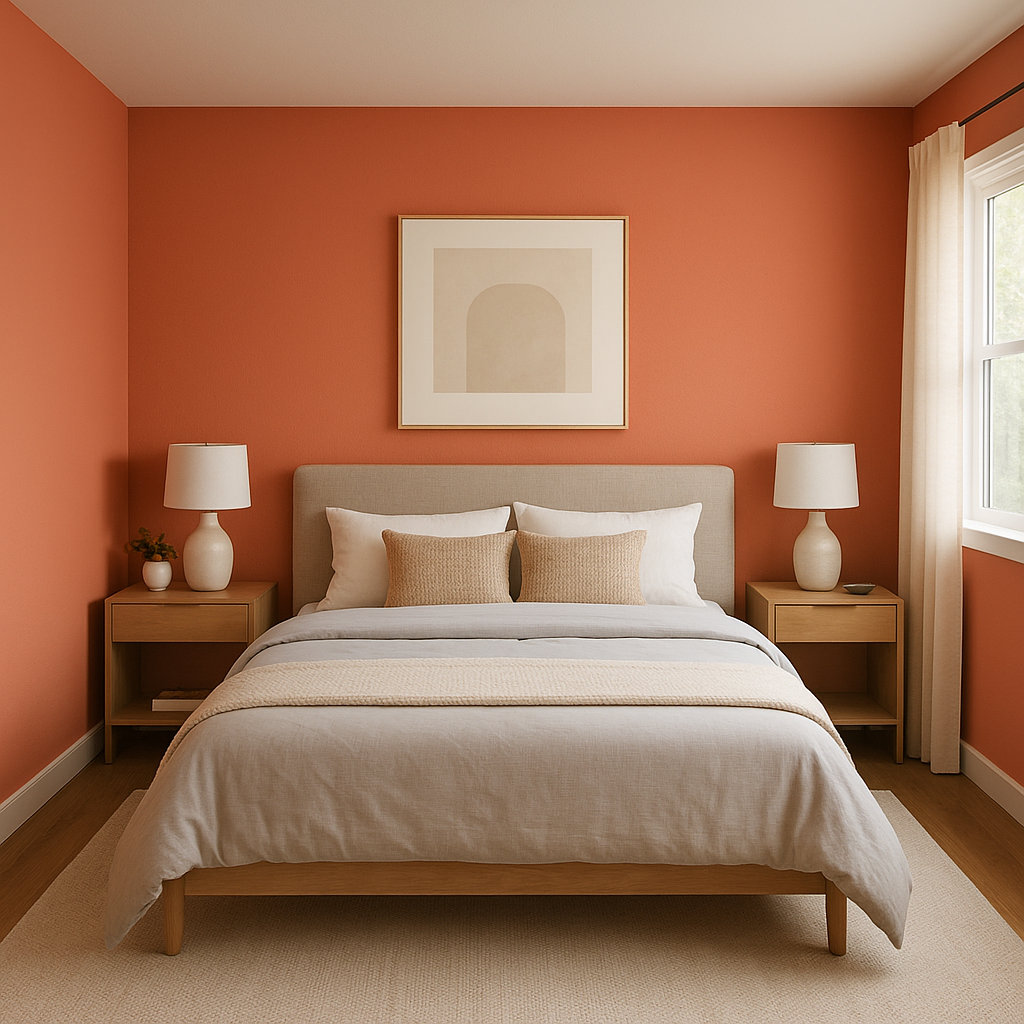
For bedrooms, Quite Coral introduces a touch of romance and softness without being overly feminine. Pair it with soft whites and beige tones for a calming retreat, or add pops of navy or emerald green for an eclectic twist.
Quite Coral is perfect for dining spaces where you want to evoke energy and conversation. Its warm undertones stimulate appetite and create a cozy ambiance, making meals feel even more enjoyable.
Bring a playful and fresh vibe to bathrooms with Quite Coral. Pair it with crisp whites and metallic finishes for a clean, modern look, or add tropical greens for a spa-like feel.
The balance of brightness and softness makes Quite Coral ideal for children’s spaces. It feels youthful and fun without being overbearing, and it pairs beautifully with soft pastels or bold primary colors.
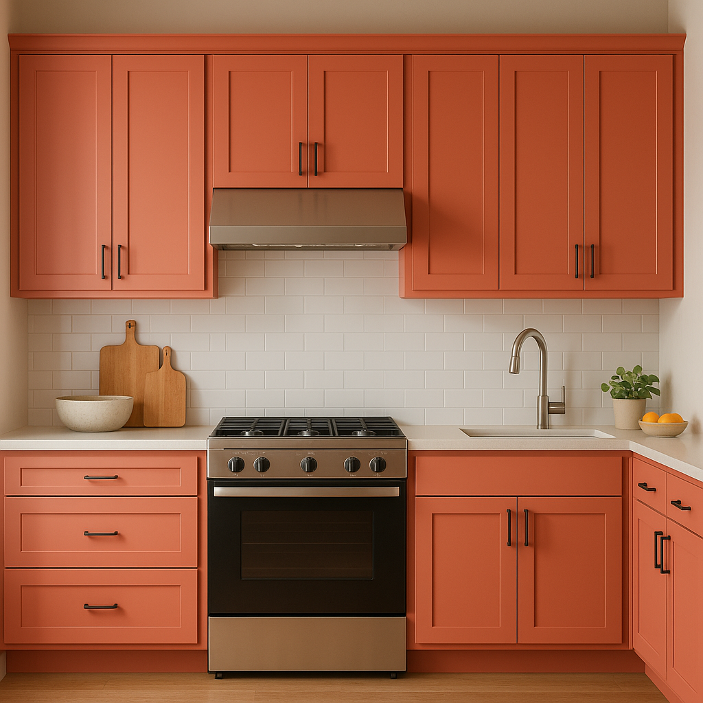
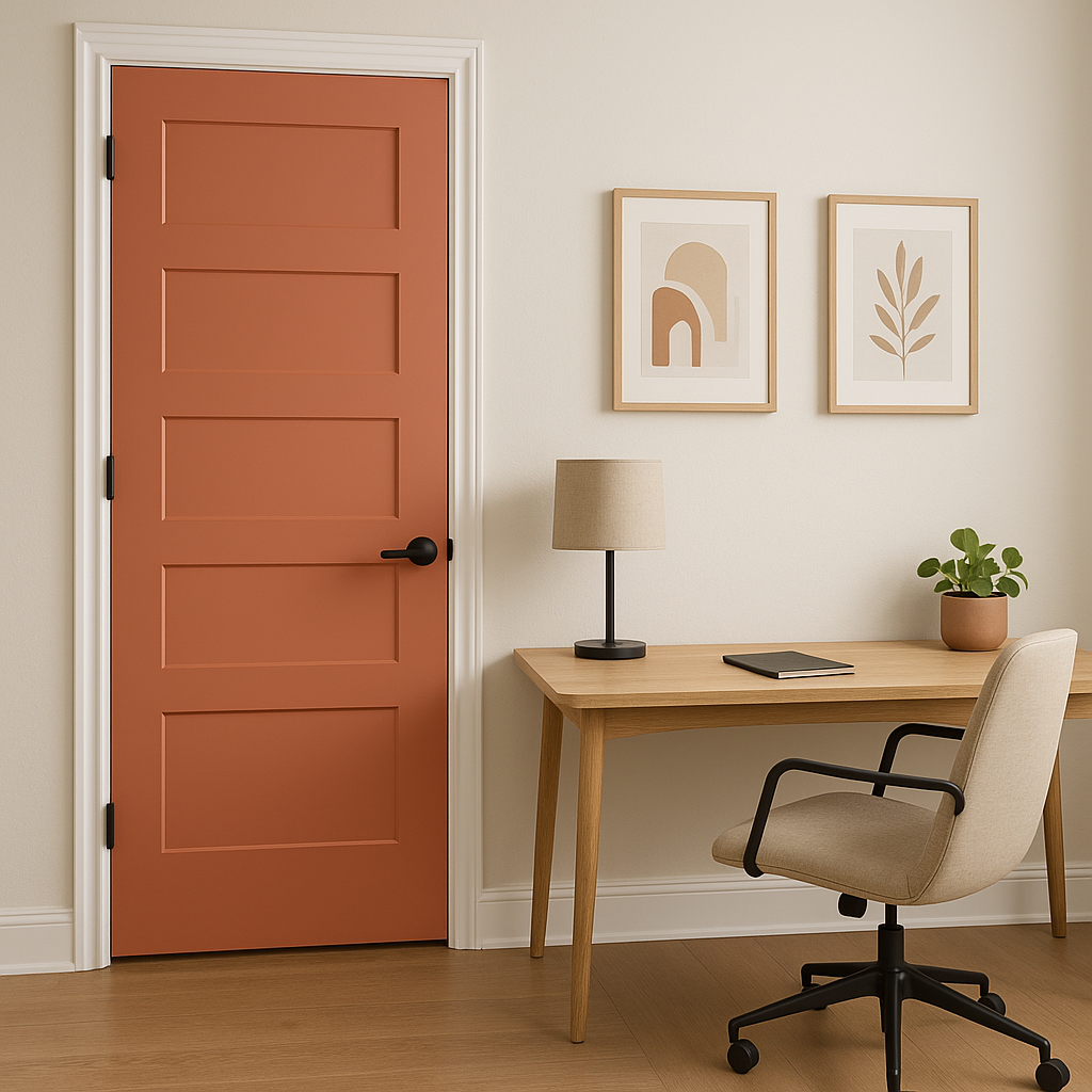
If you’re not ready to commit to an entire wall, Quite Coral can be used for smaller accents like furniture, cabinetry, or decor pieces. A coral-painted dresser or bookshelf can instantly brighten a room and add a touch of uniqueness.
To make the most of Sherwin-Williams Quite Coral, consider layering textures and finishes. Matte Quite Coral walls can pair wonderfully with glossy white trim or metallic accents like brushed gold or copper. Incorporating natural materials like wood or rattan can also enhance the warmth of the coral and create a balanced, organic aesthetic.
Sherwin-Williams Quite Coral (SW 6614) is more than just a paint color—it's a statement. Its ability to inject energy, warmth, and personality into a space makes it a standout choice for homeowners and designers alike. Whether you're crafting a bold centerpiece or adding subtle touches of coral charm, this versatile hue delivers beauty and style with every brushstroke.
Note: These images were all generated with AI, there may be inaccurate color results. Please only use a general reference to get a rough idea of what a color may look like, we will continue to generate new images to improve accuracy.
View Colors Only by Brand (No Imagery):
Sherwin-Williams
|
Benjamin-Moore
|
Behr
|
Valspar
Live on the Eastern Slope of Colorado and looking for a local painting professional, check out all our painting services and reach out for a free estimate.
Copyright © 2026 : Wild Fox Painting Inc. : 12435 Mead Way, Littleton, CO 80125


