Sherwin-Williams Copper Harbor (SW 6634) is a rich, earthy hue that instantly brings warmth and depth to a space. Its saturated, terracotta-inspired tone evokes the natural beauty of sunlit canyons and clay-rich landscapes. Whether used as the centerpiece of a room or as an accent color, Copper Harbor creates a cozy, grounding atmosphere that feels both timeless and sophisticated.
Copper Harbor carries subtle red and orange undertones, giving it a warm, sunbaked appearance. These undertones make the color feel vibrant yet approachable, striking the perfect balance between boldness and comfort. While its terracotta nature leans warm, the muted quality of Copper Harbor ensures it doesn’t overpower a space but instead envelops it in a welcoming embrace.
The reddish undertones provide a sense of richness, while the earthy base grounds the color, making it suitable for a variety of design styles—from rustic and Mediterranean to modern and bohemian. This versatility ensures Copper Harbor adapts beautifully to different lighting conditions, appearing slightly more vibrant in natural daylight and moodier under soft, warm lighting.
To create a harmonious palette, pair Copper Harbor with colors that complement its earthy warmth. Sherwin-Williams offers a range of coordinating options to suit various styles and preferences:
Neutral Partners:
Earth-Inspired Complements:
Cool Contrasts:
Using these coordinating colors, you can design spaces that feel well-balanced and visually cohesive, whether through wall-to-wall combinations or accent pieces.
Copper Harbor is a versatile color that works across a range of interiors and design styles. Its warm and earthy nature makes it ideal for creating inviting, lived-in spaces. Consider these applications:
Transform your living room into a cozy retreat by using Copper Harbor as a feature wall color. Pair it with soft neutrals like Shoji White on adjacent walls and incorporate textures like linen and leather to enhance the warmth. Add accents in natural wood tones and greenery for a relaxed, organic vibe.
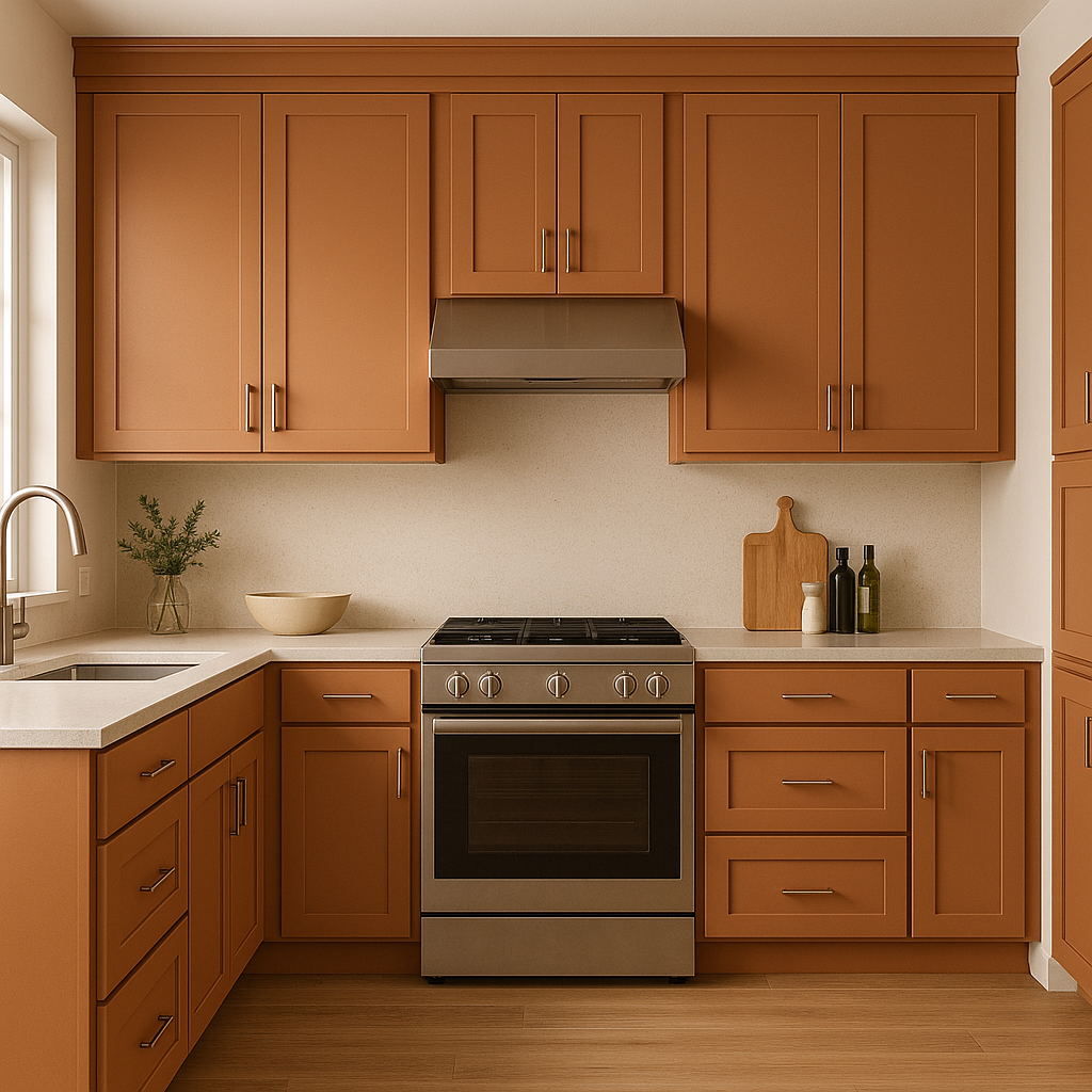
Copper Harbor’s rich tone makes it an excellent choice for a bold kitchen island or cabinetry. Pair it with brass or matte black hardware for a modern touch. In dining areas, this color encourages an intimate atmosphere, perfect for gathering with family and friends.
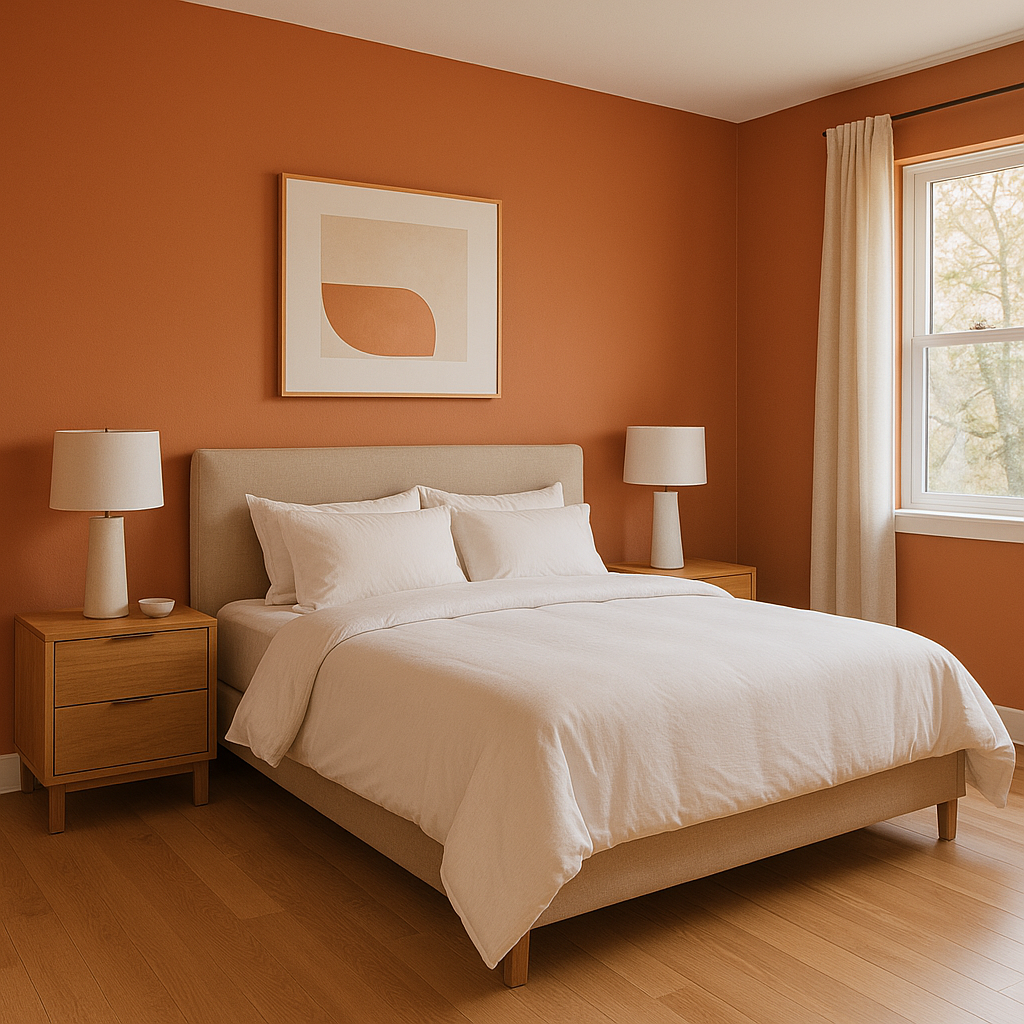
For a restful yet stylish bedroom, use Copper Harbor on an accent wall behind the bed. Pair it with crisp white bedding and soft gray or beige accents for a serene, layered look. Add textured throws and pillows in complementary earthy tones to complete the space.
Copper Harbor can add a spa-like warmth to bathrooms, especially when paired with natural materials like stone and wood. Use it on walls or cabinetry and balance the look with neutral tiles and metallic fixtures.
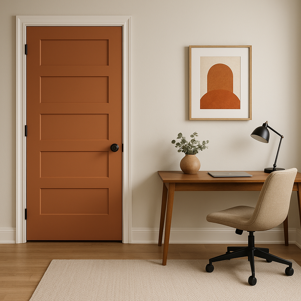
On the exterior, Copper Harbor makes a striking choice for front doors or shutters, adding a warm and inviting curb appeal. When used as a primary exterior color, it pairs beautifully with neutral trim in creamy whites or deep grays.
Lighting plays a significant role in how Copper Harbor appears in a space. In rooms with ample natural light, the color becomes brighter and livelier, showcasing its terracotta warmth. In spaces with minimal light, it takes on a cozier, more muted character. To fully appreciate its versatility, test the color in different lighting conditions before committing.
Sherwin-Williams Copper Harbor (SW 6634) is more than just a paint color—it’s a statement. With its warm undertones, flexible coordinating options, and adaptability across spaces, it’s the perfect choice for anyone looking to infuse their home with a sense of comfort, depth, and timeless style. Whether you’re designing a rustic retreat or a modern sanctuary, Copper Harbor’s earthy charm makes it a standout addition to any palette.
Note: These images were all generated with AI, there may be inaccurate color results. Please only use a general reference to get a rough idea of what a color may look like, we will continue to generate new images to improve accuracy.
View Colors Only by Brand (No Imagery):
Sherwin-Williams
|
Benjamin-Moore
|
Behr
|
Valspar
Live on the Eastern Slope of Colorado and looking for a local painting professional, check out all our painting services and reach out for a free estimate.
Copyright © 2026 : Wild Fox Painting Inc. : 12435 Mead Way, Littleton, CO 80125


