Sherwin-Williams Determined Orange (SW 6635) is a bold, vivacious paint color that brings energy, warmth, and a touch of playfulness to any space. Perfect for those seeking to make a daring design statement, this fiery hue is a true showstopper. With its lively personality and ability to invigorate interiors, Determined Orange is a color that commands attention while still feeling approachable when paired with the right elements.
Determined Orange is a saturated, medium-toned orange that leans slightly warm. It carries subtle red undertones, giving it a richness that deepens its appeal. These undertones make the color feel grounded rather than overly bright or brash, ensuring it maintains sophistication despite its high energy. The warmth in its undertones also helps it pair beautifully with other earthy or warm shades.
Pairing Determined Orange with complementary hues can amplify its charm while creating a harmonious and balanced design. Below are some ideas for coordinating colors, whether you're designing a lively living room, a bold kitchen, or an accent wall that steals the show:
Neutrals:
To tone down the vibrancy of Determined Orange, opt for warm neutrals like Sherwin-Williams Wool Skein (SW 6148) or Accessible Beige (SW 7036). These colors provide a calming balance and allow the orange to shine without overwhelming the space.
Earthy Greens:
Bring out the natural warmth of Determined Orange by pairing it with grounding greens like Sherwin-Williams Rosemary (SW 6187) or Svelte Sage (SW 6164). This pairing evokes a warm, organic feel reminiscent of autumn foliage.
Deep Blues:
For a striking contrast, pair Determined Orange with deep blues like Naval (SW 6244) or Indigo Batik (SW 7602). The cool tones of navy create a bold yet sophisticated partnership that feels dynamic and modern.
Soft Whites:
To create an airy and uplifting ambiance, incorporate soft whites such as Alabaster (SW 7008) or Creamy (SW 7012). These shades allow Determined Orange to pop while maintaining a crisp and clean aesthetic.
Determined Orange is versatile, but its bold nature makes it ideal for spaces where you want to evoke energy, creativity, or warmth. Below are some creative ways to incorporate this vibrant hue into your interior design:
Accent Walls:
Use Determined Orange as an accent wall in a living room, dining room, or entryway to instantly energize the space. Pair it with neutral furniture and decor to let the color take center stage.
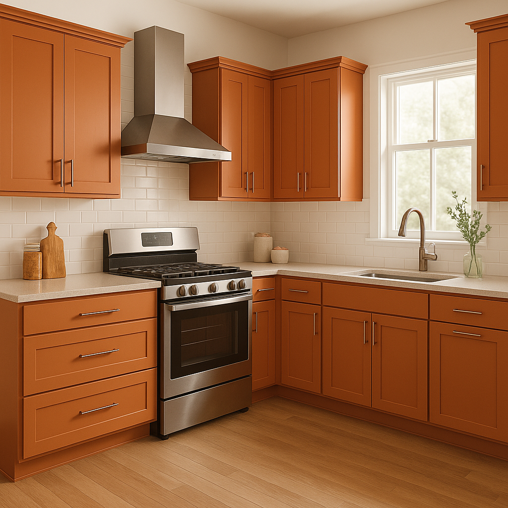
Kitchens:
This color is perfect for a kitchen that feels lively and inviting. Consider painting cabinets or using it for a backsplash. Pair it with warm wood tones and stainless steel accents for a balanced look.
Creative Spaces:
Whether you’re designing an art studio, home office, or craft room, Determined Orange stimulates creativity and enthusiasm. It’s an excellent choice for spaces where brainstorming and innovation are key.
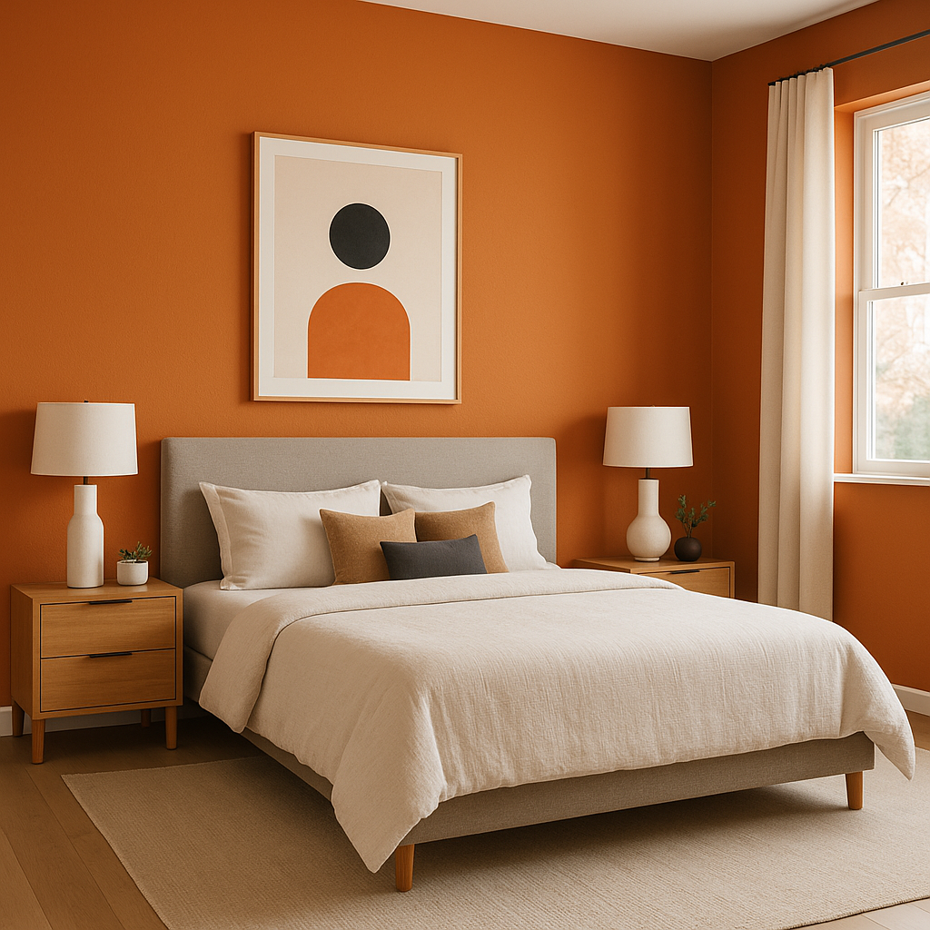
Children’s Rooms:
For a playful and cheerful vibe, use Determined Orange in a child’s bedroom or playroom. Pair it with soft whites and colorful accents to create a fun yet harmonious design.
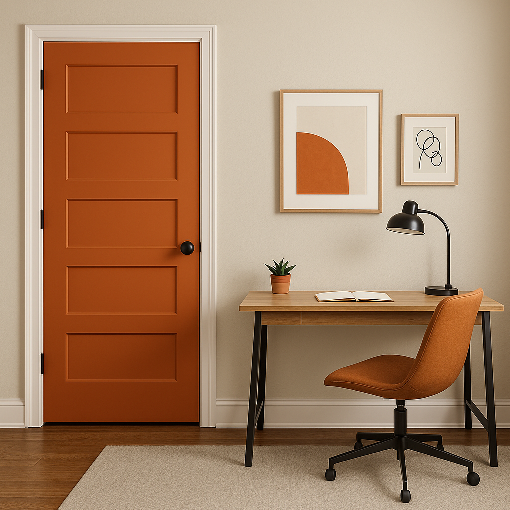
Exterior Applications:
Determined Orange can be a striking choice for a front door or shutters, adding curb appeal and making your home stand out. Pair it with a neutral exterior siding for a sophisticated contrast.
Sherwin-Williams Determined Orange (SW 6635) is the perfect color for anyone looking to infuse their space with warmth, energy, and personality. With its rich undertones, versatile pairing options, and ability to energize interiors, it’s a color that inspires creativity and leaves a lasting impression. Whether used sparingly as an accent or as the main feature in a design, Determined Orange is a choice that speaks to boldness and confidence.
Note: These images were all generated with AI, there may be inaccurate color results. Please only use a general reference to get a rough idea of what a color may look like, we will continue to generate new images to improve accuracy.
View Colors Only by Brand (No Imagery):
Sherwin-Williams
|
Benjamin-Moore
|
Behr
|
Valspar
Live on the Eastern Slope of Colorado and looking for a local painting professional, check out all our painting services and reach out for a free estimate.
Copyright © 2026 : Wild Fox Painting Inc. : 12435 Mead Way, Littleton, CO 80125


