Sherwin-Williams Butter Up (6681) is a radiant and inviting shade of yellow that brings warmth, charm, and a touch of sunshine into any space. This delightful hue is perfect for homeowners seeking to brighten up their interiors while maintaining a soft, sophisticated look. Whether you're designing a cozy kitchen nook or a welcoming living room, Butter Up offers versatility and a cheerful ambiance that can elevate your design vision.
Butter Up leans toward the warmer side of the yellow spectrum, with subtle golden undertones that add depth and richness to the color. Unlike overly vibrant or neon yellows, Butter Up is tempered with a creamy softness that makes it approachable and timeless. The golden undertones ensure that the color feels luxurious and balanced, without veering into stark or overly saturated territory. This makes it an excellent choice for spaces that need warmth without overwhelming brightness.
Pairing colors with Sherwin-Williams Butter Up is a joy, as its versatile nature allows for a variety of harmonious combinations. Whether you’re aiming for a classic palette or something more modern, these coordinating colors work beautifully with Butter Up:
This crisp, clean white creates a stunning contrast with Butter Up, allowing the yellow to shine while maintaining a fresh, airy feel. Use Extra White for trim, ceilings, or accents to create a polished and refined look.
Accessible Beige is a warm neutral that complements Butter Up's golden tones beautifully. Together, they create a sophisticated and understated palette that’s perfect for transitional or traditional spaces.
For bolder designs, pair Butter Up with Naval, a rich, deep navy blue. The juxtaposition of sunny yellow and dark blue creates a striking yet balanced combination that works well in coastal-inspired or eclectic interiors.
If you prefer a modern aesthetic, Perennial Gray offers a cool neutral base that balances Butter Up's warmth. This pairing lends itself well to contemporary styling, especially in urban or minimalist settings.
Butter Up shines in a variety of settings, thanks to its warm and welcoming nature. Here are some creative ways to incorporate this stunning hue into your home or commercial space:
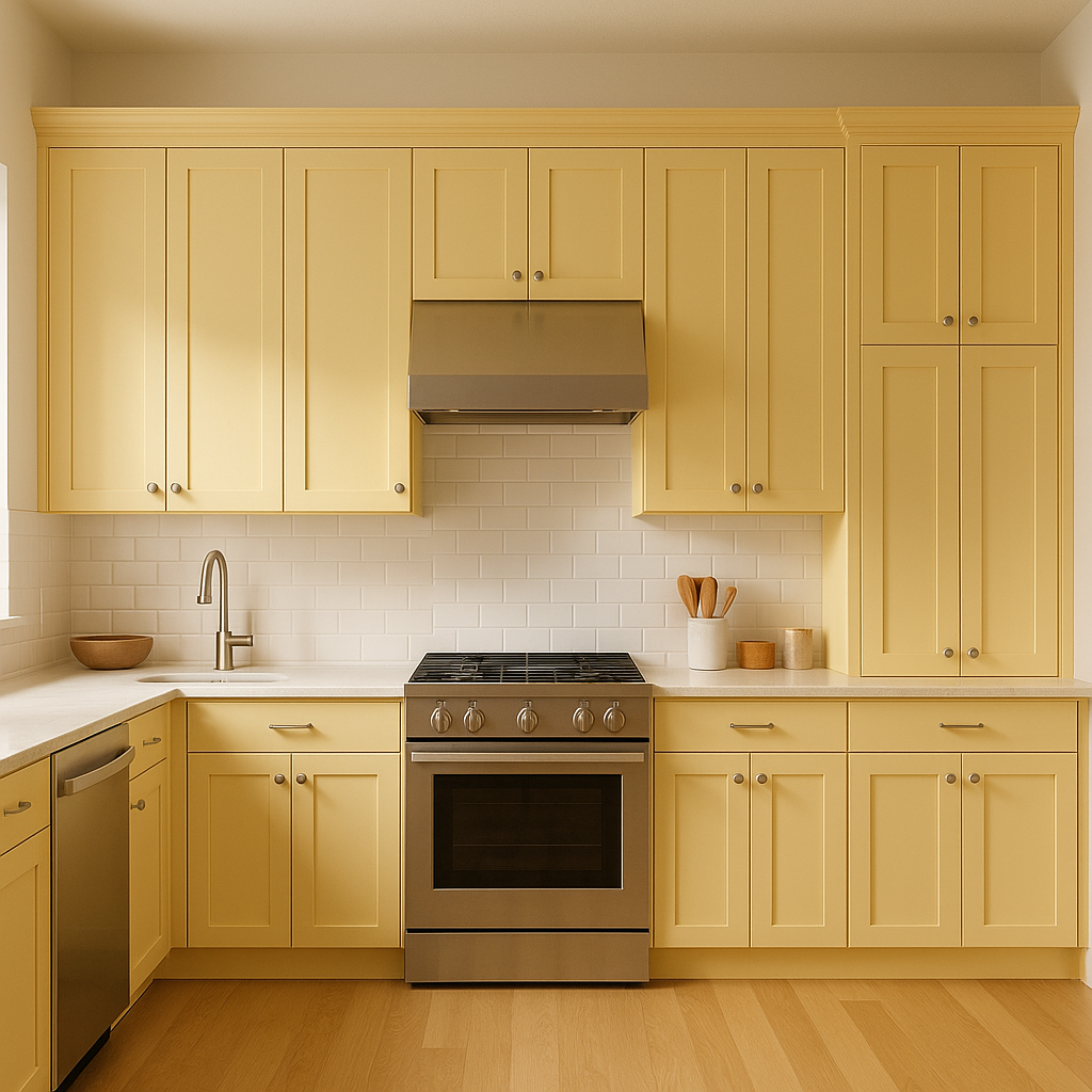
Yellow is often associated with energy, optimism, and joy, making Butter Up a great choice for kitchens and dining rooms. Use it on walls to create a sunny atmosphere that encourages lively conversation and gatherings. Pair it with white cabinetry and stainless steel appliances for a clean, modern look, or combine it with natural wood finishes for a rustic, farmhouse vibe.
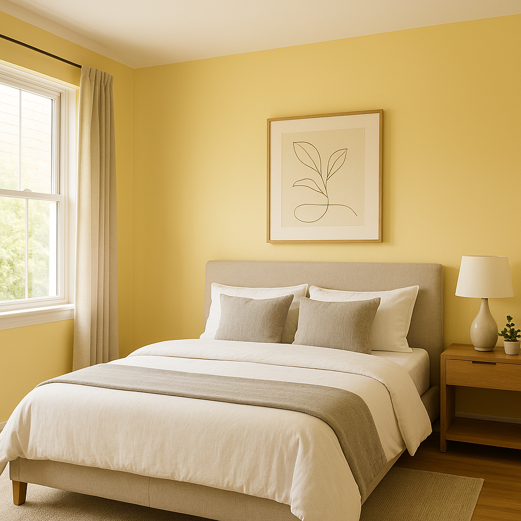
Butter Up can bring a cozy yet cheerful touch to bedrooms, especially when paired with soft white linens and neutral accents. Its golden undertones evoke a sense of relaxation, making it suitable for spaces where you'd like to unwind after a long day.
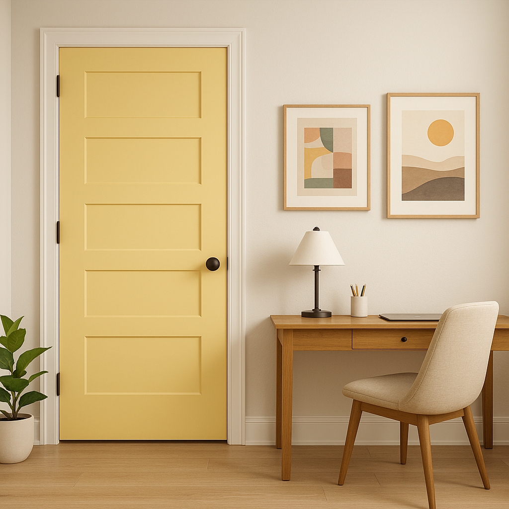
For those who prefer a more restrained use of color, Butter Up makes a fantastic choice for accent walls. It can add a pop of personality to a living room, hallway, or entryway without overwhelming the space. Pair it with neutral tones like gray or beige for a balanced, cohesive look.
Butter Up’s sunny disposition is ideal for children’s spaces. It’s vibrant enough to inspire creativity and playfulness, yet soft enough to feel calming. Pair it with pastel blues, greens, or pinks to create a dreamy, gender-neutral palette.
Butter Up works wonderfully in retail or hospitality settings where a welcoming and positive atmosphere is essential. Think boutique cafes, cheerful office spaces, or inviting hotel lobbies.
Sherwin-Williams Butter Up is an exceptional choice for anyone looking to incorporate a touch of optimism and warmth into their interiors. Its creamy golden undertones, versatile pairing options, and ability to adapt to a range of styles make it a standout color. Whether you're designing a modern retreat or a traditional haven, Butter Up has the power to transform your space into an inviting and radiant sanctuary.
If you're ready to brighten your home with a timeless yellow, Sherwin-Williams Butter Up (6681) might just be your perfect match!
Note: These images were all generated with AI, there may be inaccurate color results. Please only use a general reference to get a rough idea of what a color may look like, we will continue to generate new images to improve accuracy.
View Colors Only by Brand (No Imagery):
Sherwin-Williams
|
Benjamin-Moore
|
Behr
|
Valspar
Live on the Eastern Slope of Colorado and looking for a local painting professional, check out all our painting services and reach out for a free estimate.
Copyright © 2026 : Wild Fox Painting Inc. : 12435 Mead Way, Littleton, CO 80125


