Sherwin-Williams Brittlebush (6684) is a delightful paint color that radiates warmth, cheerfulness, and a touch of golden charm. This sunny yellow hue evokes feelings of comfort and optimism, making it an excellent choice for creating inviting spaces that feel fresh yet soothing. Whether used as the main color or as an accent, Brittlebush brings a burst of energy while maintaining a refined balance that doesn’t overwhelm.
Brittlebush has subtle golden undertones that give it depth and richness without veering into overly bold territory. These undertones lend the color a sophisticated warmth that makes it adaptable to a wide range of design styles, from farmhouse chic to mid-century modern. The golden notes ensure Brittlebush retains a grounded quality, making it feel cozy and approachable, even in brighter applications.
Pairing Sherwin-Williams Brittlebush with complementary colors can enhance its sunny character while creating a harmonious aesthetic. Here are some perfect coordinating colors:
Neutral Companions:
To create a balanced palette, pair Brittlebush with soft neutrals like Sherwin-Williams Alabaster (SW 7008) or Pure White (SW 7005). These creamy whites help tone down the vibrancy of Brittlebush, creating a light and airy space.
Earthy Accents:
For a more grounded look, coordinate Brittlebush with warm earth tones like Sherwin-Williams Toasty (SW 6095) or Nomadic Desert (SW 6107). These colors complement Brittlebush’s golden undertones while adding depth and richness.
Cool Contrasts:
If you want a striking yet balanced contrast, pair Brittlebush with cool blues or greens like Sherwin-Williams Rainwashed (SW 6211) or Tidewater (SW 6477). These colors create a refreshing dynamic that feels lively yet calming.
Bold Pairings:
For a daring combination, consider pairing Brittlebush with Sherwin-Williams Naval (SW 6244), a rich navy blue. The deep tone of Naval amplifies the brightness of Brittlebush, creating a dramatic and stylish look.
Brittlebush is a versatile color that can be used in various spaces to evoke different moods. Here are some of the best ways to incorporate this cheerful hue into your home:
Brittlebush works beautifully in living rooms where you want to create a welcoming and uplifting ambiance. Pair it with neutral furniture and accents in soft blues or greens for a balanced, nature-inspired look.
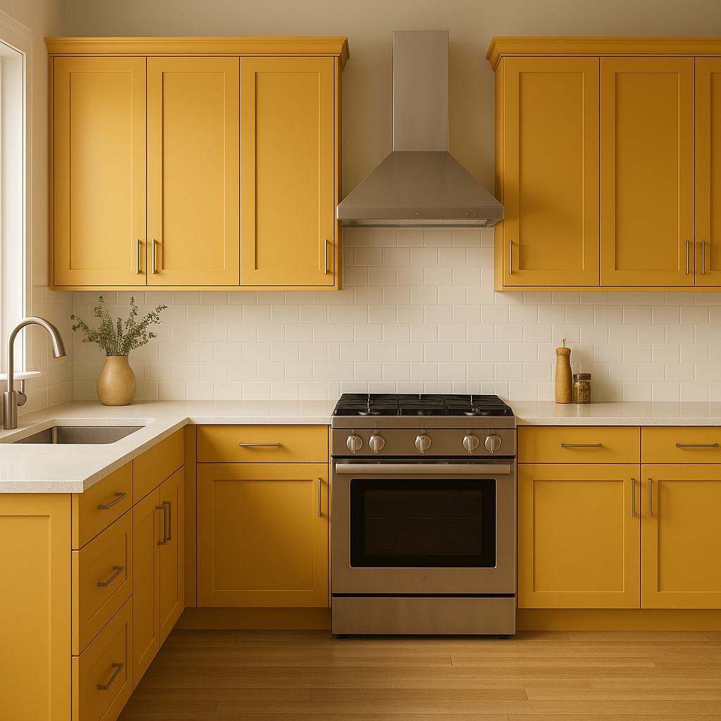
Yellow hues like Brittlebush are ideal for kitchens, as they enhance warmth and energy. Consider using it for cabinets or as an accent wall to make your kitchen feel bright and inviting. Pair it with white countertops and brushed gold hardware for a timeless finish.
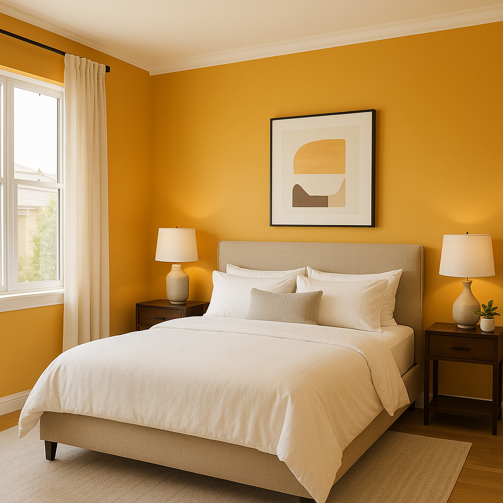
In bedrooms, Brittlebush can be used to create a cozy and cheerful retreat. Opt for lighter coordinating colors like soft whites or pale greens, and add texture with natural wood furniture and woven fabrics to create a tranquil yet sunny atmosphere.
Brittlebush can bring a fresh pop of color to bathrooms, especially when paired with crisp white tiles and silver or chrome fixtures. This combination creates a clean yet lively space, perfect for energizing mornings.
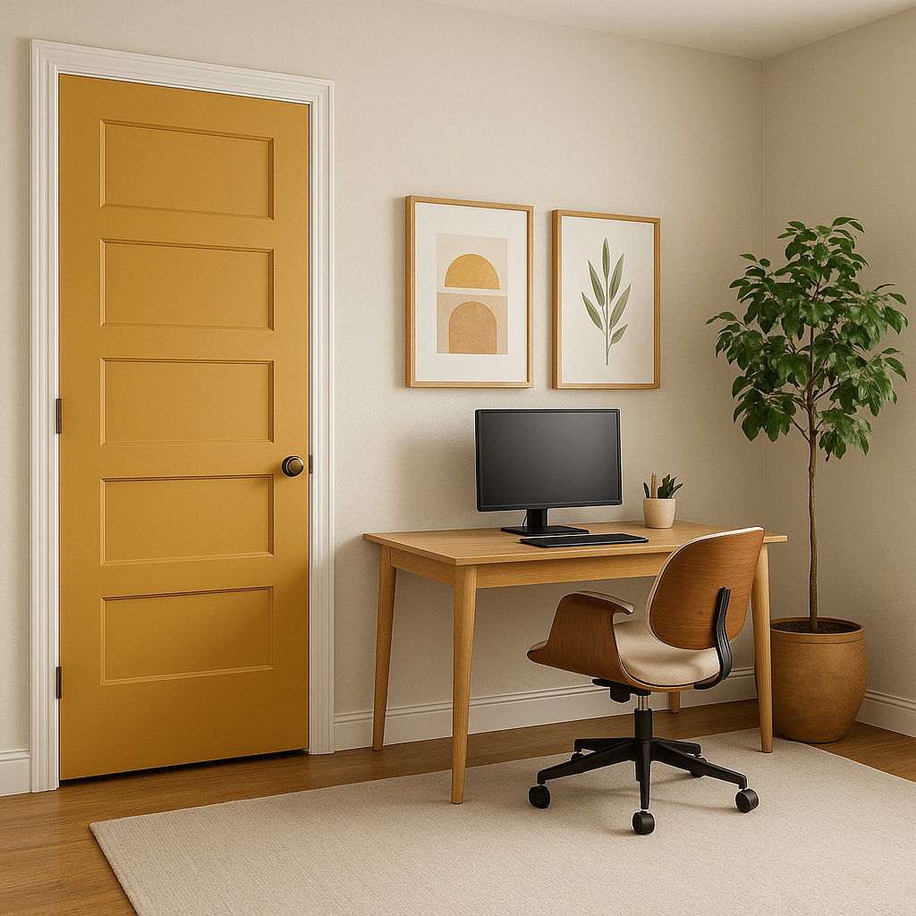
Brittlebush is also an excellent choice for exterior applications. Use it for front doors, shutters, or trim to add a welcoming and playful vibe to your home’s curb appeal. Pair it with neutral siding and dark accents for a balanced yet eye-catching look.
Brittlebush’s warm and versatile nature makes it suitable for a variety of design styles. It complements rustic and farmhouse designs, adding a vintage charm when paired with wood finishes. It also works beautifully in modern spaces, especially when teamed with sleek furniture and bold geometric patterns. For eclectic or bohemian interiors, Brittlebush can serve as an anchor color, tying together an assortment of textures and vibrant accent hues.
Sherwin-Williams Brittlebush (6684) is more than just a color; it’s a mood enhancer that brings sunshine and warmth into any space. With its golden undertones, flexible pairings, and ability to transform rooms, Brittlebush is a yellow that stands out without overpowering. Whether you’re designing interiors or refreshing exteriors, this inviting shade is sure to brighten your world.
Note: These images were all generated with AI, there may be inaccurate color results. Please only use a general reference to get a rough idea of what a color may look like, we will continue to generate new images to improve accuracy.
View Colors Only by Brand (No Imagery):
Sherwin-Williams
|
Benjamin-Moore
|
Behr
|
Valspar
Live on the Eastern Slope of Colorado and looking for a local painting professional, check out all our painting services and reach out for a free estimate.
Copyright © 2026 : Wild Fox Painting Inc. : 12435 Mead Way, Littleton, CO 80125


