Sherwin-Williams Solaria (SW 6688) is an invigorating and cheerful golden yellow paint color that radiates warmth and positivity. Perfect for spaces that need a splash of energy or a dose of sunshine, Solaria brings a bright, uplifting atmosphere to interiors and exteriors alike. Its bold yet balanced tone strikes the perfect harmony between vibrancy and sophistication, making it a versatile choice for both modern and traditional design schemes.
Solaria carries subtle golden undertones that give it depth and richness. These undertones prevent it from feeling overly saturated or harsh, ensuring that it remains a welcoming and approachable shade. The golden base makes Solaria exceptionally versatile, allowing it to pair beautifully with both warm and cool palettes. This nuanced undertone lends the color a grounded elegance that complements its sunny disposition.
Sherwin-Williams Solaria pairs effortlessly with a variety of coordinating colors, allowing you to craft a harmonious and balanced design. Consider these complementary hues for a well-rounded palette:
Solaria’s versatility makes it suitable for a wide range of applications, from statement walls to accent features. Here are some creative ways to incorporate this radiant shade into your design:
Solaria works beautifully in living rooms, dens, or family rooms where you want to create a lively and welcoming atmosphere. Pair it with neutral furnishings or bold patterned textiles for a space that feels both cozy and energetic.
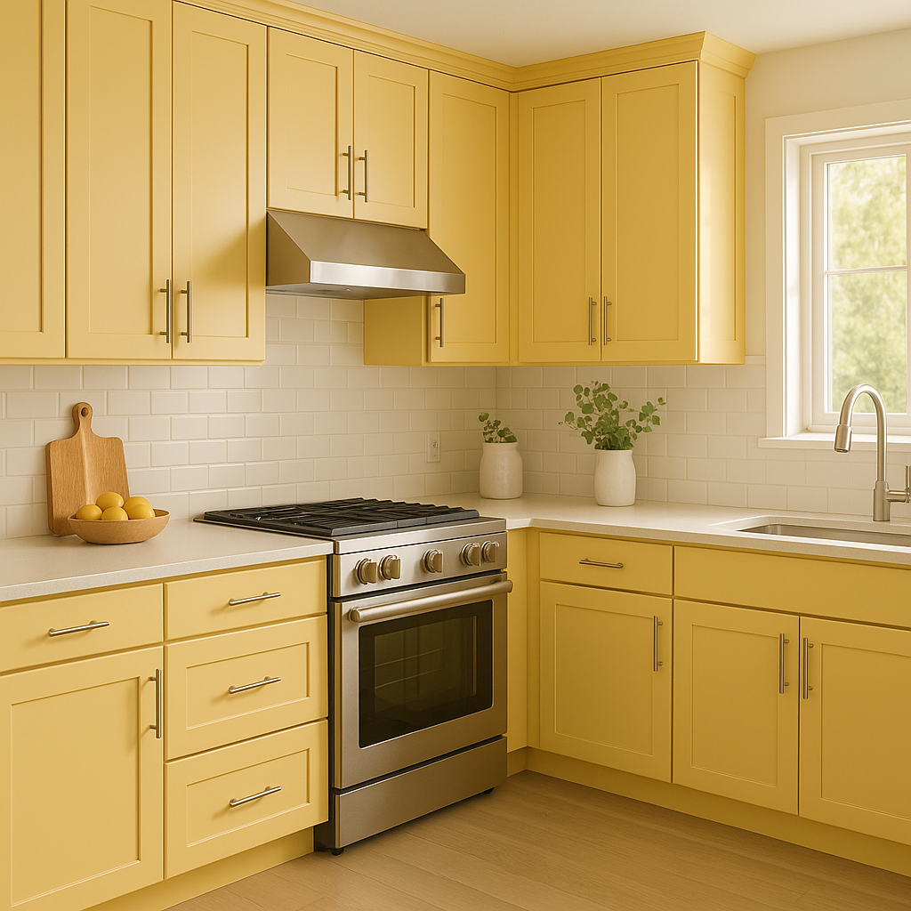
Yellow hues like Solaria are known to stimulate appetite and conversation, making them ideal for kitchens and dining rooms. Use Solaria on walls or cabinets and pair it with white countertops or backsplashes for a bright yet balanced look.
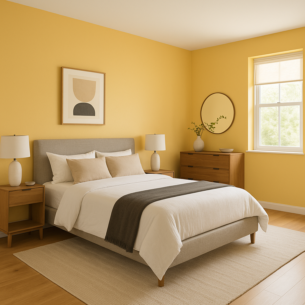
While traditionally vibrant yellows are not always used in bedrooms, Solaria can create a cheerful, sunny retreat when balanced with soft neutrals like cream or taupe. Add natural wood furniture or woven textures to enhance the warmth and coziness of the space.
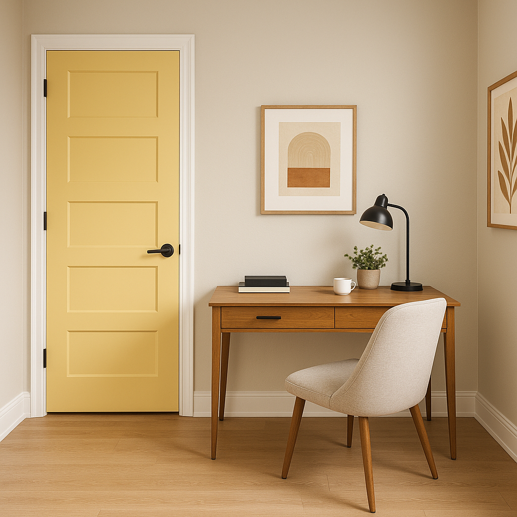
Yellow tones like Solaria are excellent for fostering creativity and boosting energy—perfect for a home office or creative studio. Pair it with muted blues or greens to strike a balance between productivity and calm.
Solaria’s sunny appeal extends outdoors, where it can be used on front doors, shutters, or as a bold siding color. Pair it with white trim for a classic look, or go modern with charcoal accents for an eye-catching curb appeal.
Sherwin-Williams Solaria (SW 6688) is more than just a paint color—it's a design statement. Its cheerful brightness makes it ideal for spaces that need a burst of energy, while its golden undertones keep it refined and versatile. Whether you’re aiming to make a bold impression or simply add a touch of warmth, Solaria is a fantastic choice for homeowners and designers alike.
Note: These images were all generated with AI, there may be inaccurate color results. Please only use a general reference to get a rough idea of what a color may look like, we will continue to generate new images to improve accuracy.
View Colors Only by Brand (No Imagery):
Sherwin-Williams
|
Benjamin-Moore
|
Behr
|
Valspar
Live on the Eastern Slope of Colorado and looking for a local painting professional, check out all our painting services and reach out for a free estimate.
Copyright © 2026 : Wild Fox Painting Inc. : 12435 Mead Way, Littleton, CO 80125


