Sherwin-Williams Daybreak SW 6700 is a soft, inviting shade that captures the essence of tranquility and simplicity. This delicate off-white with subtle undertones is a perfect choice if you're looking to brighten a space without overwhelming it. Its versatility and understated charm make it a staple in modern and classic design aesthetics alike.
Daybreak SW 6700 is a warm off-white with faint yellow-beige undertones. These undertones lend a welcoming glow to any space, creating an atmosphere that feels sunny yet subtle. Unlike cooler whites with blue or gray hints, Daybreak’s warmth radiates a soft, creamy feel, making it ideal for spaces where comfort is key. Its undertones are delicate enough to pair beautifully with a wide variety of colors while still providing a hint of depth and personality.
To create a harmonious look, Sherwin-Williams Daybreak SW 6700 pairs well with a range of complementary and accent colors. Here are some suggestions to guide your design palette:
By using these coordinating colors thoughtfully, you can create palettes that feel unified and inviting for both residential and commercial spaces.
Daybreak’s versatility makes it a fantastic choice for a wide range of applications. Its soft, warm tones make it especially well-suited for spaces where light and comfort are essential.
Daybreak’s ability to reflect light beautifully helps create an airy, open atmosphere in living rooms and family spaces. Pair it with light wood furniture and soft textiles for a relaxed, cozy environment.
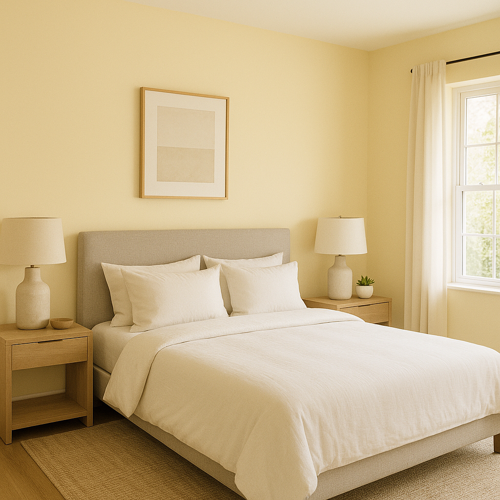
In bedrooms, Daybreak’s warmth contributes to a restful, serene vibe. Layer it with soft bedding in neutral tones, or incorporate accent colors like muted greens or blushes for added personality.
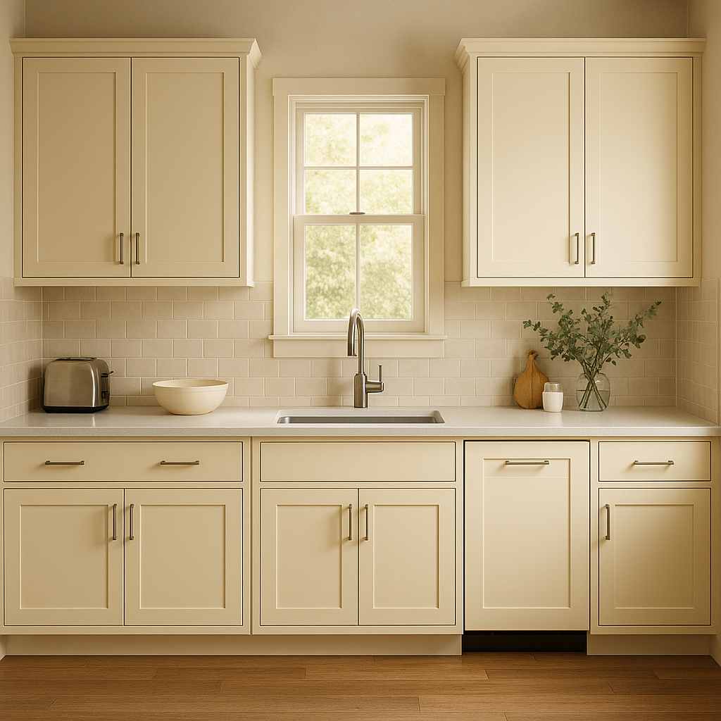
For kitchens and dining spaces, Daybreak offers a clean, fresh canvas. Pair it with natural wood cabinetry or sleek white countertops to enhance its brightness. Adding metallic accents like gold or brushed nickel can bring a touch of modern sophistication.
Daybreak’s light-reflective qualities make it an excellent choice for smaller spaces like bathrooms. It can make even the smallest powder room feel more expansive and spa-like when paired with natural stone or tile.
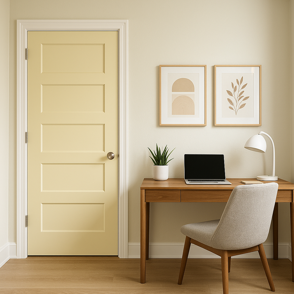
If you’re designing a home office, Daybreak’s warm undertones create a calming backdrop that fosters focus and creativity. Pair it with darker furniture or bold accent colors for a professional yet inspiring environment.
Sherwin-Williams Daybreak SW 6700 is more than just a paint color—it’s a versatile design tool that can transform the mood of any space. Its warmth, adaptability, and light-reflective qualities make it a timeless choice for homes and commercial spaces alike.
Note: These images were all generated with AI, there may be inaccurate color results. Please only use a general reference to get a rough idea of what a color may look like, we will continue to generate new images to improve accuracy.
View Colors Only by Brand (No Imagery):
Sherwin-Williams
|
Benjamin-Moore
|
Behr
|
Valspar
Live on the Eastern Slope of Colorado and looking for a local painting professional, check out all our painting services and reach out for a free estimate.
Copyright © 2026 : Wild Fox Painting Inc. : 12435 Mead Way, Littleton, CO 80125


