Sherwin-Williams Frolic SW 6703 is a lively, warm, and inviting shade of yellow-green that brings a sense of energy and joy to any space. Perfectly straddling the line between a bold statement color and a versatile accent, Frolic is a hue that feels fresh, dynamic, and full of personality. Its cheerful demeanor makes it an excellent choice for those looking to create spaces filled with positivity and charm.
Frolic is infused with sunny yellow undertones that lend it a vibrant, almost citrusy quality. These undertones are balanced by subtle hints of green, giving the color richness and depth without veering too far into neon territory. The result is a hue that feels both grounded and uplifting, making it a fantastic option for creating a lively yet sophisticated environment.
When exposed to natural light, Frolic tends to lean more toward its brighter, yellow side, while in artificial lighting, its green undertones become more pronounced. This chameleon-like nature makes it a versatile choice for various lighting conditions and design aesthetics.
To maximize the impact of Frolic, pairing it with complementary or contrasting hues can create a harmonious and visually stunning palette. Here are a few coordinating color options:
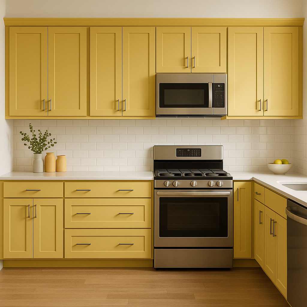
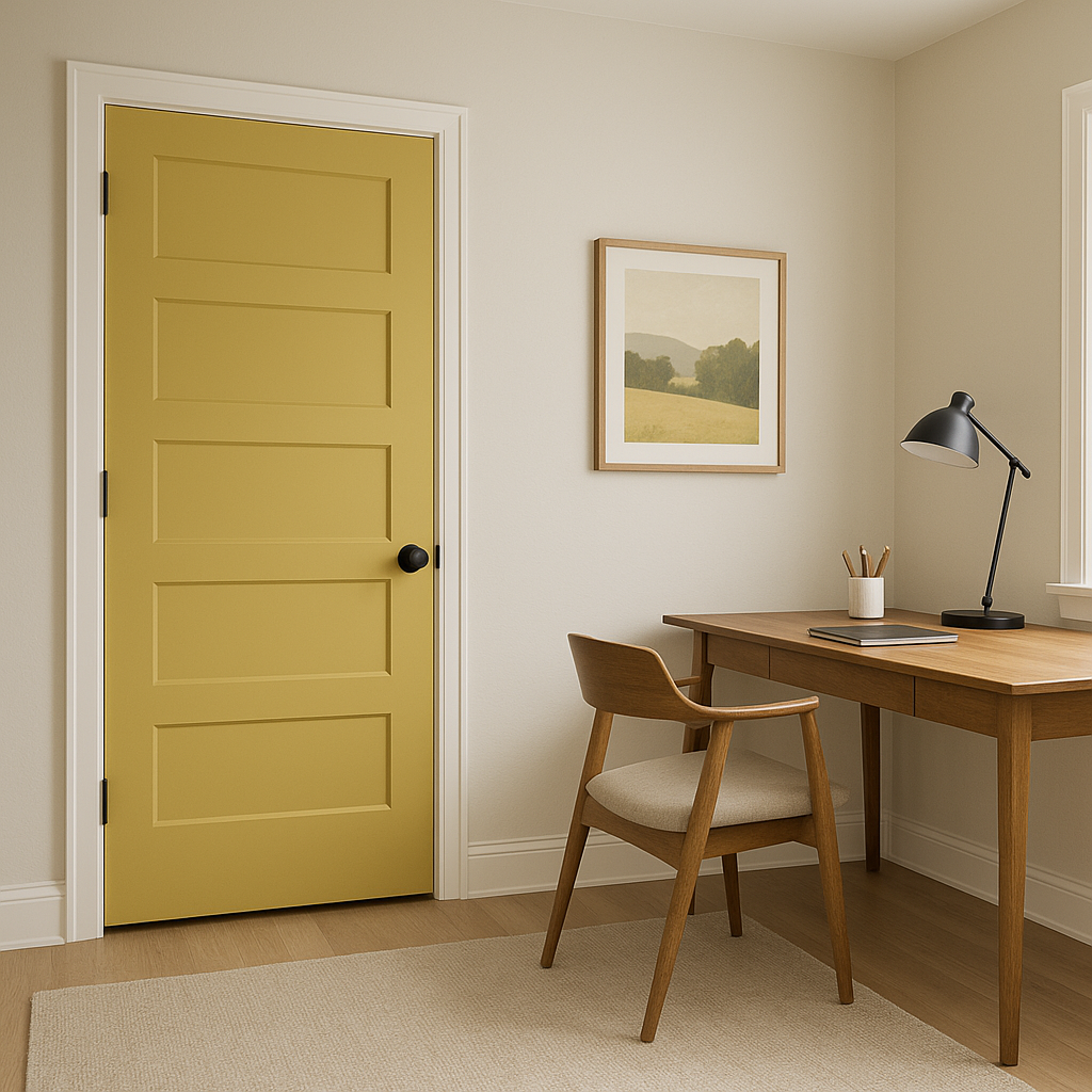
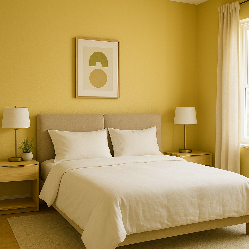
Frolic's versatility and vibrancy make it suitable for a variety of applications, from accent walls to full-room coverage. Here are some ideas on how to incorporate this striking hue into your home or workspace:
Note: These images were all generated with AI, there may be inaccurate color results. Please only use a general reference to get a rough idea of what a color may look like, we will continue to generate new images to improve accuracy.
View Colors Only by Brand (No Imagery):
Sherwin-Williams
|
Benjamin-Moore
|
Behr
|
Valspar
Live on the Eastern Slope of Colorado and looking for a local painting professional, check out all our painting services and reach out for a free estimate.
Copyright © 2026 : Wild Fox Painting Inc. : 12435 Mead Way, Littleton, CO 80125


