
Sherwin-Williams Springtime (SW 6708) is a lively and refreshing green that evokes the essence of budding leaves and new beginnings. This color brings a sense of vitality and optimism to any space, making it an excellent choice for creating environments that feel rejuvenated, cheerful, and connected to nature. Whether you're designing a cozy living room, an inspiring workspace, or a playful children's room, Springtime delivers an uplifting touch that brightens the overall mood of your interior.
Springtime is a mid-tone green with warm yellow undertones. These subtle yellow notes add a sunny, approachable quality to the color, preventing it from feeling overly cool or harsh. The undertones make Springtime a versatile shade that pairs beautifully with both neutral and bold palettes. It maintains a delicate balance between brightness and softness, making it suitable for spaces where you want to create a welcoming and invigorating atmosphere.
When choosing coordinating colors for Springtime, consider hues that complement its fresh and natural vibe. Here are a few suggestions:
These coordinating colors allow Springtime to shine in both monochromatic and contrasting palettes, giving you the flexibility to tailor your design to the mood and style you want to achieve.
Springtime is a versatile green that can transform a variety of spaces, from contemporary and eclectic to traditional and farmhouse-style interiors. Here are some creative ways to incorporate this uplifting shade into your home or office:
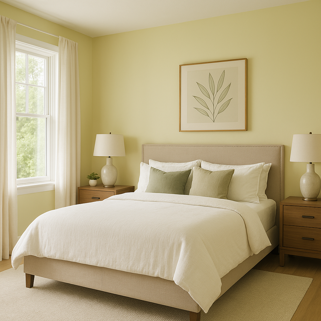
Use Springtime on your walls to create a lively yet inviting atmosphere where family and friends can gather. Pair it with off-white trim and earth-toned furniture for a grounded yet refreshing look. Incorporate natural elements like wooden accents and indoor plants to enhance its organic vibe.
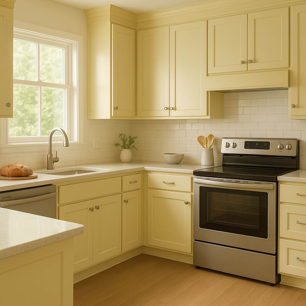
Springtime is an excellent choice for kitchens and dining spaces, especially if you want to infuse energy into the room. Consider painting cabinets or a feature wall in Springtime, complemented by brass or matte black hardware for a modern touch.
This energetic green can stimulate creativity and focus, making it perfect for home offices or art studios. Pair it with neutral tones like gray or beige to keep the space balanced and professional.
With its cheerful and playful air, Springtime is a fantastic option for children’s bedrooms or playrooms. Combine it with bold accent colors like orange, pink, or turquoise for a fun, whimsical vibe.
Bring the vibrancy of Springtime to your outdoor spaces by using it for patio furniture, planters, or even as an exterior paint color. Its fresh, natural tone will blend seamlessly with lush greenery and blooming flowers.
Sherwin-Williams Springtime (SW 6708) is the perfect green for anyone looking to breathe life into their interiors. Its warm undertones, versatility, and bright yet balanced character make it a standout choice for a variety of spaces and design styles. Whether you're aiming for a bold statement or a subtle nod to nature, Springtime can elevate your interior design while creating a joyful ambiance that feels timeless.
By incorporating coordinating colors and thoughtful design elements, you can make the most of Sherwin-Williams Springtime and experience the transformative power of this cheerful green.
Note: These images were all generated with AI, there may be inaccurate color results. Please only use a general reference to get a rough idea of what a color may look like, we will continue to generate new images to improve accuracy.
View Colors Only by Brand (No Imagery):
Sherwin-Williams
|
Benjamin-Moore
|
Behr
|
Valspar
Live on the Eastern Slope of Colorado and looking for a local painting professional, check out all our painting services and reach out for a free estimate.
Copyright © 2026 : Wild Fox Painting Inc. : 12435 Mead Way, Littleton, CO 80125


