Sherwin-Williams Mélange Green (SW 6710) is a captivating and versatile paint color that brings the serene hues of nature indoors. Rooted in the soothing essence of greenery, Mélange Green is a medium-toned shade that strikes the perfect balance between boldness and subtlety. Whether you're looking to create a calming retreat or a sophisticated statement, this color offers endless possibilities for interior and exterior design.
Mélange Green is a rich, earthy green with warm undertones that give it a soft and approachable feel. Unlike cooler greens that can veer into stark or sterile territory, Mélange Green has an inviting warmth to it, thanks to subtle golden undertones. These undertones make it incredibly versatile, as it pairs beautifully with both neutral and vibrant palettes.
Its natural and grounding essence makes Mélange Green ideal for spaces aiming to evoke relaxation, harmony, or rejuvenation. Whether used in a bedroom, living room, or kitchen, this shade feels timeless and rooted in nature.
To make the most of Sherwin-Williams Mélange Green, consider pairing it with complementary and coordinating hues that enhance its natural beauty.
Mélange Green is a versatile shade that can adapt to various design styles and spaces. Its natural elegance makes it suitable for both traditional and contemporary interiors.
Create a welcoming and grounded atmosphere in your living room by using Mélange Green as the main wall color. Pair it with warm wood tones, soft beige upholstery, and metallic accents like brass or gold for a sophisticated yet cozy vibe.
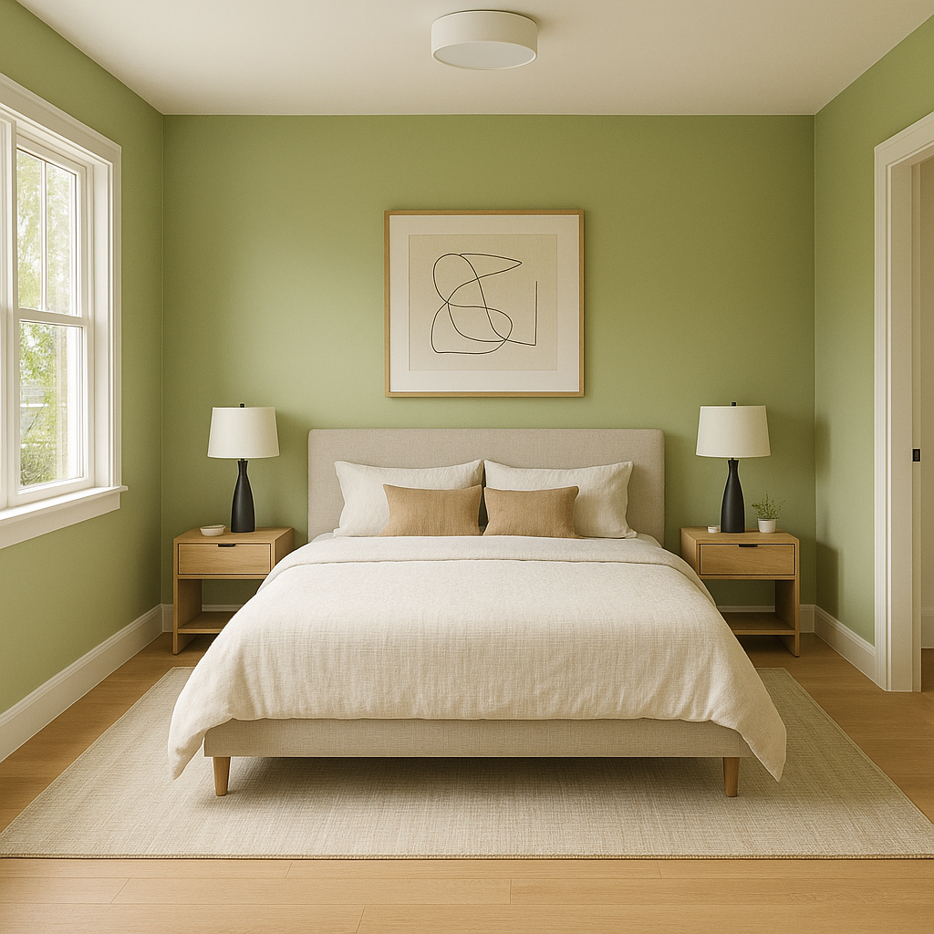
Mélange Green is ideal for bedrooms, as its soothing tones promote relaxation and tranquility. Pair it with crisp white linens, natural textures like rattan or jute, and accent colors like soft pink or muted gray for a serene sanctuary.
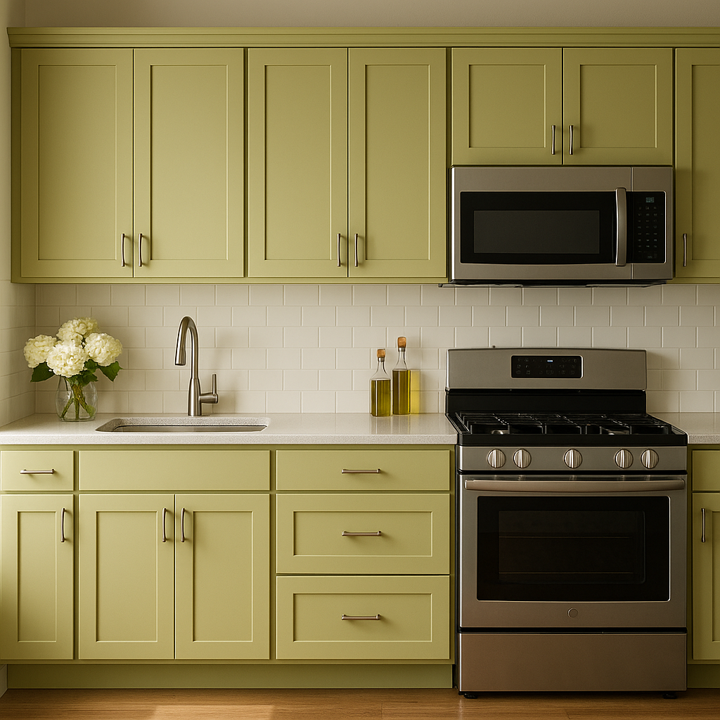
In the kitchen, Mélange Green lends itself beautifully to cabinets or accent walls. Combine it with creamy white countertops and matte black hardware for a modern farmhouse aesthetic or pair it with polished brass fixtures for a more upscale look.
Bring an organic spa-like feel to your bathroom with Mélange Green. Use it on the walls or vanity and complement the look with white tiles, natural wood accents, and greenery to amplify the fresh, nature-inspired ambiance.
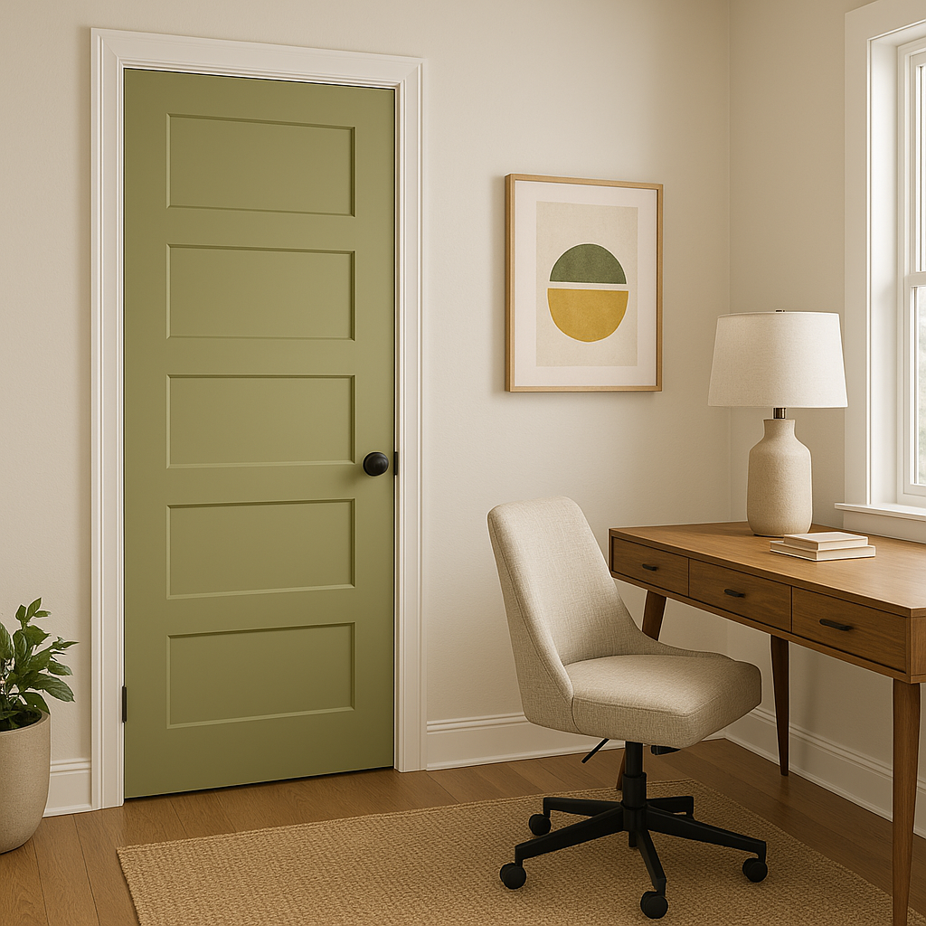
Mélange Green is also a stunning choice for exteriors. Its earthy tones blend harmoniously with landscaping and natural surroundings, making it an excellent color for siding, shutters, or even a front door. Pair it with stone textures, white trim, or deep brown accents for a timeless curb appeal.
Sherwin-Williams Mélange Green offers the perfect synergy of warmth, depth, and natural beauty. Its golden undertones make it adaptable to a wide range of palettes, while its ability to evoke a sense of calm and connection to nature makes it a favorite among interior designers. Whether you're looking to refresh a single room or transform your entire home, Mélange Green is a color that stands the test of time while bringing effortless sophistication to any space.
Note: These images were all generated with AI, there may be inaccurate color results. Please only use a general reference to get a rough idea of what a color may look like, we will continue to generate new images to improve accuracy.
View Colors Only by Brand (No Imagery):
Sherwin-Williams
|
Benjamin-Moore
|
Behr
|
Valspar
Live on the Eastern Slope of Colorado and looking for a local painting professional, check out all our painting services and reach out for a free estimate.
Copyright © 2026 : Wild Fox Painting Inc. : 12435 Mead Way, Littleton, CO 80125


