Sherwin-Williams Paradise (SW 6720) is a luscious green that captures the essence of tropical foliage and serene natural retreats. This bold yet balanced hue evokes feelings of vitality, tranquility, and connection to nature, making it an inspiring choice for both residential and commercial spaces. Whether you're looking to infuse energy into a room or craft a calming backdrop, Paradise is a versatile green that brings life and sophistication to your design palette.
Paradise is a vibrant medium green with subtle yellow undertones that lend it warmth and brightness. These undertones prevent it from feeling overly cool or stark, giving it a lively yet approachable character. The yellow hints make Paradise feel sun-kissed and alive, reminiscent of lush tropical plants bathed in sunlight. This undertone balance allows the color to pair beautifully with both warm and cool palettes, adding depth and dimension to your space.
Sherwin-Williams Paradise works harmoniously with a variety of shades, making it easy to create a cohesive and visually appealing design. Below are some coordinating colors that pair well with Paradise:
These coordinating colors enable both bold, adventurous designs and understated, serene environments depending on your aesthetic goals.
Paradise is perfect for living rooms, family rooms, or sunrooms where you want to create a lively and inviting atmosphere. Pair it with neutral furniture and natural textures like rattan, jute, or wood to emphasize its tropical, organic vibe.
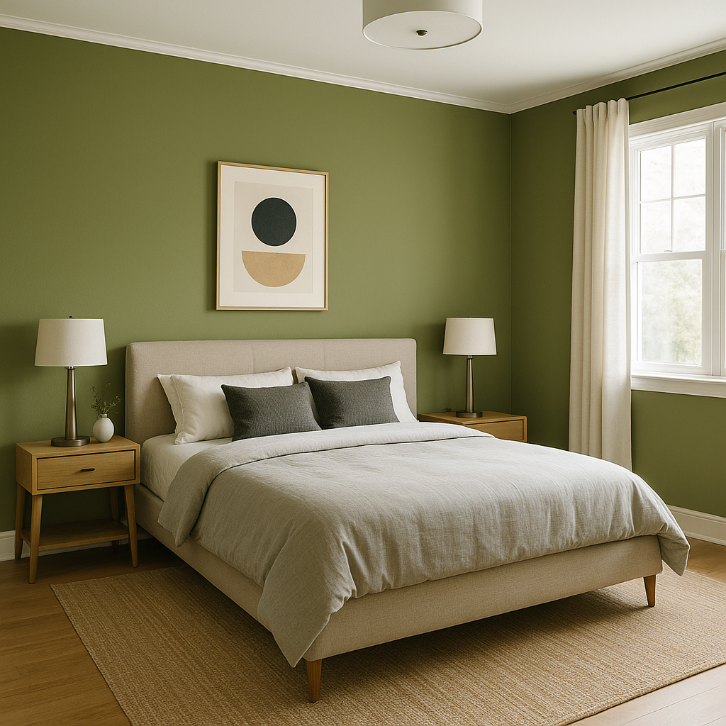
For bedrooms, Paradise can be used as an accent wall to bring a fresh yet calming energy to the space. Pair it with soft whites, muted grays, or pastel shades to ensure the room maintains a restful ambiance.
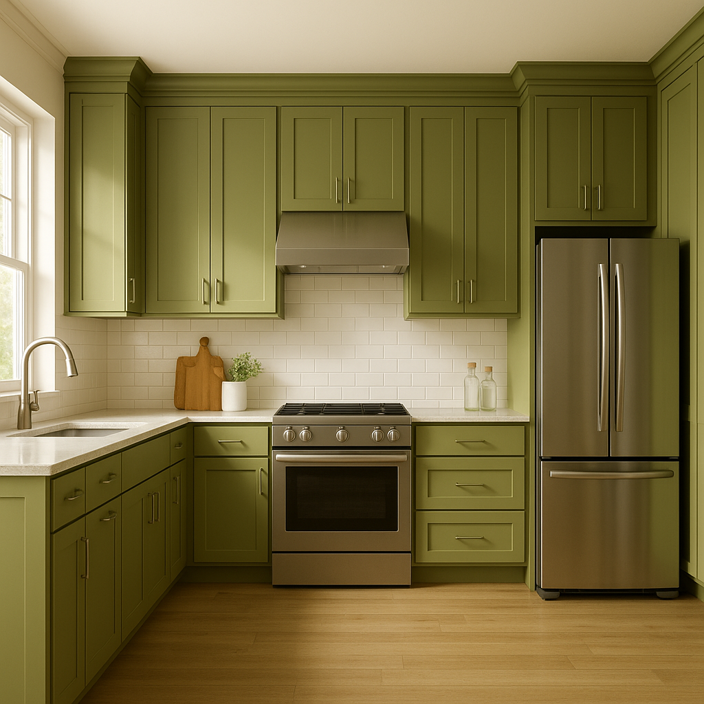
Paradise shines in kitchens and dining spaces, especially when paired with crisp white cabinetry or natural wood finishes. Its energizing tone stimulates conversation and creativity, making it ideal for gathering spaces.
Transform your bathroom into a spa-like retreat by using Paradise on walls or cabinetry. Complement it with natural stone or white tiles for a clean, refreshing look.
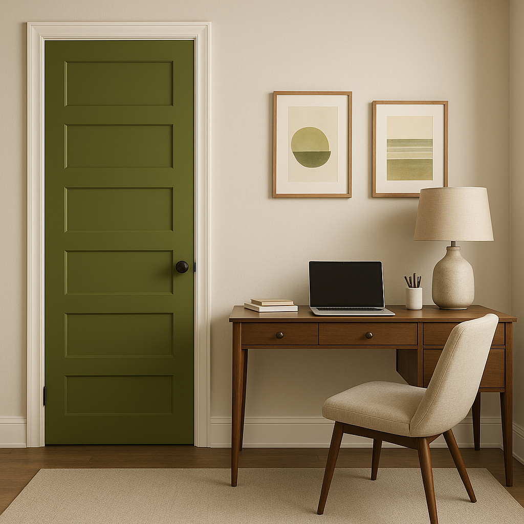
If you're not ready to commit to a full room painted in Paradise, it works beautifully as an accent color. Use it to highlight architectural features, window frames, or built-ins for a pop of vibrant energy that enhances the overall design.
Paradise responds remarkably to different lighting conditions. In natural light, its green tones feel lively and fresh, while in artificial light, the yellow undertones emerge, adding warmth. To ensure you achieve the desired effect, test the color in your space under various lighting conditions before committing to it.
Sherwin-Williams Paradise (SW 6720) is a daring yet adaptable choice that transforms any space into a vibrant haven. With its rich green tone and subtle warmth, it's a color that invites the beauty of nature indoors, creating spaces that are both energizing and restorative. Perfect for accent walls, full-room applications, or paired with complementary hues, Paradise is a versatile green that inspires creativity and connection with every brushstroke.
Note: These images were all generated with AI, there may be inaccurate color results. Please only use a general reference to get a rough idea of what a color may look like, we will continue to generate new images to improve accuracy.
View Colors Only by Brand (No Imagery):
Sherwin-Williams
|
Benjamin-Moore
|
Behr
|
Valspar
Live on the Eastern Slope of Colorado and looking for a local painting professional, check out all our painting services and reach out for a free estimate.
Copyright © 2026 : Wild Fox Painting Inc. : 12435 Mead Way, Littleton, CO 80125


