Sherwin-Williams Picnic (SW 6731) is a lively and refreshing green that instantly evokes the feeling of being outdoors on a beautiful spring day. This cheerful shade marries the vibrancy of nature with a sophisticated twist, making it a versatile choice for both modern and traditional interiors. Whether you're looking to create a bold statement or infuse your space with an invigorating touch, Picnic is a paint color that delivers charm and energy in abundance.
Picnic is a medium green with warm yellow undertones that give it a sunny disposition. These subtle yellow notes add depth and vitality, preventing the green from feeling overly cool or sterile. The result is a color that feels grounded yet dynamic, perfect for spaces that need a boost of personality. Picnic’s undertones make it especially suitable for rooms with natural light, as they enhance the color's brightness and create a welcoming atmosphere.
Sherwin-Williams Picnic works beautifully with a range of complementary shades, allowing you to design spaces that feel balanced and cohesive:
Sherwin-Williams Picnic is a versatile green that can be used in multiple ways throughout your home, whether as a primary color or accent. Here are some ideas to spark your inspiration:
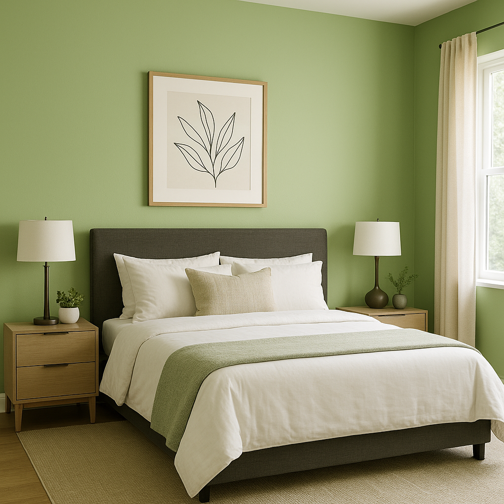
Infuse energy into your living room or family space by using Picnic as a feature wall color. Its warm undertones make it inviting while its vibrancy adds a lively focal point to areas where family and friends gather. Pair it with soft furnishings in neutral tones or colorful accents for a playful yet balanced look.
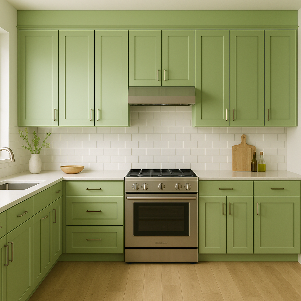
Picnic is perfect for kitchens and dining areas, where its fresh and invigorating qualities can energize the space. It works especially well for cabinets or accent walls, adding a pop of color that complements wood tones, stainless steel, or even bold patterns.
This shade’s playful nature makes it an excellent choice for children’s spaces. Use Picnic to create an environment that feels imaginative and lively. Pair it with whimsical accessories or mix it with brighter complementary colors for a fun and youthful vibe.
Stimulate creativity and productivity by incorporating Picnic into your workspace. This green hue has just the right amount of energy to keep your mind alert while its natural undertones provide a calming backdrop for focused tasks.
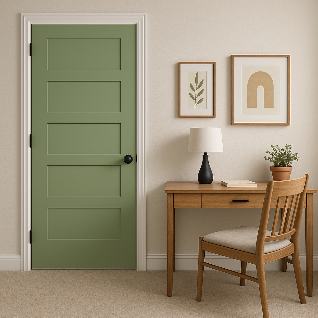
Picnic is a fantastic choice for exterior spaces like front doors, shutters, or patio furniture. Its nature-inspired tone blends seamlessly with landscaping, creating a cohesive and inviting outdoor aesthetic.
The appearance of Sherwin-Williams Picnic can vary depending on the lighting in your space. In rooms with ample natural light, Picnic’s yellow undertones shine through, creating a bright and cheerful atmosphere. In spaces with artificial or dim lighting, the green can appear slightly darker and more subdued, lending a cozy and grounded feel.
Sherwin-Williams Picnic (SW 6731) is more than just a paint color—it’s a mood-enhancer, a statement-maker, and a versatile choice that celebrates the beauty of nature. Whether you’re revamping a single room or designing an entire house, Picnic’s vibrant yet balanced personality makes it a go-to option for homeowners who want to bring joy and energy into their spaces.
Make Sherwin-Williams Picnic the centerpiece of your color palette, and watch as your home transforms into a haven of vitality and style!
Note: These images were all generated with AI, there may be inaccurate color results. Please only use a general reference to get a rough idea of what a color may look like, we will continue to generate new images to improve accuracy.
View Colors Only by Brand (No Imagery):
Sherwin-Williams
|
Benjamin-Moore
|
Behr
|
Valspar
Live on the Eastern Slope of Colorado and looking for a local painting professional, check out all our painting services and reach out for a free estimate.
Copyright © 2026 : Wild Fox Painting Inc. : 12435 Mead Way, Littleton, CO 80125


