Sherwin-Williams Refresh (SW 6751) is a captivating aqua shade that radiates tranquility and rejuvenation. Perfectly balancing soft blue and green tones, Refresh evokes the calming essence of coastal waters and spa-like serenity. Its airy and light nature makes it an ideal choice for creating spaces that feel open, soothing, and effortlessly inviting.
Refresh (SW 6751) carries subtle green undertones, giving it a gentle warmth and depth. While primarily cool in appearance due to its blue influence, the green undertones lend a natural vibrancy that prevents the color from feeling overly icy or sterile. This harmonious blend of blue and green makes Refresh incredibly versatile, adapting beautifully to a variety of lighting conditions. In natural light, it leans more toward a breezy aqua, while under artificial lighting, the green undertones become slightly more pronounced, offering a refreshing yet grounded aesthetic.
Sherwin-Williams Refresh pairs effortlessly with both neutral and bold palettes, making it a flexible choice for diverse interior design styles. Here are some coordinating colors to consider:
Sherwin-Williams Refresh is a versatile color that works seamlessly across various interior styles, from coastal and modern farmhouse to Scandinavian and transitional design. Its calming nature makes it particularly suited for spaces where relaxation and rejuvenation are key.
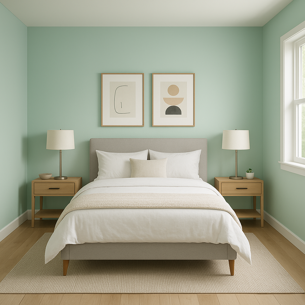
In bedrooms, Refresh creates a tranquil retreat, fostering a sense of calm and peacefulness. Pair it with crisp white bedding and natural wood accents to craft a serene, spa-like atmosphere. For bathrooms, the aquatic tones of Refresh make it a natural match. Combine it with white subway tiles, brushed nickel fixtures, and soft gray or beige accents for a clean and sophisticated look.
In living rooms, Refresh can serve as a refreshing backdrop that brightens the space while maintaining a calming ambiance. Pair it with neutral-toned furniture and pops of navy or coral for a modern coastal aesthetic. Its versatility also makes it a great choice for accent walls, adding depth and dimension without overwhelming the room.
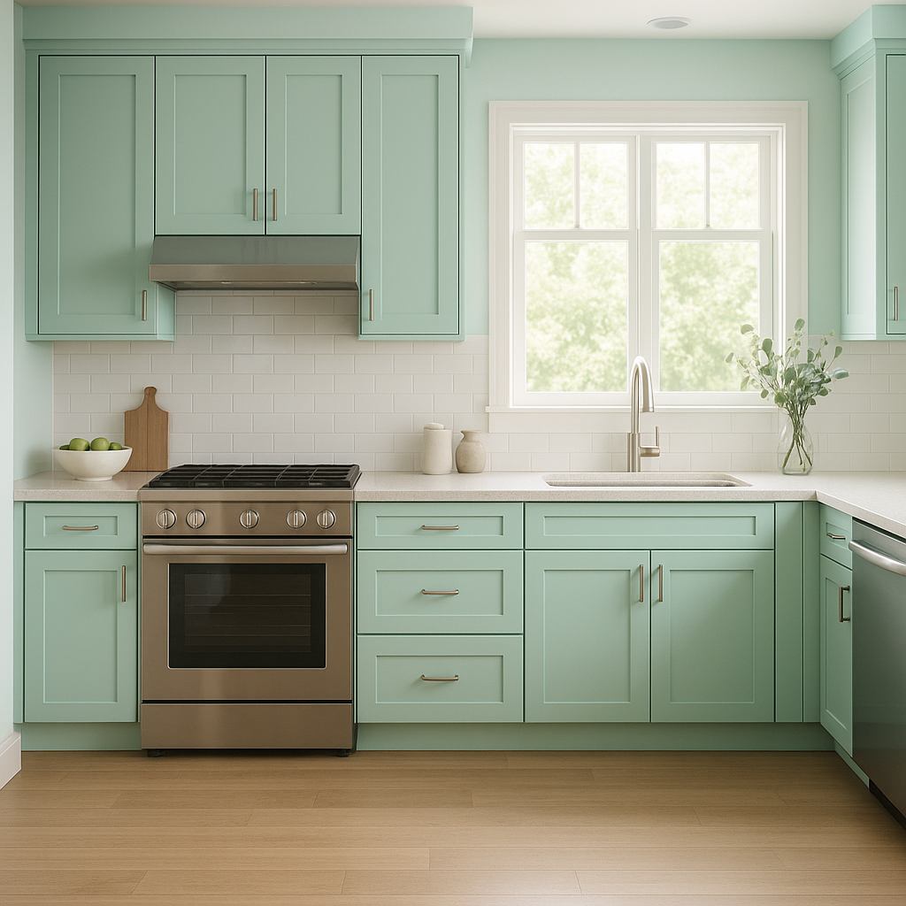
For kitchens, Refresh brings a light and airy vibe. Use it on cabinetry or walls to create a fresh, welcoming space. Pair it with white countertops and backsplashes for a clean, modern look, or incorporate natural wood elements for a more organic, rustic feel.
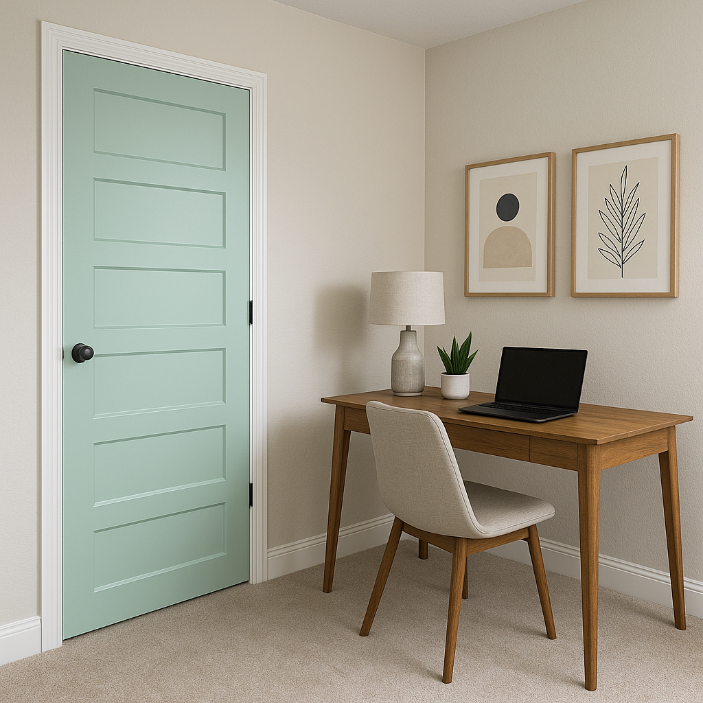
Refresh is an excellent choice for home offices or creative spaces, as its cool tones can help promote focus and clarity. Pair it with minimalist furniture and muted accents for a calm yet inspiring environment.
As with any paint color, lighting plays a crucial role in how Refresh appears in your space. In rooms with ample natural light, its cool aqua tones will shine, creating a bright and invigorating atmosphere. In spaces with limited light, the green undertones become more prominent, lending an earthy softness to the color. To ensure the best results, test Refresh in different lighting conditions before committing to an application.
Refresh is more than just a paint color—it's a mood-enhancer that transforms any space into a haven of relaxation and renewal. Its versatile blend of blue and green tones adapts effortlessly to various styles and palettes, making it a go-to choice for designers and homeowners alike. Whether you're revamping a single room or creating a cohesive home design, Sherwin-Williams Refresh delivers timeless elegance and tranquility.
Note: These images were all generated with AI, there may be inaccurate color results. Please only use a general reference to get a rough idea of what a color may look like, we will continue to generate new images to improve accuracy.
View Colors Only by Brand (No Imagery):
Sherwin-Williams
|
Benjamin-Moore
|
Behr
|
Valspar
Live on the Eastern Slope of Colorado and looking for a local painting professional, check out all our painting services and reach out for a free estimate.
Copyright © 2026 : Wild Fox Painting Inc. : 12435 Mead Way, Littleton, CO 80125


