Sherwin-Williams Blue Nile SW 6776 is a stunning and versatile shade of blue that exudes sophistication and depth. This rich, mid-tone color blends classic elegance with a modern edge, making it a popular choice for both traditional and contemporary interior spaces. Whether you're looking to create a serene retreat, a bold accent, or a striking exterior, Blue Nile is a reliable and captivating option.
One of the most defining characteristics of Blue Nile is its subtle undertones. This shade features both green and gray undertones, which give it a unique depth and versatility. The green undertones lend a natural, organic quality, while the gray undertones provide a grounding effect, softening the intensity of the blue. This well-balanced combination ensures that Blue Nile feels neither overly bright nor too muted, making it adaptable to a variety of lighting conditions and design styles.
In bright natural light, the green undertones become more pronounced, evoking a sense of tranquility and connection to nature. In dimmer or artificial lighting, the gray undertones take center stage, giving the color a moody, sophisticated vibe. This dynamic quality allows Blue Nile to transform throughout the day, keeping your space visually interesting and engaging.
To fully highlight the beauty of Blue Nile SW 6776, pair it with complementary and coordinating colors that enhance its undertones and create a harmonious palette.
Neutrals: Pair Blue Nile with crisp whites like Sherwin-Williams Pure White (SW 7005) or Alabaster (SW 7008) for a clean and timeless look. These whites allow Blue Nile to stand out while maintaining an airy, balanced feel.
Earthy Tones: Bring out the green undertones by combining Blue Nile with warm, earthy shades like Accessible Beige (SW 7036) or Urbane Bronze (SW 7048). These colors create a grounded, organic palette that feels calming and natural.
Accent Colors: For a bold and striking contrast, consider pairing Blue Nile with warm golds or yellows like Goldenrod (SW 6677) or a pop of coral, such as Lei Flower (SW 6613). These accents will add energy and vibrancy to your design.
Deep and Dramatic: If you're aiming for a dramatic, layered look, team Blue Nile with darker shades like Peppercorn (SW 7674) or Naval (SW 6244). This creates a moody, luxurious ambiance perfect for spaces where you want to make a statement.
Blue Nile is an incredibly flexible color that works beautifully in a variety of spaces and applications. Here are some ideas to inspire your design:
Living Rooms: Use Blue Nile on the walls of a living room to create a cozy yet refined atmosphere. Pair it with plush furniture in neutral tones or natural textures like wood and leather for a balanced, inviting space.
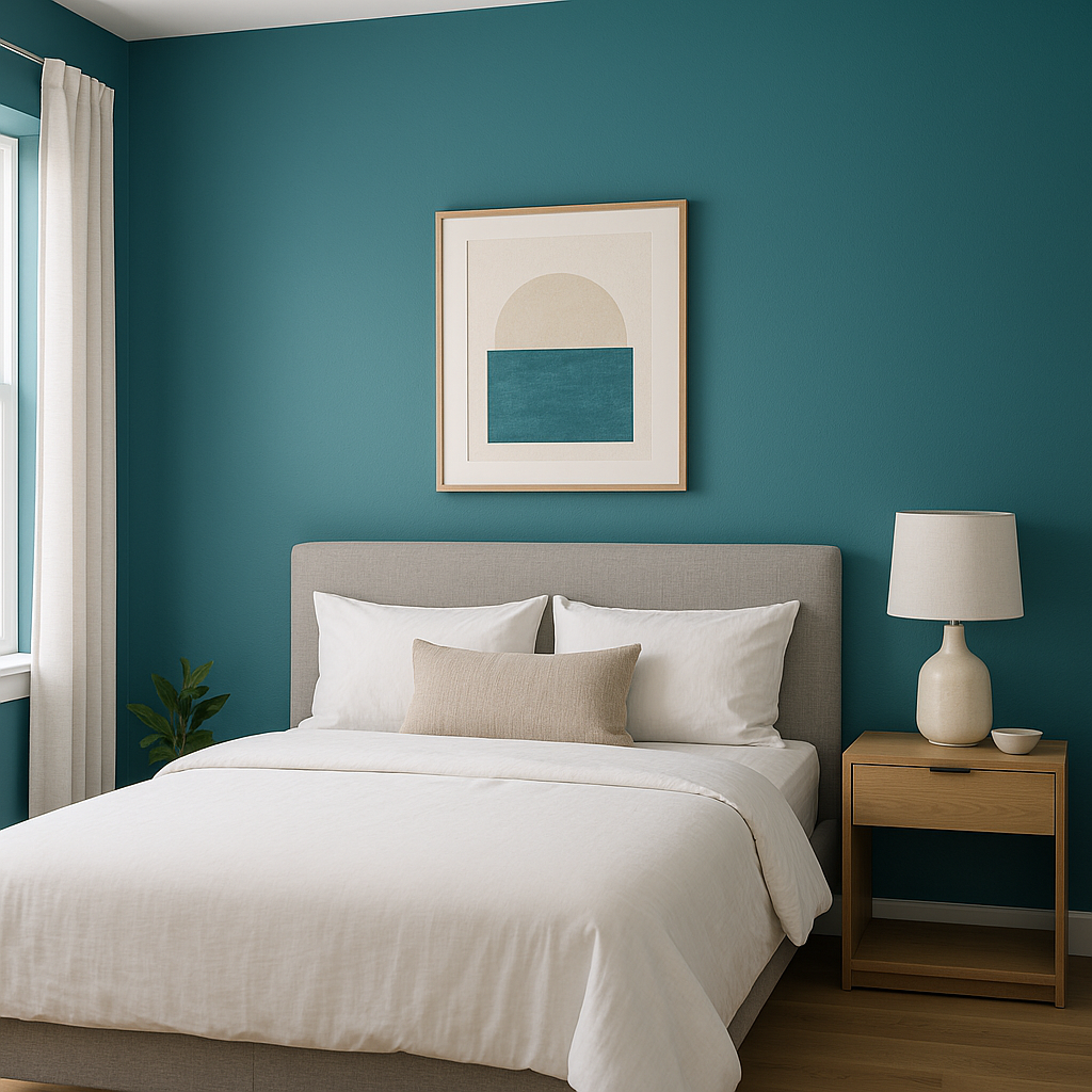
Bedrooms: Blue Nile's calming undertones make it a perfect choice for a bedroom. Paint the walls or use it as an accent color on a feature wall behind your bed. Layer the room with soft linens and complementary decor to enhance the serene ambiance.
Bathrooms: For a spa-like retreat, use Blue Nile in the bathroom. Its natural undertones work beautifully with white tiles, light marble, and chrome or brushed nickel finishes.
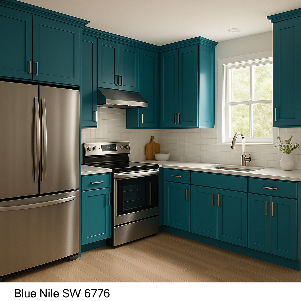
Kitchens: Blue Nile can be used on kitchen cabinets or an island to create a bold yet elegant focal point. Pair it with white countertops and a backsplash in subway tile or natural stone to maintain a clean, modern aesthetic.
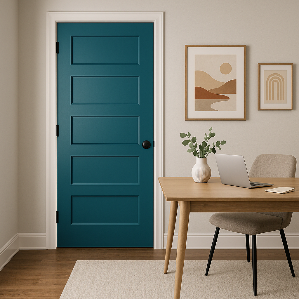
Exterior: On the exterior of your home, Blue Nile makes a striking choice for shutters, doors,
Note: These images were all generated with AI, there may be inaccurate color results. Please only use a general reference to get a rough idea of what a color may look like, we will continue to generate new images to improve accuracy.
View Colors Only by Brand (No Imagery):
Sherwin-Williams
|
Benjamin-Moore
|
Behr
|
Valspar
Live on the Eastern Slope of Colorado and looking for a local painting professional, check out all our painting services and reach out for a free estimate.
Copyright © 2026 : Wild Fox Painting Inc. : 12435 Mead Way, Littleton, CO 80125


