Sherwin-Williams Bravo Blue (SW 6784) is a color that radiates energy and serenity in equal measure. This striking shade belongs to the blue family but carries a unique balance of brightness and softness, making it a versatile choice for both bold and tranquil interiors. With its fresh and welcoming appeal, Bravo Blue can instantly transform a room into an inviting retreat or a lively statement space.
Bravo Blue is a clean, vibrant blue with subtle green undertones. These green undertones give the color a slightly aquatic feel, reminiscent of tropical waters or a crisp summer sky. The undertones prevent Bravo Blue from becoming overly cool or stark, ensuring it remains approachable and soothing. Depending on your room's lighting, this hue may lean toward a soft turquoise in natural light or take on a more vivid blue tone under artificial lighting.
To create a harmonious or dynamic aesthetic, pairing Bravo Blue with the right coordinating colors is key. Here are some options to consider:
Neutral Pairings: For a balanced and sophisticated look, pair Bravo Blue with soft neutrals like Sherwin-Williams Alabaster (SW 7008) or Pure White (SW 7005). These whites provide a clean, crisp contrast that allows the blue to take center stage without overwhelming the space.
Earthy Complements: To ground Bravo Blue, earthy tones such as Accessible Beige (SW 7036) or Modern Gray (SW 7632) work beautifully. These shades soften the vibrancy of the blue and create a more natural, relaxed atmosphere.
Bold Accents: If you’re aiming for a bold, high-energy palette, consider pairing Bravo Blue with rich, saturated colors like Naval (SW 6244) or even a pop of coral, such as Rejuvenate (SW 6620). These accents enhance the vibrancy of Bravo Blue while adding depth and drama.
Cool Complements: For a more monochromatic or coastal-inspired look, coordinate Bravo Blue with other cool tones like Aquaverde (SW 9051) or Rainwashed (SW 6211). This layered approach creates a tranquil, spa-like environment.
Bravo Blue’s versatility makes it an exceptional choice for a variety of interior spaces. Its vibrant yet calming qualities allow it to fit effortlessly into different design styles and settings. Here are some ways to incorporate Bravo Blue into your home:
Living Rooms: Use Bravo Blue as an accent wall to energize your living room or apply it to all four walls for a fresh, coastal-inspired vibe. Pair it with light furniture and natural textures like rattan or linen to complete the look.
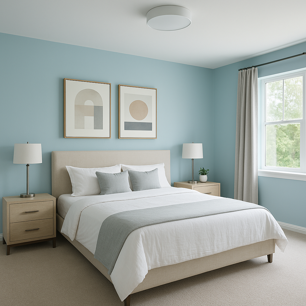
Bedrooms: Transform your bedroom into a restful oasis by using Bravo Blue on the walls or as a feature color in your bedding, curtains, or accent pieces. Pair it with soft whites and muted grays for a serene, dreamy atmosphere.
Bathrooms: Bravo Blue is an excellent choice for bathrooms, evoking a clean and refreshing ambiance. Pair it with white subway tiles, chrome fixtures, and soft gray or beige accents for a spa-like retreat.
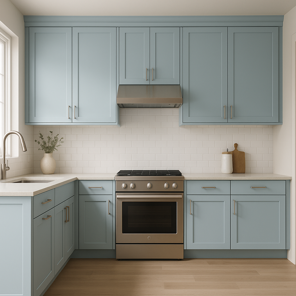
Kitchens: Consider Bravo Blue for kitchen cabinetry or a backsplash. It adds a charming, cheerful touch without feeling overwhelming. Pair it with white countertops and warm brass fixtures for a trendy yet timeless aesthetic.
Kids' Rooms: Its playful yet calming nature makes Bravo Blue a fantastic choice for children’s rooms. Use it as the main wall color and incorporate colorful accessories to create a joyful, energetic space.
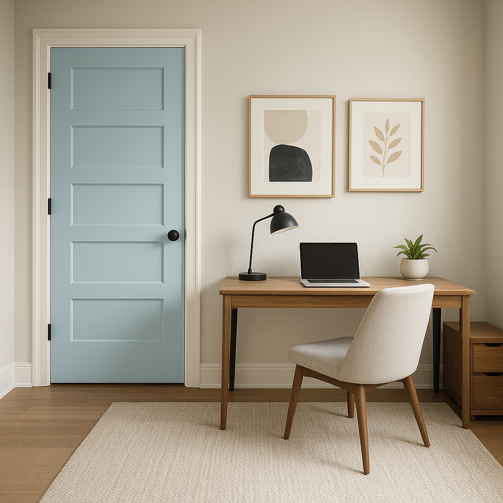
Outdoor Spaces: Bravo Blue works equally well on exteriors, particularly for front doors, shutters, or patio furniture, where it can add a pop of brightness and personality to your home’s curb appeal.
Lighting plays a crucial role in how Bravo Blue is perceived in a space. In rooms with ample natural light, the green undertones become more pronounced, lending an airy, tropical feel. In spaces with limited light or incandescent bulbs, Bravo Blue may appear deeper and more vibrant. Experiment with swatches in different areas of your home to see how the color interacts with your lighting throughout the day.
Sherwin-Williams Bravo Blue (SW 6784) is a versatile, uplifting color that brings the tranquility of natural elements into your home. With its subtle green undertones, wide range of coordinating options, and adaptability to various lighting conditions, Bravo Blue is a timeless shade that can suit any room or design style. Whether you’re aiming for a peaceful retreat or a bold statement, this color is sure to exceed your expectations.
Note: These images were all generated with AI, there may be inaccurate color results. Please only use a general reference to get a rough idea of what a color may look like, we will continue to generate new images to improve accuracy.
View Colors Only by Brand (No Imagery):
Sherwin-Williams
|
Benjamin-Moore
|
Behr
|
Valspar
Live on the Eastern Slope of Colorado and looking for a local painting professional, check out all our painting services and reach out for a free estimate.
Copyright © 2026 : Wild Fox Painting Inc. : 12435 Mead Way, Littleton, CO 80125


