Sherwin-Williams Fountain (SW 6787) is a gorgeous, light blue-green paint color that evokes a sense of serenity and rejuvenation. This shade is reminiscent of a gentle stream or the soft hues of a sunlit sky reflected on water, making it an ideal choice for creating spaces that feel peaceful, uplifting, and connected to nature. Its subtle sophistication and versatility allow it to fit seamlessly into a variety of design styles, from coastal and modern farmhouse to contemporary and Scandinavian interiors.
Fountain is a delightful balance between blue and green with soft gray undertones. These gray undertones keep the color from leaning too pastel or overly vibrant, giving it a sophisticated and grounded appearance. The blue notes lend a calming, airy vibe, while the green adds a touch of natural warmth, making it feel fresh and organic. Depending on the lighting, Fountain can appear more blue in cooler settings or lean slightly greener in warmer, natural light.
Fountain (SW 6787) works beautifully with a variety of complementary and contrasting colors, offering endless opportunities for creative design. Here are some suggestions for coordinating hues:
Neutrals: Pair Fountain with soft neutrals like Sherwin-Williams Alabaster (SW 7008) or Eider White (SW 7014) to create a clean, airy, and timeless look. These light neutrals allow Fountain's subtle tones to take center stage.
Deeper Contrasts: For a striking contrast, consider anchoring Fountain with darker tones like Sherwin-Williams Naval (SW 6244) or Iron Ore (SW 7069). These rich, bold shades add depth and drama to the overall palette.
Earthy Accents: Enhance Fountain’s natural appeal with warm earth tones like Accessible Beige (SW 7036) or Dried Thyme (SW 6186). These hues complement its green undertones and create a grounded, organic feel.
Pops of Color: For a playful and vibrant touch, introduce accents in cheerful shades like Coral Reef (SW 6606) or Butterfield (SW 6676). These colors bring energy without overpowering Fountain's tranquil essence.
Fountain (SW 6787) is a versatile color that can adapt beautifully to a variety of spaces and applications. Its calming qualities and fresh aesthetic make it especially suited for areas where relaxation and rejuvenation are a priority:
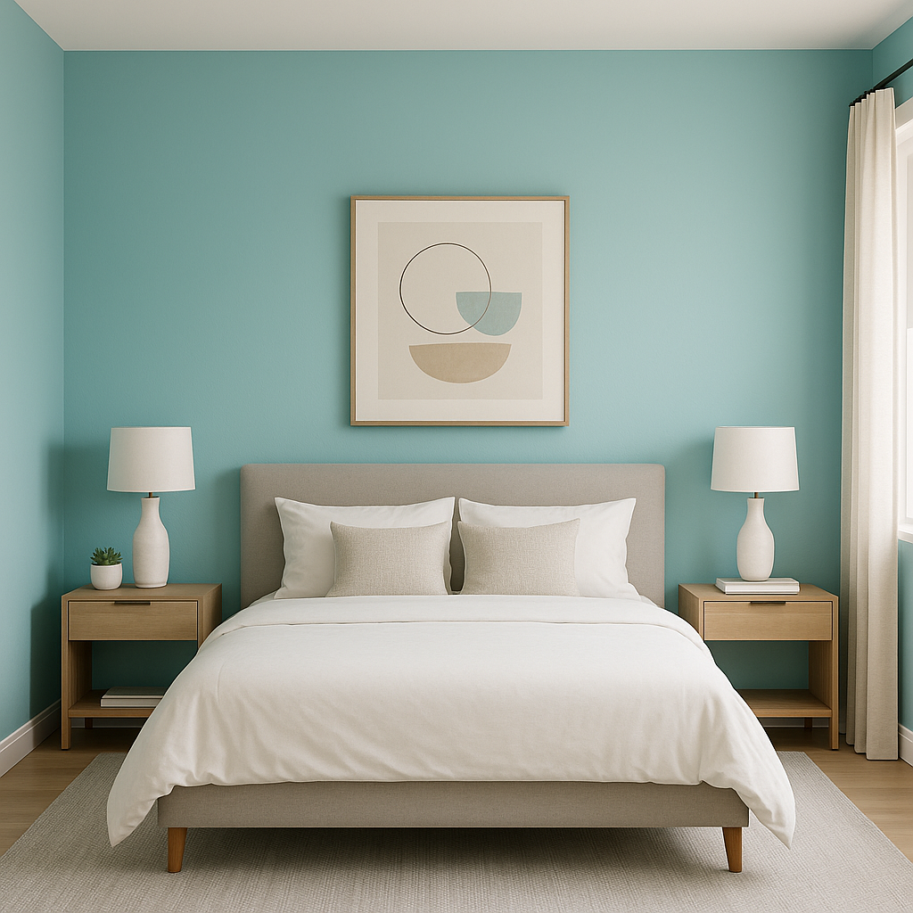
Fountain creates a soothing backdrop for living rooms and bedrooms, fostering a sense of calm and comfort. Pair it with plush textiles, natural wood finishes, and layered neutral decor to design an inviting retreat.
The soft blue-green tones of Fountain are perfect for bathrooms, where its spa-like quality can transform the space into a personal oasis. Combine it with white subway tiles, brushed nickel fixtures, and fluffy towels for a crisp, refreshing look.
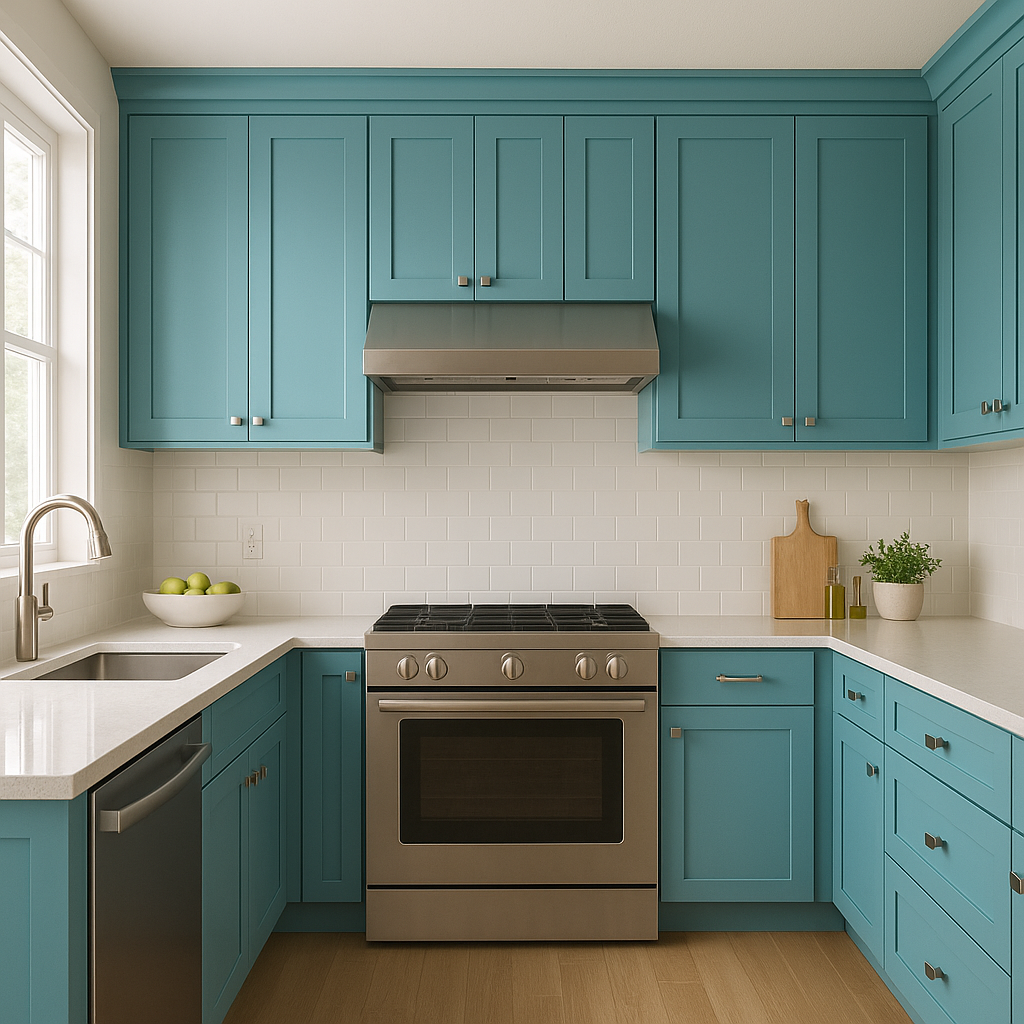
For a contemporary or farmhouse-inspired kitchen, Fountain works beautifully on cabinetry or as an accent wall. It pairs well with white quartz countertops, matte black hardware, and warm wood accents for a timeless yet modern aesthetic.
Fountain’s calming undertones make it an excellent choice for home offices. This color promotes focus and creativity while maintaining a peaceful environment. Pair it with sleek furniture and minimalistic decor for a workspace that inspires productivity.
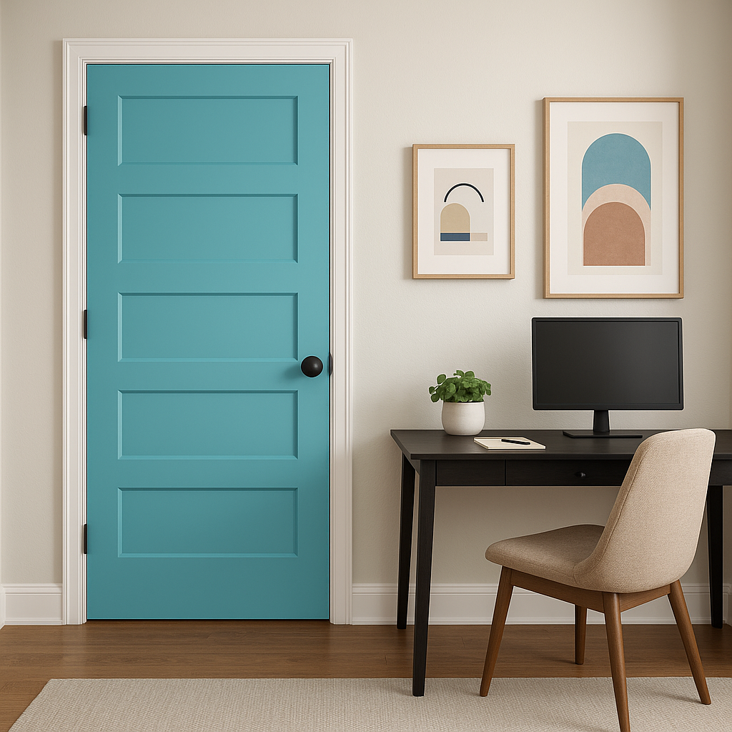
If you’re not ready to commit to covering an entire room, Fountain also shines as an accent color. Use it on a single wall, inside built-in shelving, or on furniture pieces to introduce a subtle yet impactful touch of color.
As with any paint color, Fountain (SW 6787) can shift in appearance based on the lighting in your space. In rooms with abundant natural light, its blue and green tones will feel brighter and more vibrant. In dimly lit areas or spaces illuminated with warm artificial light, the gray undertones may become more pronounced, creating a softer, muted effect. Always test a sample of Fountain in your space to see how it interacts with your lighting conditions.
Sherwin-Williams Fountain (SW 6787) is a timeless, tranquil color that brings a sense of rejuvenation and sophistication to any space. Its balanced undertones, versatile coordinating options, and adaptability across different rooms make it a standout choice for homeowners and designers alike. Whether you’re aiming for a serene retreat or a fresh, contemporary aesthetic, Fountain is a shade that won’t disappoint.
Note: These images were all generated with AI, there may be inaccurate color results. Please only use a general reference to get a rough idea of what a color may look like, we will continue to generate new images to improve accuracy.
View Colors Only by Brand (No Imagery):
Sherwin-Williams
|
Benjamin-Moore
|
Behr
|
Valspar
Live on the Eastern Slope of Colorado and looking for a local painting professional, check out all our painting services and reach out for a free estimate.
Copyright © 2026 : Wild Fox Painting Inc. : 12435 Mead Way, Littleton, CO 80125


