Sherwin-Williams Capri (SW 6788) is a captivating, coastal-inspired color that brings a sense of vibrancy and freshness to any space. Its rich aqua-blue tone evokes the tranquil beauty of Mediterranean waters, creating a lively yet soothing ambiance in your home. Capri is an excellent choice for homeowners who want to inject energy, charm, and a touch of exotic sophistication into their interiors. This radiant shade is ideal for making bold design statements or enhancing spaces with a playful, tropical vibe.
Capri (SW 6788) boasts subtle green undertones that balance its vivid blue hue, giving the color depth and dimensionality. These undertones prevent the shade from feeling overly cool, ensuring it pairs beautifully with both warm and cool palettes. Depending on the lighting in your space, Capri can shift slightly in appearance—leaning more toward its aqua personality in bright daylight or showcasing its greenish blue charm under softer, ambient lighting.
When designing with Sherwin-Williams Capri, selecting coordinating colors that complement its boldness is key. Here are some stunning pairings to inspire your palette:
Capri is a versatile color that can be used in various spaces to achieve different moods and design styles. Here are some ideas to incorporate this vibrant hue into your home:
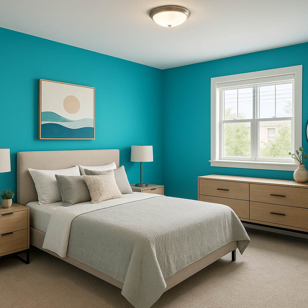
Capri makes for a stunning accent wall in living rooms, bedrooms, or even dining areas. Pair it with neutral furniture and décor to let the color shine while maintaining a balanced look.
Bring a spa-like feel to your bathroom by using Capri as the main wall color or pairing it with crisp whites and natural textures like bamboo or stone. Its aquatic undertones make it an ideal choice for spaces connected to water.
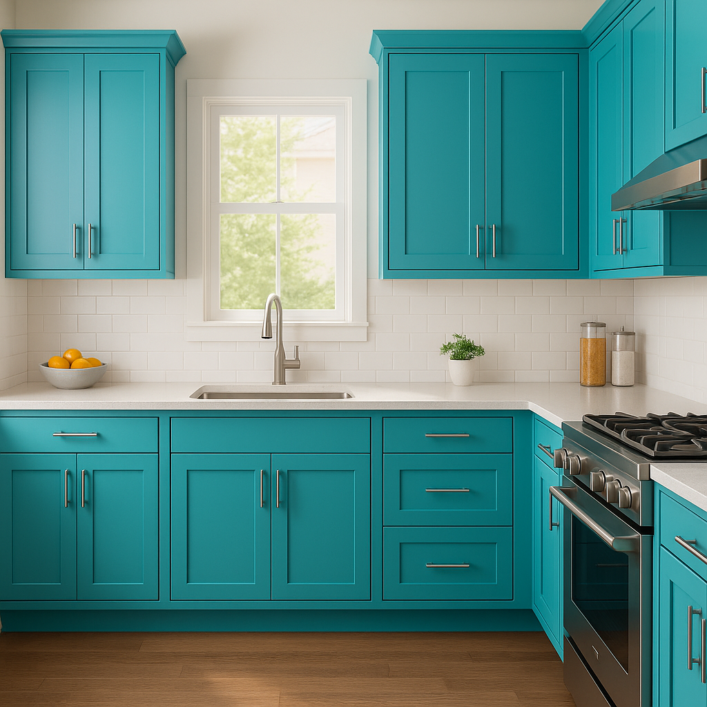
Create a cheerful and energizing kitchen by using Capri on cabinetry or as a backsplash color. Pair it with white countertops and stainless steel appliances for a clean yet vibrant aesthetic.
Capri’s playful energy makes it a fantastic choice for children’s bedrooms or playrooms. Combine it with bright accent colors like yellow, pink, or lime green to craft an inspiring and creative environment.
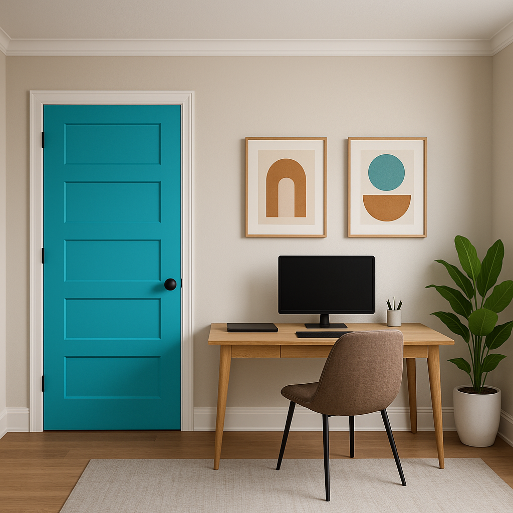
Capri works beautifully in exterior applications, such as front doors or patio furniture. Its vibrant tone adds a welcoming and cheerful touch to outdoor living areas.
Capri's dynamic personality makes it sensitive to lighting conditions. In rooms with natural light, the color feels bright and invigorating, emphasizing its aqua tones. In spaces with warm artificial lighting, Capri leans toward its green undertones, creating a softer, cozier atmosphere. Consider testing the color in your space to evaluate how it interacts with your existing light sources and furnishings.
Sherwin-Williams Capri (SW 6788) is a show-stopping shade that can inject life and vibrancy into any room while maintaining an elegant appeal. Whether you’re designing a bold accent wall or refreshing your outdoor spaces, this versatile hue offers endless possibilities for creative expression. Pair it with thoughtfully selected coordinating shades to create a cohesive and impactful design that reflects your unique style.
Note: These images were all generated with AI, there may be inaccurate color results. Please only use a general reference to get a rough idea of what a color may look like, we will continue to generate new images to improve accuracy.
View Colors Only by Brand (No Imagery):
Sherwin-Williams
|
Benjamin-Moore
|
Behr
|
Valspar
Live on the Eastern Slope of Colorado and looking for a local painting professional, check out all our painting services and reach out for a free estimate.
Copyright © 2026 : Wild Fox Painting Inc. : 12435 Mead Way, Littleton, CO 80125


