Sherwin-Williams Adriatic Sea (SW 6790) is a rich, deep blue that evokes the tranquility and depth of ocean waters. This captivating shade carries a sense of elegance and sophistication, making it an exceptional choice for both modern and traditional spaces. Its bold yet calming presence creates a stunning backdrop for interiors and exteriors alike, offering versatility that appeals to homeowners and designers seeking to make a statement.
Adriatic Sea boasts cool undertones that lean towards green, giving it a soft teal-like quality depending on the lighting and surrounding colors. These subtle green hints lend the color a natural, earthy vibe reminiscent of sea foam or coastal landscapes. The undertones help balance its richness, ensuring it doesn’t feel overly stark or heavy, even in smaller spaces.
In areas with bright natural light, Adriatic Sea may appear slightly lighter and more vibrant, emphasizing its blue-green character. In dimmer conditions, the color deepens, creating a moody, dramatic ambiance that feels intimate and luxurious.
Adriatic Sea pairs beautifully with a wide array of coordinating shades, allowing for creative versatility in any design scheme. Here are some suggested color combinations:
Adriatic Sea’s bold personality makes it an excellent choice for creating striking focal points or grounding larger spaces. Below are some of the most effective ways to incorporate this color into your home:
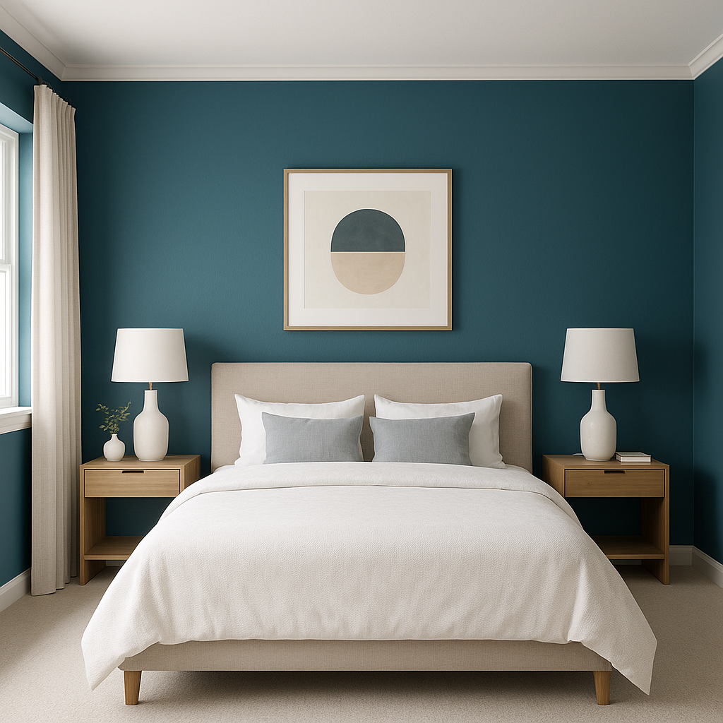
Using Adriatic Sea for an accent wall is a powerful way to add drama and dimension to a room. Pair it with lighter neutral walls to create contrast and draw attention to architectural features, such as a fireplace or built-in shelving.
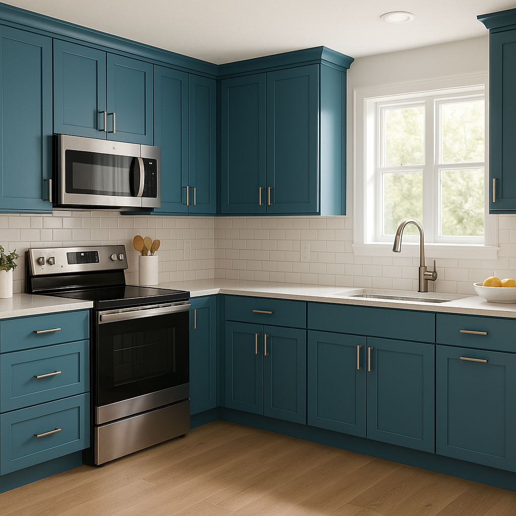
This color shines on kitchen or bathroom cabinets, transforming them into statement pieces. Its rich tones pair beautifully with metallic hardware, such as brushed gold or matte black, for a luxe look. Adriatic Sea can also be used on furniture, like a painted dresser or side table, for a pop of color in otherwise neutral spaces.
Adriatic Sea brings an undeniable sense of calm and relaxation, making it ideal for bedrooms and living rooms. Pair it with soft linens, warm wood tones, and natural textures like rattan or woven jute to create a cozy, coastal-inspired retreat.
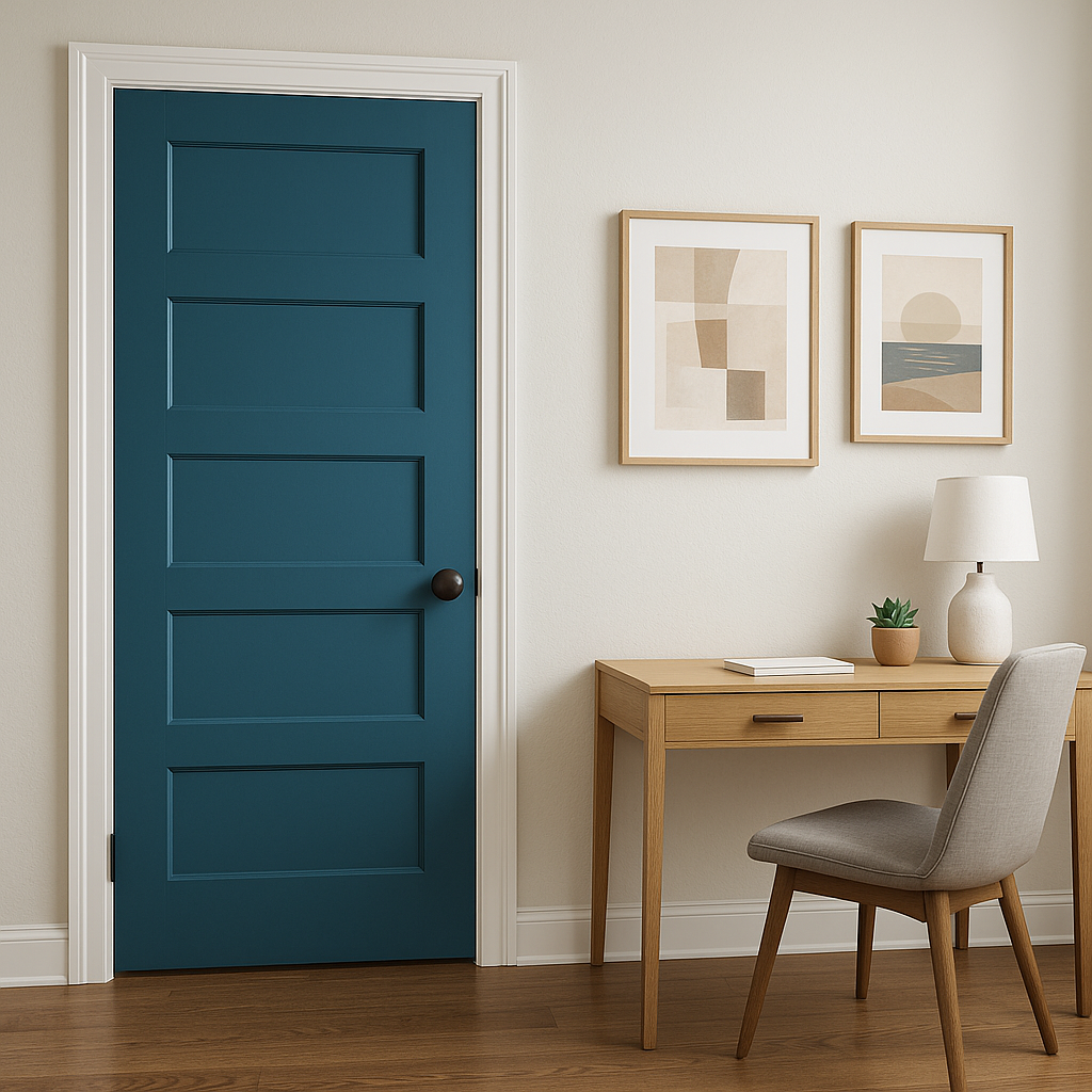
On the exterior of a home, Adriatic Sea offers a bold and inviting curb appeal. Whether used for front doors, shutters, or siding, it pairs beautifully with white trim and natural stone accents for a timeless look.
This color is perfect for bathrooms where you want to evoke a spa-like atmosphere. Pair it with glossy white tiles, polished chrome fixtures, and natural greenery to channel a serene, oceanic vibe.
As with any deep color, lighting plays a crucial role in how Adriatic Sea is perceived. In rooms with ample natural light, Adriatic Sea will showcase its vibrant blue-green undertones. In spaces with limited light, the color can appear darker and moodier, creating a cozy and intimate feel. Consider testing this shade with swatches under different lighting conditions to ensure it complements your space.
Sherwin-Williams Adriatic Sea (SW 6790) is more than just a paint color; it’s a design statement. Whether you’re aiming to create a serene coastal retreat or a dramatic, modern interior, this versatile hue offers endless possibilities. Its bold yet balanced undertones make it easy to pair with neutrals, complementary shades, or metallics, ensuring it enhances any space it touches.
Note: These images were all generated with AI, there may be inaccurate color results. Please only use a general reference to get a rough idea of what a color may look like, we will continue to generate new images to improve accuracy.
View Colors Only by Brand (No Imagery):
Sherwin-Williams
|
Benjamin-Moore
|
Behr
|
Valspar
Live on the Eastern Slope of Colorado and looking for a local painting professional, check out all our painting services and reach out for a free estimate.
Copyright © 2026 : Wild Fox Painting Inc. : 12435 Mead Way, Littleton, CO 80125


