Sherwin-Williams Wondrous Blue (SW 6807) is a serene and captivating paint color that brings a soothing coastal vibe to interior and exterior spaces. Its soft yet enchanting blue tone evokes tranquility, making it an excellent choice for creating restful and inviting environments. Whether you're aiming to design a breezy beach-inspired retreat or a modern sanctuary, this color delivers elegance and versatility.
Wondrous Blue is a light, airy shade with subtle gray undertones that give it a refined and sophisticated edge. These cool undertones prevent the color from feeling overly bright or saturated, ensuring it remains understated and timeless. In certain lights, hints of green can emerge, adding a nuanced complexity to its character. This chameleon-like quality allows Wondrous Blue to adapt beautifully to different lighting conditions, from natural daylight to warm artificial lighting.
Pairing Sherwin-Williams Wondrous Blue with complementary hues can elevate your design and create a cohesive palette. Here are some suggested coordinating colors:
Whites:
Neutrals:
Accent Colors:
Wondrous Blue is incredibly versatile and works well in a variety of settings. Its calming presence makes it particularly suited for spaces where relaxation is key, but it can also add a refreshing touch to more active areas.
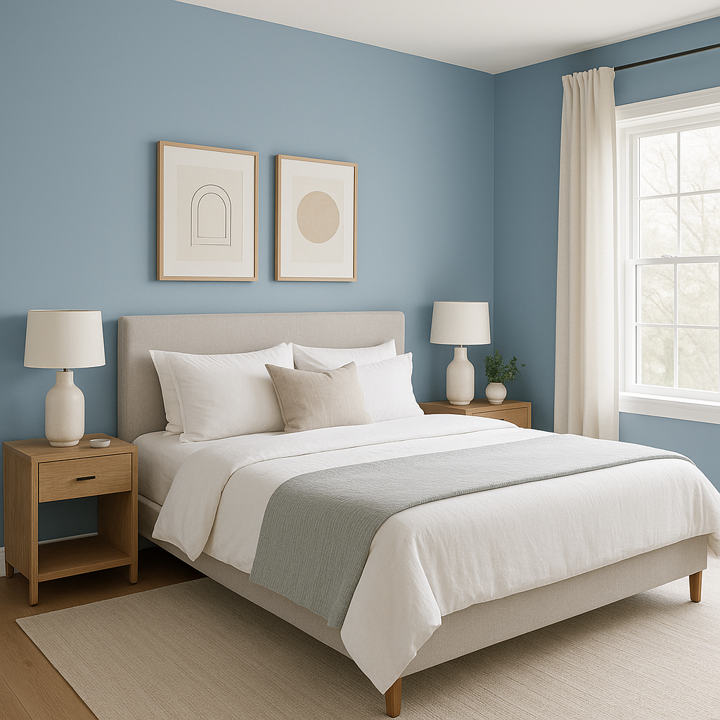
Create a soothing oasis by using Wondrous Blue in bedrooms and bathrooms. Its tranquil quality promotes relaxation, making it ideal for spaces designed for unwinding. Pair it with crisp white trim and natural wood accents for a spa-like atmosphere.
For living rooms and dining spaces, Wondrous Blue offers a light and airy backdrop that pairs beautifully with both modern and traditional furnishings. Add texture with woven rugs, linen curtains, or metallic finishes to complement its coastal charm.
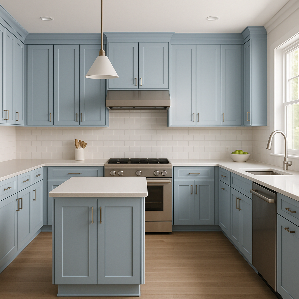
In kitchens, Wondrous Blue can be used on cabinetry or as a wall color to create a fresh, clean look. Pair it with white countertops, subway tile backsplashes, and brushed nickel hardware for a timeless yet contemporary vibe.
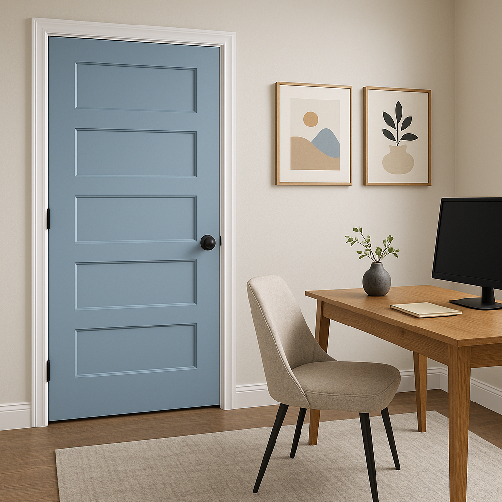
Wondrous Blue shines as a choice for exterior siding, shutters, or doors. Its soft gray undertones ensure it blends harmoniously with natural surroundings while still providing a pop of color.
Wondrous Blue’s appearance can shift depending on the lighting conditions. In spaces with abundant natural light, its blue tones are more pronounced, creating a bright and airy look. Under artificial or low light, its gray undertones come forward, lending a subtle sophistication. To achieve the desired effect, test the color in your space with different lighting sources before committing.
Sherwin-Williams Wondrous Blue (SW 6807) is a versatile and dreamy shade that combines the tranquility of soft blue with the sophistication of gray undertones. Perfect for bedrooms, bathrooms, living spaces, and even exteriors, this color adapts beautifully to various styles and lighting conditions. Pair it with whites, neutrals, or bold accents to craft a space that feels harmonious and effortlessly elegant. Whether you're designing a coastal-inspired retreat or a modern sanctuary, Wondrous Blue is a timeless choice that will transform your home into a haven of peace and beauty.
Note: These images were all generated with AI, there may be inaccurate color results. Please only use a general reference to get a rough idea of what a color may look like, we will continue to generate new images to improve accuracy.
View Colors Only by Brand (No Imagery):
Sherwin-Williams
|
Benjamin-Moore
|
Behr
|
Valspar
Live on the Eastern Slope of Colorado and looking for a local painting professional, check out all our painting services and reach out for a free estimate.
Copyright © 2026 : Wild Fox Painting Inc. : 12435 Mead Way, Littleton, CO 80125


