Sherwin-Williams Wisteria (SW 6822) is a captivating lavender hue that effortlessly combines sophistication with a gentle touch of whimsy. Perfectly suited for spaces where tranquility and elegance are desired, Wisteria evokes feelings of serenity while providing a subtle pop of color. Its soft, muted nature makes it versatile, allowing it to shine in various design contexts, from modern interiors to vintage-inspired spaces.
Wisteria is a delicate lavender shade with cool undertones, leaning slightly towards blue rather than pink. These cool undertones give the color its calming and airy character, making it ideal for creating restful environments. The hint of blue ensures that the color feels soothing without becoming overly sweet or saccharine, striking a perfect balance between femininity and sophistication.
This unique undertone profile allows Wisteria to work well in spaces that need a touch of color without overwhelming the senses. Whether used as a primary wall color or as an accent, its subtlety ensures it harmonizes beautifully with other design elements.
Sherwin-Williams Wisteria pairs gracefully with a variety of complementary and contrasting hues, making it a versatile choice for any palette. Here are some coordinating options:
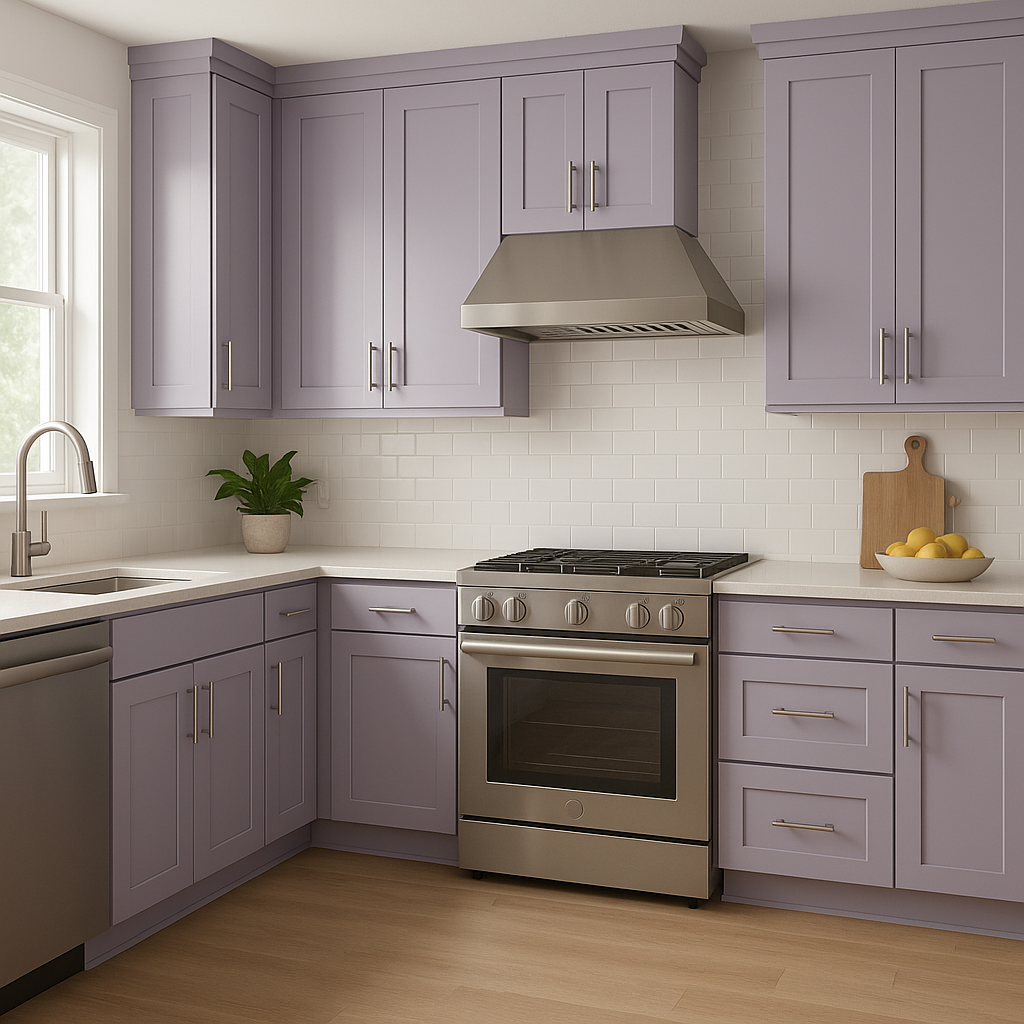
Wisteria’s soft lavender hue lends itself beautifully to a variety of spaces and purposes. Here are some creative ways to incorporate it into your home design:
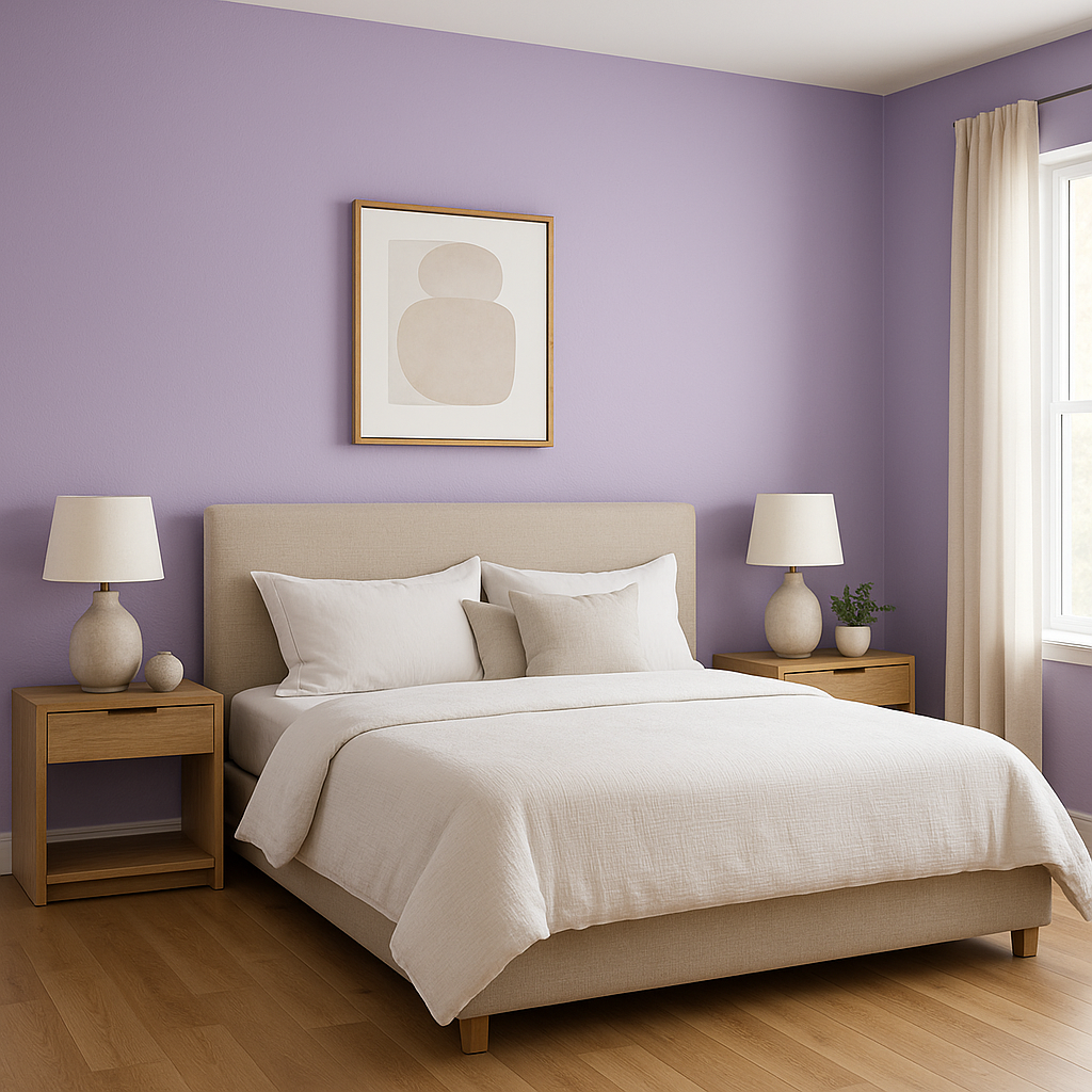
The calming and romantic qualities of Wisteria make it an ideal choice for bedrooms. Use it as the main wall color to create a soothing retreat, and pair it with crisp white trim for a fresh, polished look. Introduce cozy textiles in complementary colors like gray or soft green to complete the space.
Wisteria brings a spa-like tranquility to bathrooms. Pair it with white subway tiles, silver fixtures, and soft gray accents for a serene and timeless design. Its cool undertones can also work beautifully with marble countertops or floors.
For a gender-neutral nursery, Wisteria offers a refreshing alternative to traditional pastels. Combine it with soft yellows or muted greens for a playful yet calming space that feels welcoming and unique.
Introduce Wisteria as an accent wall in living rooms to add a subtle touch of color. Pair it with neutral furniture and metallic finishes, such as brushed gold or silver, to elevate the space with understated elegance.
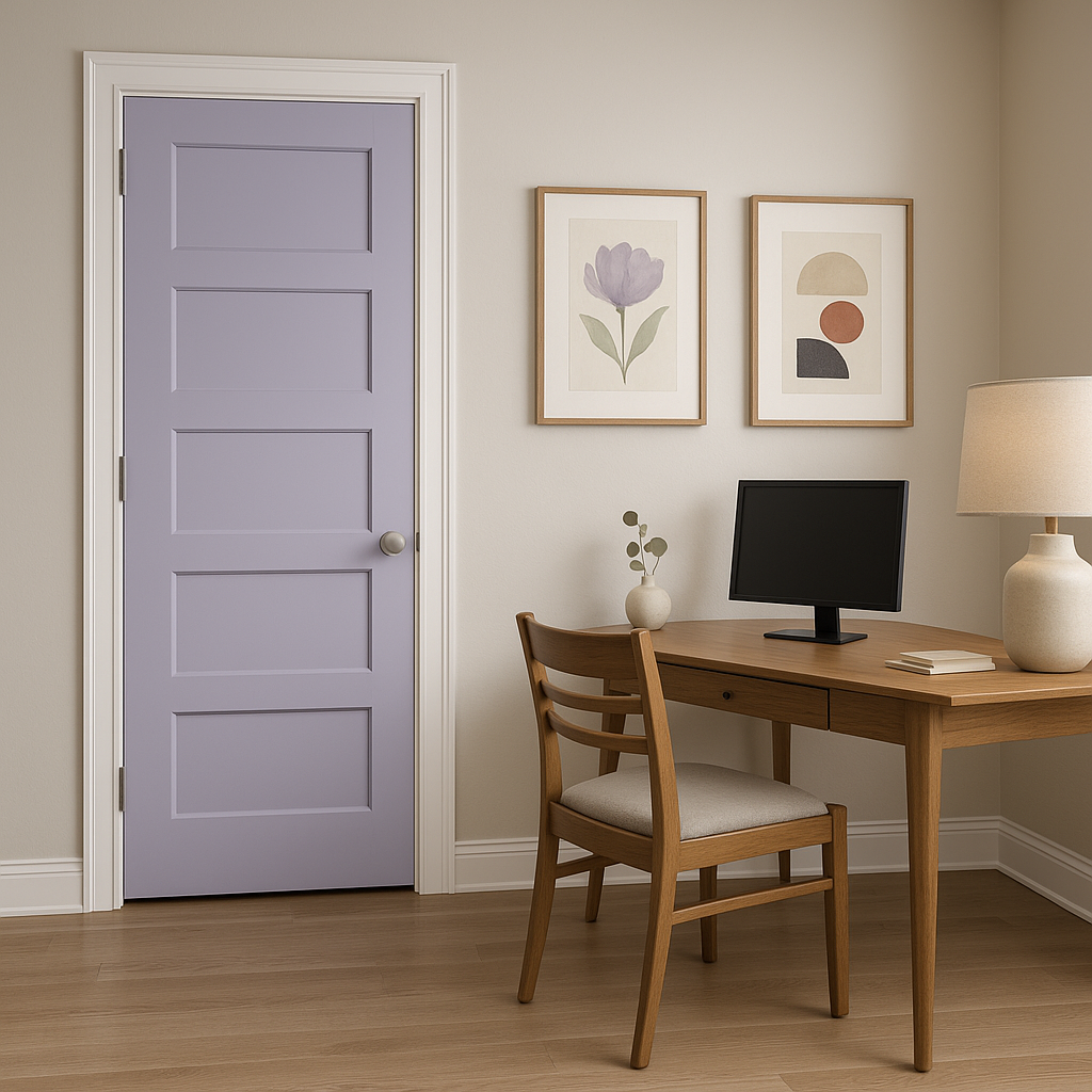
Wisteria’s soothing qualities make it an excellent choice for home offices, where concentration and calmness are key. Pair it with warm woods and minimalist decor to create a productive yet inviting environment.
For a bold, unconventional design statement, consider using Wisteria on ceilings or trim. This unexpected placement can create a whimsical and artistic look while maintaining the room’s overall sense of tranquility.
Wisteria’s appearance can shift depending on the lighting in your space. In natural light, its cool lavender tones will feel airy and vibrant, while under warm artificial light, it may lean slightly towards a softer, muted lilac. To ensure the perfect application, test the color in your space at different times of the day to see how it interacts with your lighting conditions.
Sherwin-Williams Wisteria (SW 6822) is more than just a paint color—it’s a mood setter. With its versatile undertones, impeccable coordinating options, and wide range of uses, it’s an excellent choice for anyone looking to infuse their home with serenity and charm. Whether you’re designing a peaceful bedroom retreat or a dreamy nursery, Wisteria is sure to inspire and delight.
Note: These images were all generated with AI, there may be inaccurate color results. Please only use a general reference to get a rough idea of what a color may look like, we will continue to generate new images to improve accuracy.
View Colors Only by Brand (No Imagery):
Sherwin-Williams
|
Benjamin-Moore
|
Behr
|
Valspar
Live on the Eastern Slope of Colorado and looking for a local painting professional, check out all our painting services and reach out for a free estimate.
Copyright © 2026 : Wild Fox Painting Inc. : 12435 Mead Way, Littleton, CO 80125


