Sherwin-Williams Izmir Purple (SW 6825) is a captivating and luxurious paint color that brings depth and character to any space. Named after the vibrant city of Izmir, known for its rich culture and vivid hues, this purple strikes the perfect balance between boldness and sophistication. With its moody undertones and versatile nature, Izmir Purple is a show-stopping choice for homeowners and designers looking to make a statement or create an intimate atmosphere.
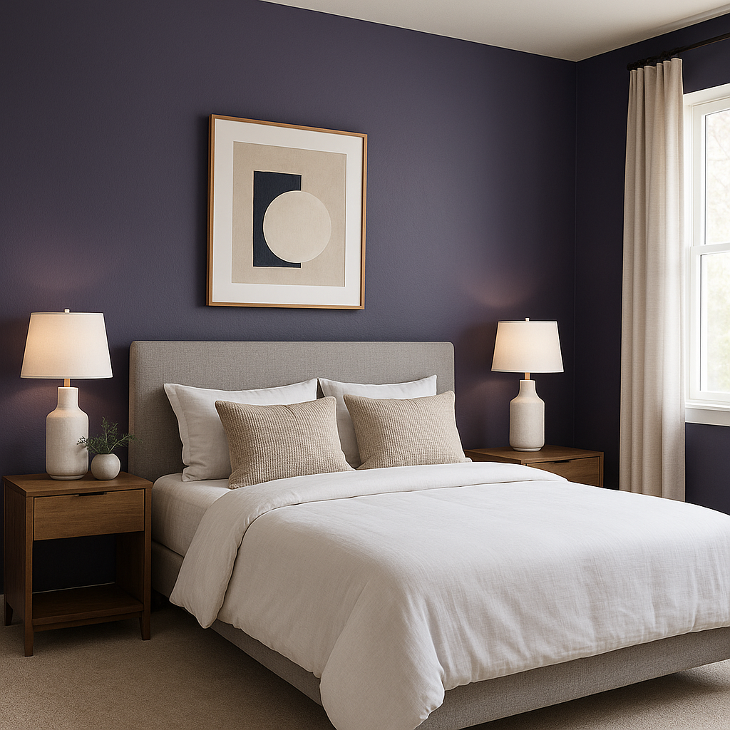
Izmir Purple is a deep, saturated shade that leans toward the cooler side of the color spectrum. Its undertones are rooted in blue, giving it a refined and regal quality that sets it apart from warmer purples with red or plum influences. The blue undertones lend the color a sense of calm and tranquility, making it an excellent choice for spaces where relaxation and creativity are key. This complex hue also has subtle gray undertones, which soften its intensity and make it adaptable in a variety of lighting conditions.
To create a harmonious palette, pair Izmir Purple with colors that complement its rich depth and cool undertones. Sherwin-Williams offers an array of coordinating shades that work beautifully with this bold purple:
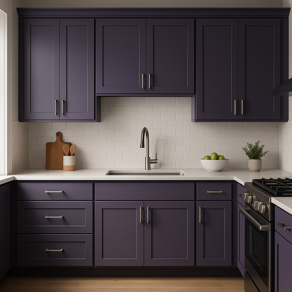
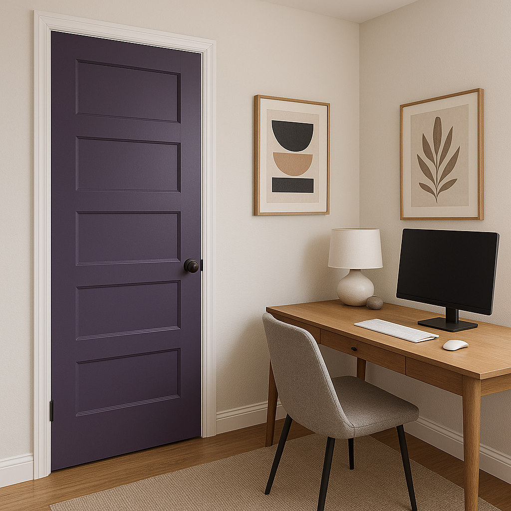
Izmir Purple is a versatile shade that works well in both residential and commercial spaces. Its bold nature makes it ideal for creating focal points, while its muted undertones allow it to blend seamlessly into a variety of design styles.
Lighting plays a crucial role in how Izmir Purple appears in a space. In natural light, its blue undertones become more apparent, giving it a cooler and brighter appearance. Under warm artificial light, the subtle gray undertones emerge, creating a cozier and more subdued vibe. Experimenting with different lighting options can help tailor the mood of the room to your desired aesthetic.
Sherwin-Williams Izmir Purple (SW 6825) is a bold yet versatile color that allows you to embrace creativity and sophistication in your design. Whether you're looking to craft a moody retreat, an elegant gathering space, or an inspiring office, Izmir Purple delivers a dramatic and memorable impact every time.
Note: These images were all generated with AI, there may be inaccurate color results. Please only use a general reference to get a rough idea of what a color may look like, we will continue to generate new images to improve accuracy.
View Colors Only by Brand (No Imagery):
Sherwin-Williams
|
Benjamin-Moore
|
Behr
|
Valspar
Live on the Eastern Slope of Colorado and looking for a local painting professional, check out all our painting services and reach out for a free estimate.
Copyright © 2026 : Wild Fox Painting Inc. : 12435 Mead Way, Littleton, CO 80125


