Sherwin-Williams Spangle SW 6834 is a bold, eye-catching shade of purple that infuses energy and sophistication into any space. This vivid hue commands attention with its lively personality, making it an ideal choice for those looking to make a statement in their home or workspace. Whether used as an accent or a dominant color, Spangle is sure to leave a lasting impression.
Spangle SW 6834 leans toward the cooler side of the spectrum with blue undertones that give it a crisp and modern edge. These undertones provide a refreshing vibrancy, making the color feel dynamic yet balanced. It’s not overly muted or pastel-like; instead, it radiates a bold, jewel-like brilliance. The blue undertones also help Spangle pair beautifully with other cool-toned shades, creating harmonious and visually stunning palettes.
The reflective quality of Spangle can vary depending on lighting conditions. In spaces with ample natural light, it appears brighter and more vivid, while in dimmer settings, it takes on a deeper, more saturated tone. This makes Spangle a versatile option that adapts to different environments.
To bring out the best in Sherwin-Williams Spangle, pair it with complementary or coordinating colors that enhance its vibrancy. Here are some great options for building a cohesive color palette:
Neutrals:
Blues and Greens:
Yellows and Golds:
These combinations allow for a variety of aesthetics, from elegant and sophisticated to fun and adventurous.
Spangle SW 6834 excels as a feature color in spaces where you want to make a bold and creative statement. Here are some design ideas for incorporating it into your interiors:
Accent Walls:
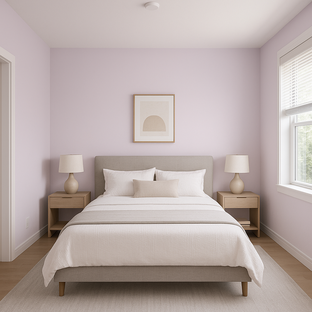
Use Spangle on a single wall to create a focal point in living rooms, bedrooms, or offices. It pairs well with neutral furnishings and modern décor for a striking yet balanced look.
Furniture and Cabinets:
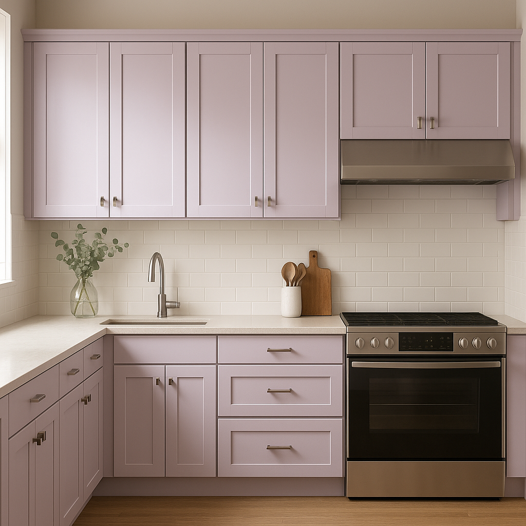
Think outside the box by applying Spangle to furniture or cabinetry. A painted dresser, bookshelf, or even kitchen cabinets in this vibrant hue can instantly refresh and modernize your space.
Children’s Rooms:
Spangle is a playful and energetic color that works wonderfully in kids’ rooms. Pair it with lighter pastels for a whimsical feel or bold patterns for a dynamic, youthful atmosphere.
Creative and Artistic Spaces:
This vibrant purple is perfect for studios, craft rooms, or home offices. Its energetic vibe can help inspire creativity while adding a touch of personality to the space.
Outdoor Accents:
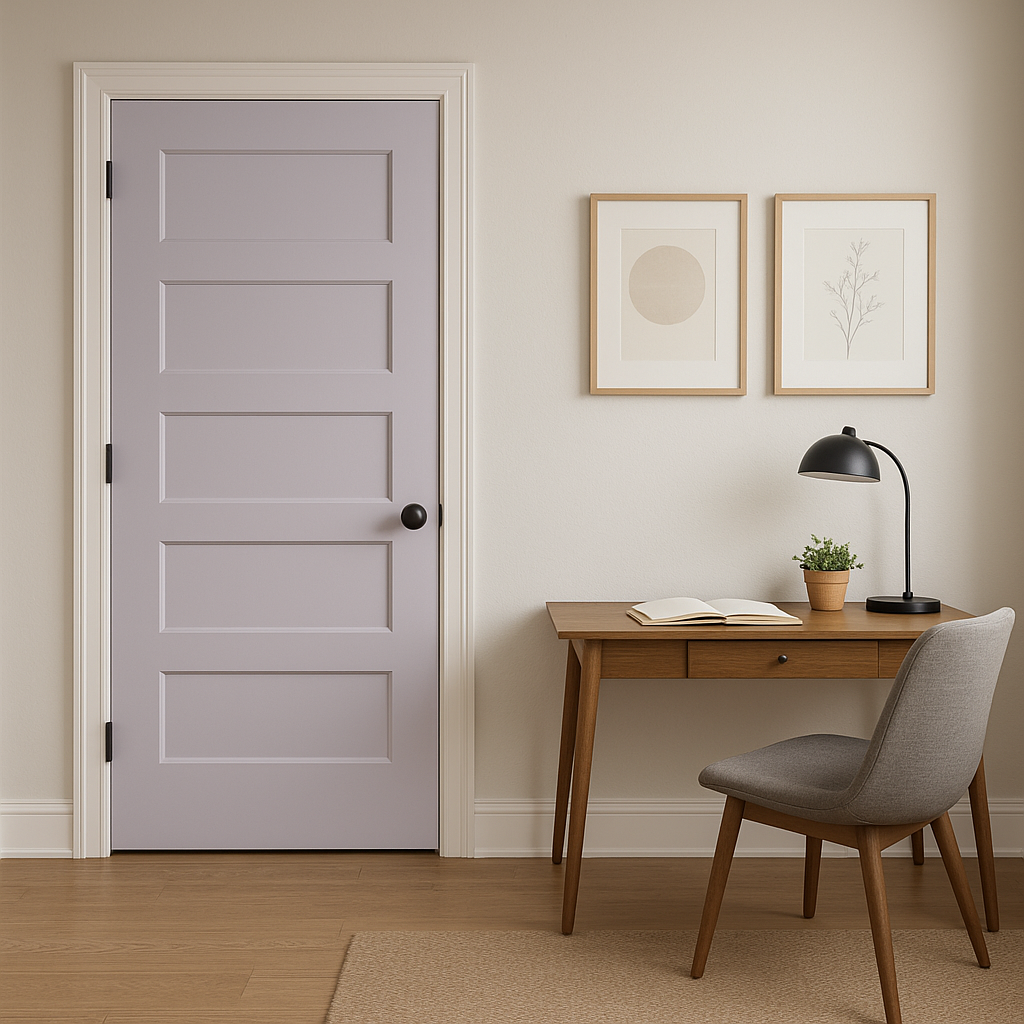
Don’t be afraid to take Spangle outdoors! Use it on front doors, shutters, or patio furniture to add a pop of unexpected color to your home’s exterior.
Spangle SW 6834 is more than just a color—it’s a statement. Its bold,
Note: These images were all generated with AI, there may be inaccurate color results. Please only use a general reference to get a rough idea of what a color may look like, we will continue to generate new images to improve accuracy.
View Colors Only by Brand (No Imagery):
Sherwin-Williams
|
Benjamin-Moore
|
Behr
|
Valspar
Live on the Eastern Slope of Colorado and looking for a local painting professional, check out all our painting services and reach out for a free estimate.
Copyright © 2026 : Wild Fox Painting Inc. : 12435 Mead Way, Littleton, CO 80125


