Sherwin-Williams Baroness (6837) is a rich and refined color that exudes timeless elegance and a sense of dramatic sophistication. Perfectly suited for creating statement spaces, this bold hue commands attention while offering versatility in design. With its deep magenta base and subtle purple undertones, Baroness strikes the perfect balance between warmth and coolness, making it an ideal choice for a variety of interior styles.
Baroness (6837) is a striking shade of magenta with noticeable purple undertones. The interplay between red and violet creates a nuanced color that feels both vibrant and luxurious. The reddish-magenta base lends warmth, while the cooler violet undertones soften the intensity, making it adaptable to diverse lighting conditions. In spaces with natural light, it can appear brighter and more vivid, while in dimly lit rooms, it takes on a deeper, moodier quality.
This rich hue evokes a sense of drama and regality, making it ideal for spaces where you want to make an impression. Its complexity ensures it doesn’t feel overwhelming, allowing it to enhance rather than overpower the surrounding decor.
Sherwin-Williams Baroness pairs beautifully with a variety of complementary and contrasting colors, offering flexibility for curated palettes that suit different styles and moods.
Neutral Pairings:
To balance its boldness, pair Baroness with soft neutrals like Sherwin-Williams Pure White (7005) or Alabaster (7008). These whites create a clean canvas, allowing Baroness to stand out while maintaining harmony in the overall design.
Earthy Accents:
For a grounded and sophisticated palette, consider pairing it with warm earth tones like Sherwin-Williams Accessible Beige (7036) or Perfect Greige (6073). These colors soften Baroness’s vibrancy and create a calming contrast.
Dramatic Contrasts:
To emphasize its regal personality, combine Baroness with darker shades such as Tricorn Black (6258) or Iron Ore (7069). These rich, deep tones heighten the drama and create a luxurious atmosphere.
Vibrant Complements:
If you’re looking to create a playful, contemporary vibe, pair Baroness with bold complementary hues like Sherwin-Williams Lemon Twist (6909) or Spa (6745). These brighter colors bring energy and excitement to the space.
Baroness (6837) is a commanding color that lends itself to creative and intentional use in interior spaces. Whether you’re designing a cozy retreat or a show-stopping focal point, this hue can adapt to a variety of purposes.
Accent Walls:
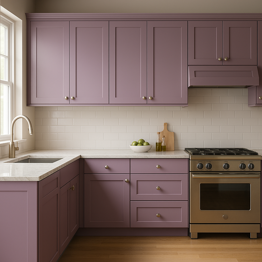
Baroness makes a stunning accent wall, especially in living rooms, bedrooms, or dining areas where you want to create a focal point. Pair it with neutral walls to let its vibrancy shine without overwhelming the space.
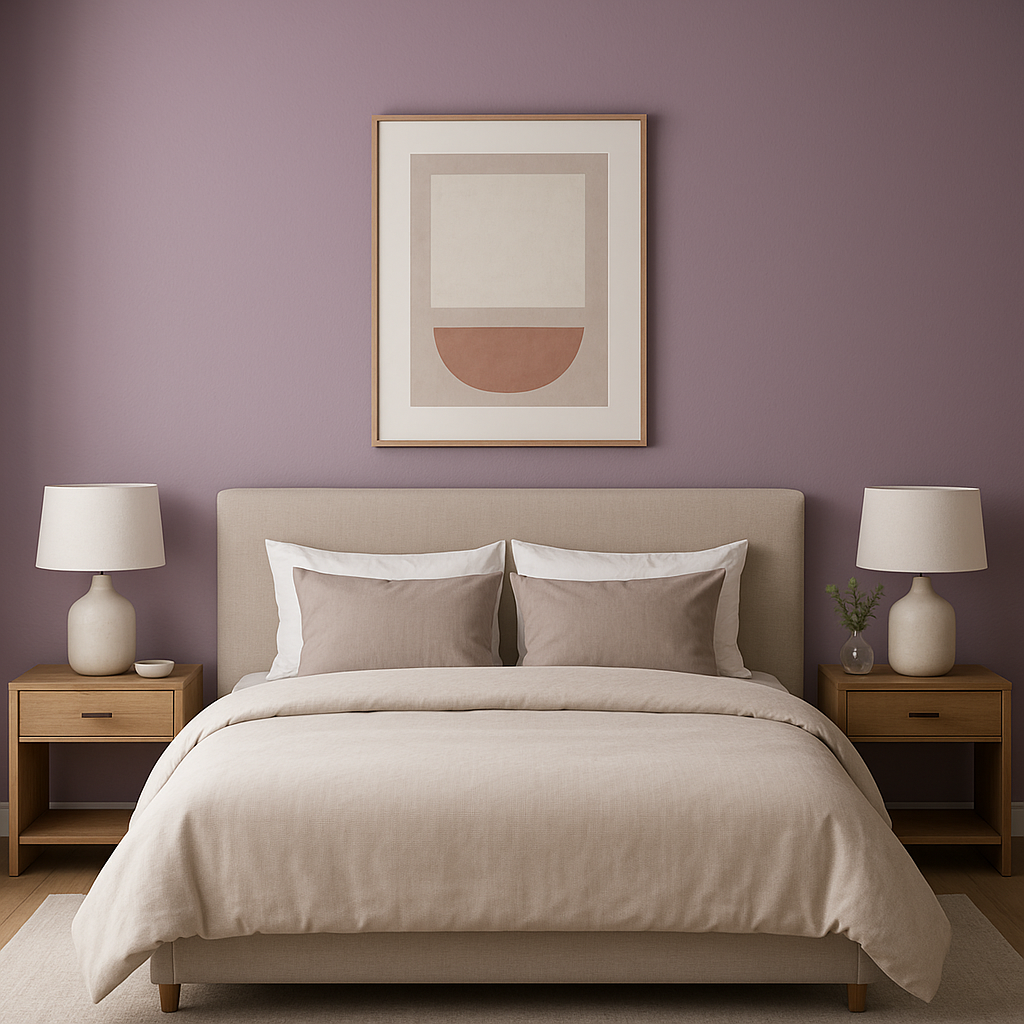
Bedrooms:
The rich, regal tone of Baroness can transform a bedroom into a luxurious retreat. Use it as the main color for walls or incorporate it through bedding and decorative accents for a dramatic yet restful ambiance.
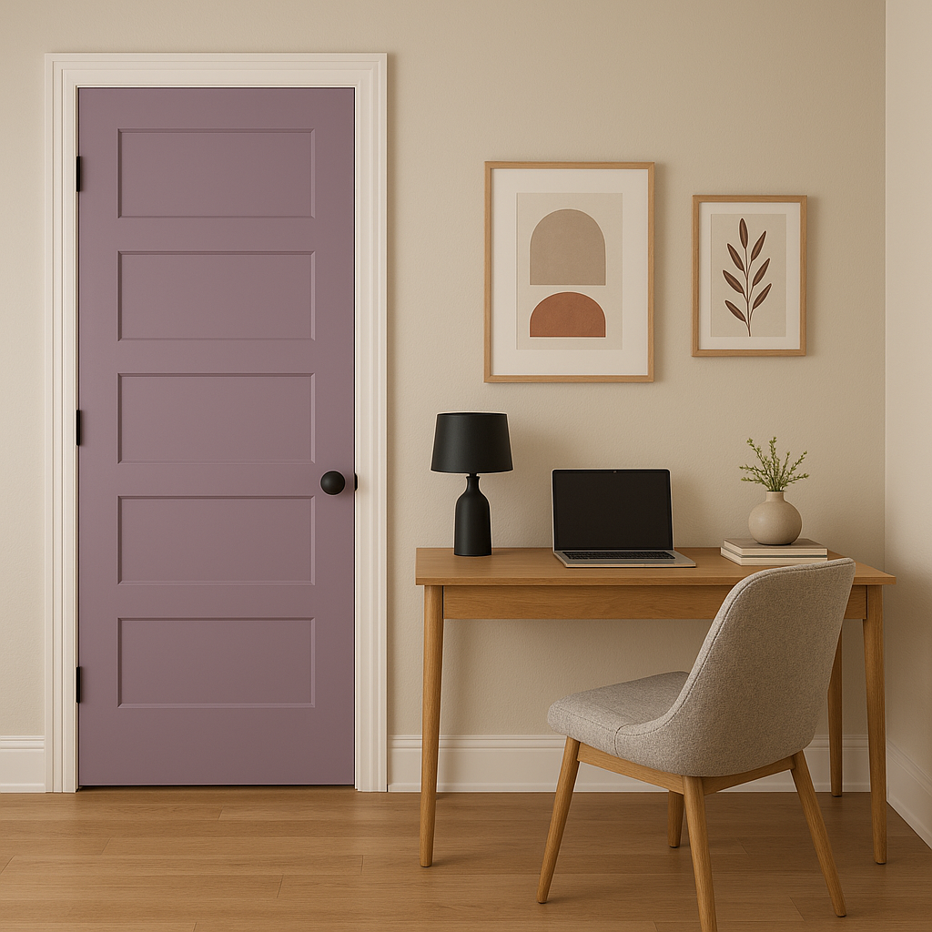
Powder Rooms:
Bold and compact spaces like powder rooms are perfect for experimenting with strong colors. Baroness can turn a small bathroom into a jewel box, making it unforgettable for guests.
Furniture and Decor:
If you prefer smaller doses of color, incorporate Baroness through painted furniture pieces, upholstery, or accessories like throw pillows and artwork. Its richness complements wood tones and metallic finishes such as brushed brass or gold.
Creative Spaces:
In home offices or studios, Baroness encourages creativity and passion. Pair it with dynamic accents and warm lighting to inspire productivity and imagination.
As with any bold color, lighting plays a significant role in how Sherwin-Williams Baroness appears in a space. Natural daylight highlights its magenta vibrancy, giving it an energetic quality, while warm artificial lighting enhances its luxurious undertones, creating an inviting and intimate atmosphere. Cool lighting, on the other hand, can emphasize its purple hues, lending a more modern or moody vibe.
Sherwin-Williams Baroness (6837) is the epitome of elegance and versatility, offering countless opportunities to elevate your interior design. Whether used as a bold statement or a sophisticated accent, this rich magenta hue is sure to leave a lasting impression.
Note: These images were all generated with AI, there may be inaccurate color results. Please only use a general reference to get a rough idea of what a color may look like, we will continue to generate new images to improve accuracy.
View Colors Only by Brand (No Imagery):
Sherwin-Williams
|
Benjamin-Moore
|
Behr
|
Valspar
Live on the Eastern Slope of Colorado and looking for a local painting professional, check out all our painting services and reach out for a free estimate.
Copyright © 2026 : Wild Fox Painting Inc. : 12435 Mead Way, Littleton, CO 80125


