Sherwin-Williams Cherries Jubilee 6862 is a rich, vibrant red that commands attention and exudes warmth and energy. This striking color is perfect for creating bold, dramatic spaces that leave a lasting impression. Its luscious depth and dynamic personality make it an excellent choice for those looking to add a touch of sophistication and passion to their interiors.
Cherries Jubilee is a true red with subtle blue undertones, giving it a cool and balanced edge. These undertones prevent it from veering into orange territory, maintaining a classic red appearance that feels timeless and refined. The slight coolness also ensures that it doesn’t overwhelm a space, allowing it to remain vibrant yet approachable.
This balance of warmth and coolness makes Cherries Jubilee versatile, as it pairs well with both warm and cool palettes while retaining its bold character.
To create a cohesive and stylish look, pair Cherries Jubilee 6862 with complementary and coordinating colors. Below are some suggestions for building a well-rounded palette:
Neutral Pairings:
Cool Accents:
Warm Complements:
This versatile red can adapt to both modern, edgy palettes and traditional, cozy schemes, depending on the colors you choose to incorporate.
Cherries Jubilee is a statement-making color that can be used in a variety of ways to elevate your space. Here are some ideas on how to incorporate it into your home or commercial design:
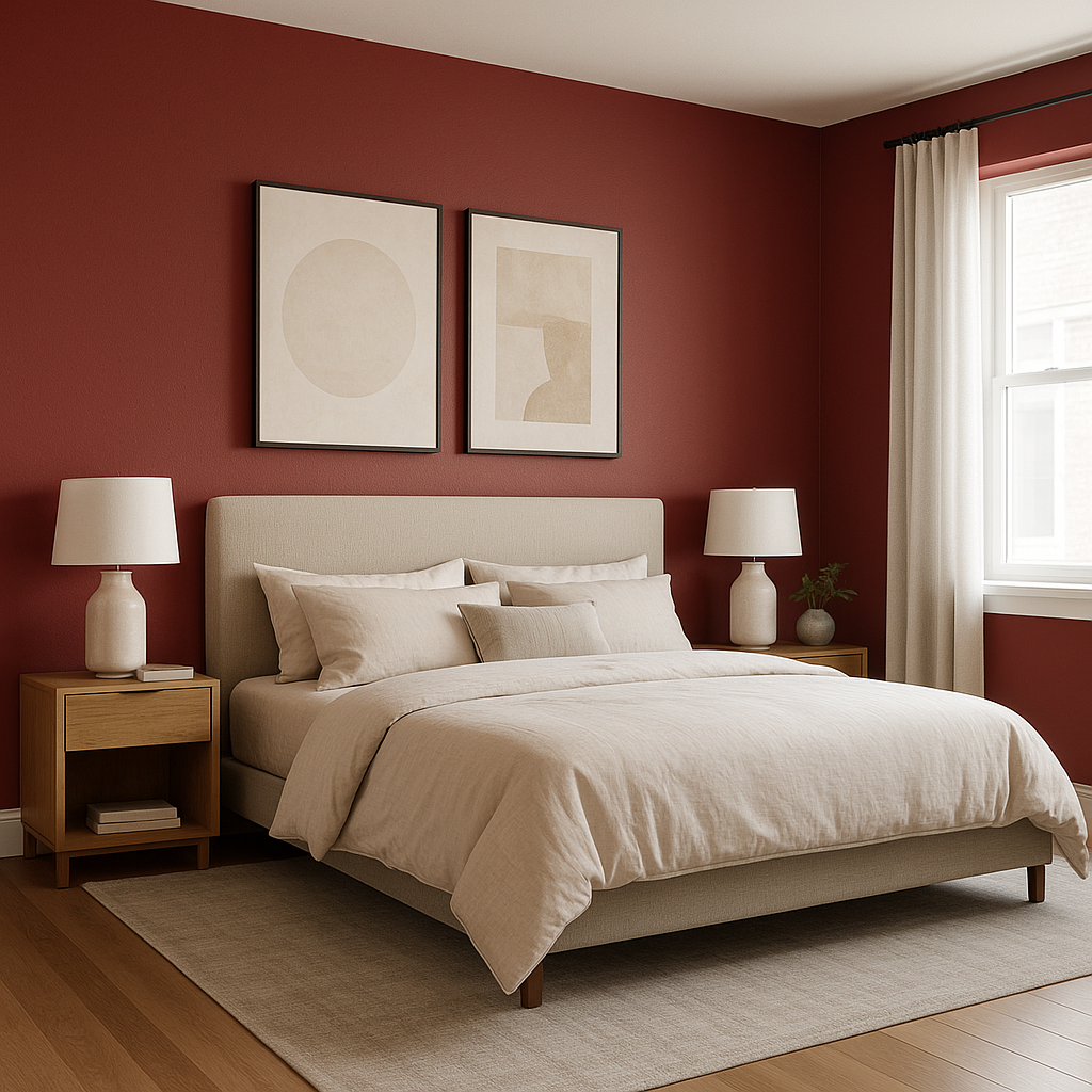
Cherries Jubilee is an excellent choice for accent walls in living rooms, dining rooms, or bedrooms. Its boldness adds a touch of drama and sophistication, making a space feel luxurious and inviting. Pair it with lighter neutral walls for a balanced look.
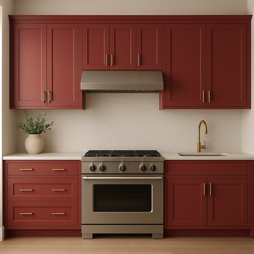
Use Cherries Jubilee to create eye-catching painted furniture or cabinetry. In kitchens, consider painting an island or lower cabinets in this color for a pop of personality. In bedrooms or living areas, a Cherries Jubilee-painted bookshelf or console table can serve as a focal point.
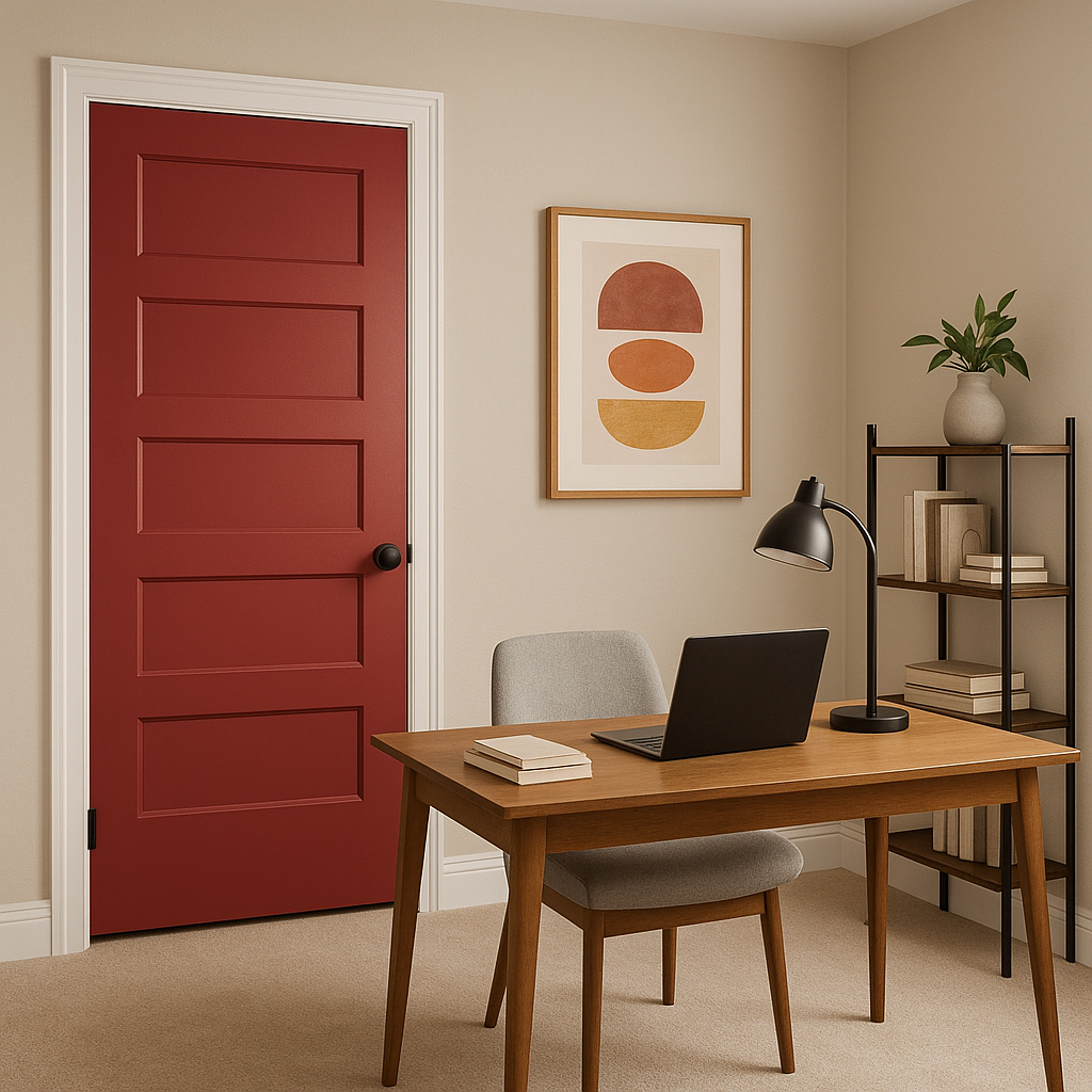
For a striking first impression, use Cherries Jubilee on your front door. Its rich red tone adds curb appeal and a sense of warmth to any home exterior. Pair it with creamy whites or soft grays for a timeless look.
This color is particularly well-suited for dining rooms, as red tones are known to stimulate appetite and conversation. Pair it with elegant metallic accents, such as gold or brass, to create a sophisticated, inviting atmosphere.
In commercial settings, Cherries Jubilee can be used to create a sense of energy and excitement. It works particularly well in restaurants, boutique shops, or creative workspaces where bold statements are encouraged.
As with any bold color, the way Cherries Jubilee appears can change depending on lighting.
Note: These images were all generated with AI, there may be inaccurate color results. Please only use a general reference to get a rough idea of what a color may look like, we will continue to generate new images to improve accuracy.
View Colors Only by Brand (No Imagery):
Sherwin-Williams
|
Benjamin-Moore
|
Behr
|
Valspar
Live on the Eastern Slope of Colorado and looking for a local painting professional, check out all our painting services and reach out for a free estimate.
Copyright © 2026 : Wild Fox Painting Inc. : 12435 Mead Way, Littleton, CO 80125


