Sherwin-Williams Stop (SW 6869) is a striking and vibrant red that commands attention and exudes energy. This bold hue is perfect for those who want to make a statement in their space, offering a sense of passion, intensity, and confidence. Whether used as an accent color or as the centerpiece of a design, Stop is a show-stopper that adds depth and character to any room.
Stop (SW 6869) is a true, high-impact red with subtle blue undertones. These cooler undertones lend a balanced vibrancy to the color, preventing it from feeling overly warm or orange-leaning. The blue undertones also give the shade a refined, modern edge that works beautifully in both contemporary and traditional interior designs. When paired with cooler neutrals or complementary hues, the undertones of Stop become even more pronounced, creating a dynamic and eye-catching effect.
Pairing Stop with the right colors can elevate its bold appeal while creating a harmonious and cohesive design. Here are some coordinating colors that work beautifully alongside Stop:
Stop (SW 6869) is versatile in its application, but due to its bold nature, it’s best used intentionally and thoughtfully. Here are some ways to incorporate this color into your home or commercial spaces:
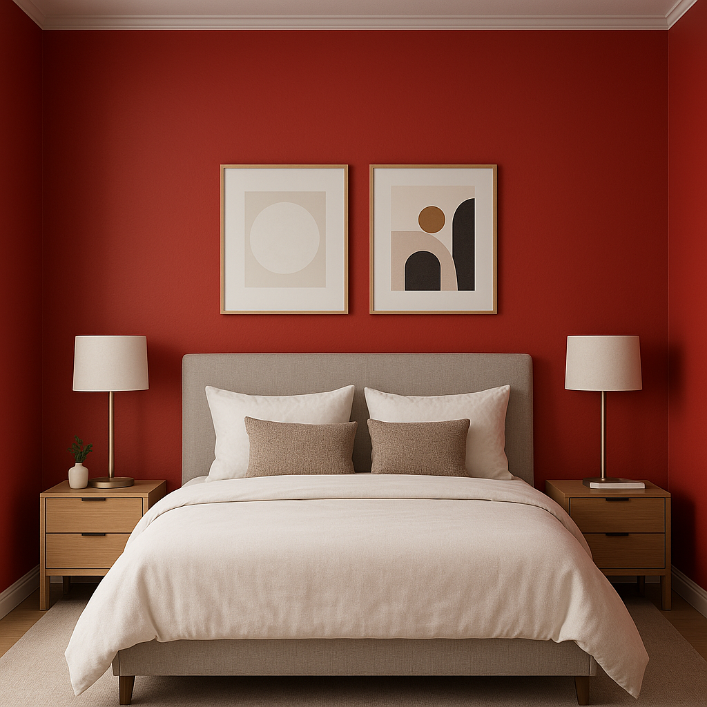
Create an unforgettable focal point by using Stop on an accent wall. Its vibrant tone draws the eye and adds dimension to living rooms, dining rooms, or home offices. Pair it with neutral furniture and decor for a balanced look.
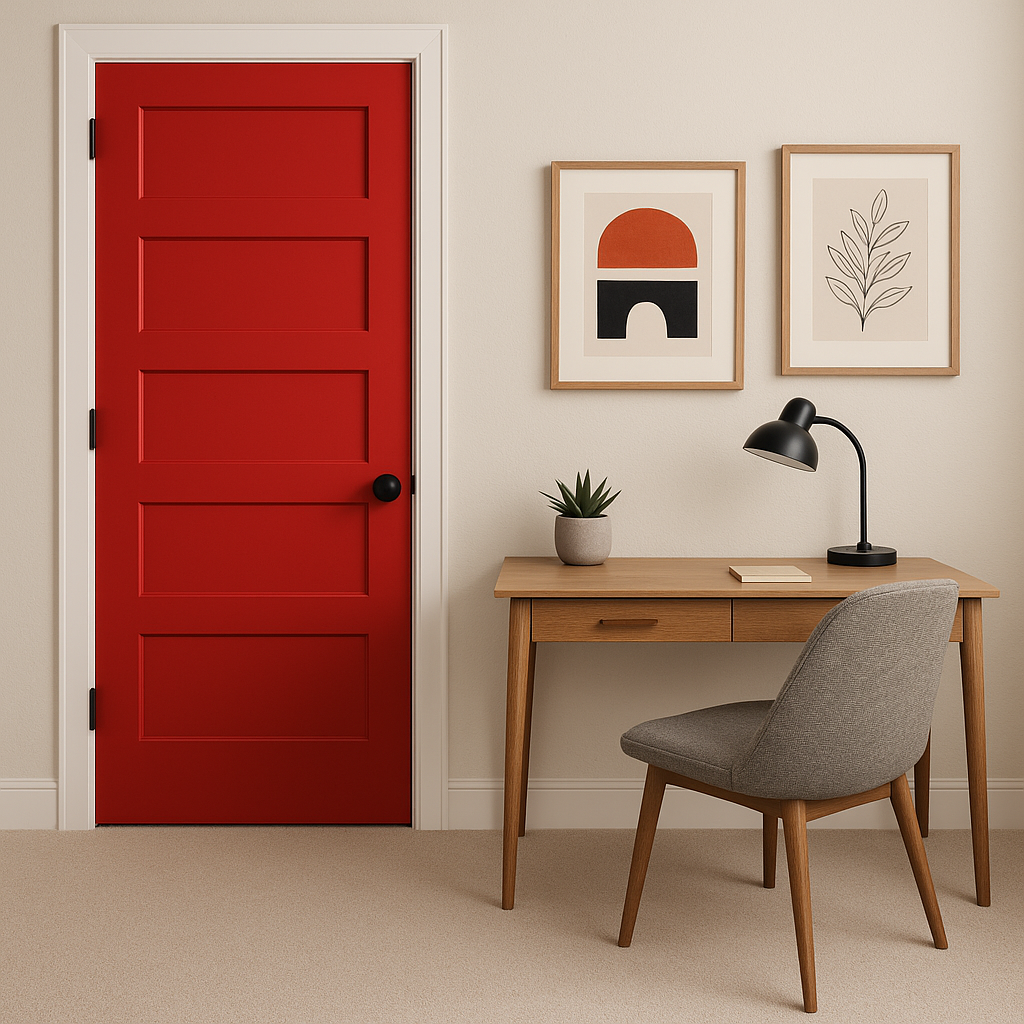
Make a stunning first impression with a front door painted in Stop. Its boldness radiates warmth, energy, and personality, setting a welcoming tone for your home’s exterior.
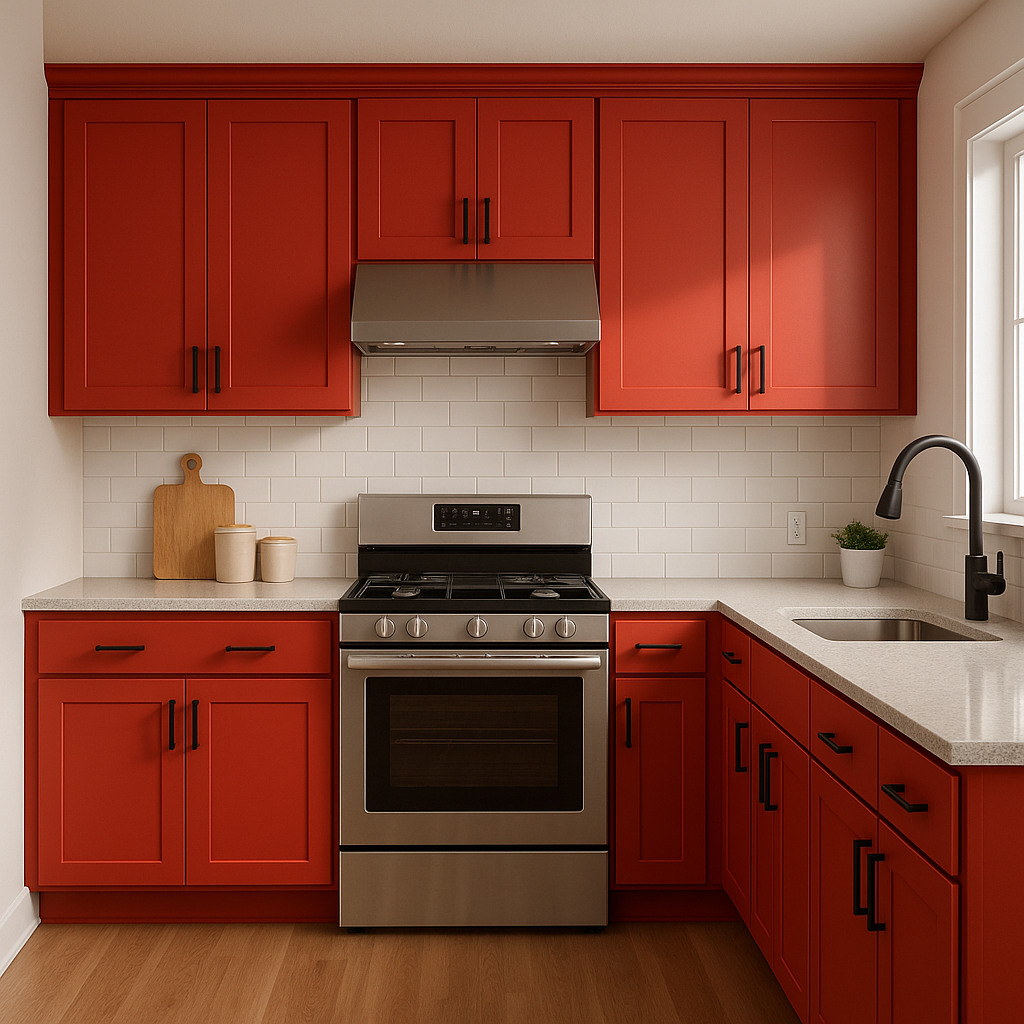
For those who aren’t afraid to embrace color, Stop is a fantastic choice for kitchen cabinets or a bold backsplash. Pair it with white countertops and stainless steel appliances for a modern, high-contrast look.
If painting an entire wall feels too daring, incorporate Stop through artwork, decorative accents, or textiles like throw pillows and rugs. This will add pops of color without overwhelming the space.
Stop’s vibrant energy makes it ideal for retail shops, restaurants, or cafes where you want to evoke excitement and stimulate conversation. Use it on feature walls, signage, or branding elements to leave a lasting impression.
The appearance of Stop can shift depending on lighting conditions. In spaces with ample natural light, it becomes brighter and more vibrant, emphasizing its boldness. In dimly lit areas, it takes on a richer, deeper tone, offering a dramatic effect. Pairing Stop with thoughtful lighting choices can help you achieve the desired mood for your space.
Sherwin-Williams Stop (SW 6869) is not for the faint of heart, but for those who embrace its daring spirit, it delivers a dynamic, unforgettable presence. Whether you’re looking to energize a room or make a bold design statement, this color is your go-to choice for bold sophistication.
Note: These images were all generated with AI, there may be inaccurate color results. Please only use a general reference to get a rough idea of what a color may look like, we will continue to generate new images to improve accuracy.
View Colors Only by Brand (No Imagery):
Sherwin-Williams
|
Benjamin-Moore
|
Behr
|
Valspar
Live on the Eastern Slope of Colorado and looking for a local painting professional, check out all our painting services and reach out for a free estimate.
Copyright © 2026 : Wild Fox Painting Inc. : 12435 Mead Way, Littleton, CO 80125


