Sherwin-Williams Knockout Orange (6885) is a vibrant, audacious paint color that instantly commands attention. This saturated orange hue radiates warmth, energy, and enthusiasm, making it an exceptional choice for spaces that aim to inspire creativity or evoke a sense of vitality. Whether you're designing a statement wall or incorporating it into a bold color palette, Knockout Orange is a choice that brings a dynamic flair to your interiors.
Knockout Orange is a true orange with minimal deviation from its core hue, but it carries subtle red undertones that give it an intense vibrancy. These undertones ensure that the color feels warm and inviting rather than overly harsh. It’s not overly yellow, nor does it lean too far into cooler tones, which makes it ideal for those seeking a pure, impactful orange.
Pairing Knockout Orange with complementary or neutral tones can enhance its visual impact while ensuring balance in your design. Here are some coordinating colors to consider:
Knockout Orange is a versatile color that can be used in various ways to achieve different effects:
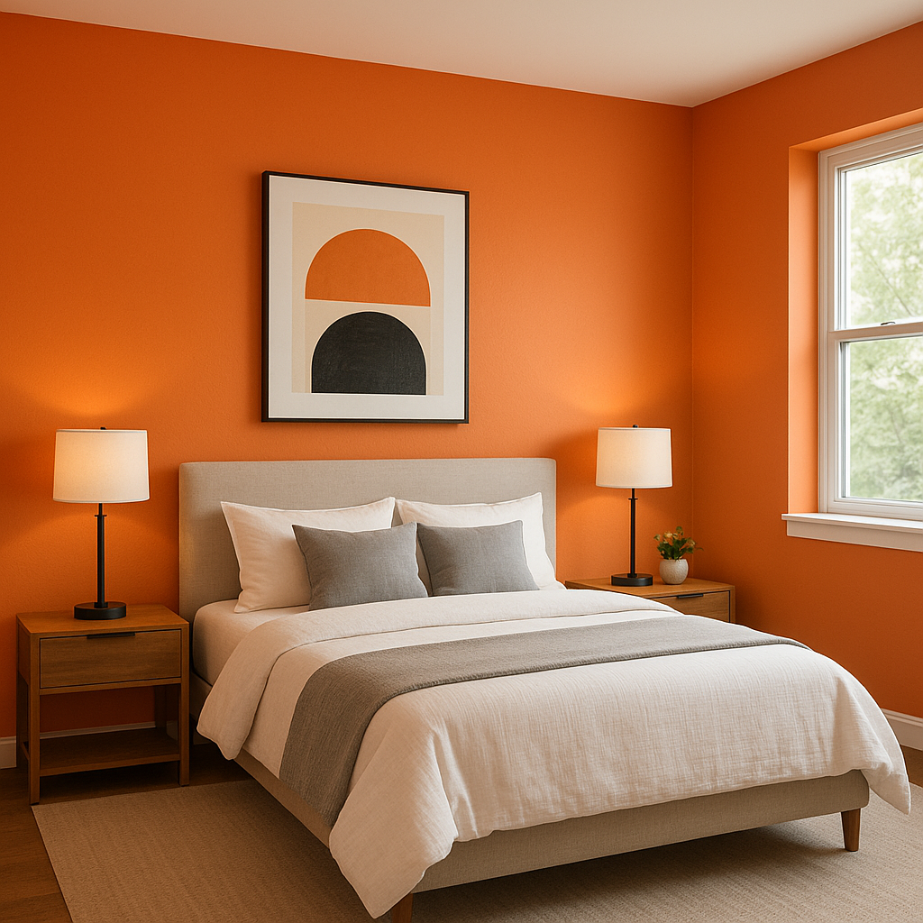
Use Knockout Orange to create an accent wall in spaces like home offices, living rooms, or kids' playrooms. Its energizing qualities can help stimulate creativity and focus while adding a unique personality to the room.
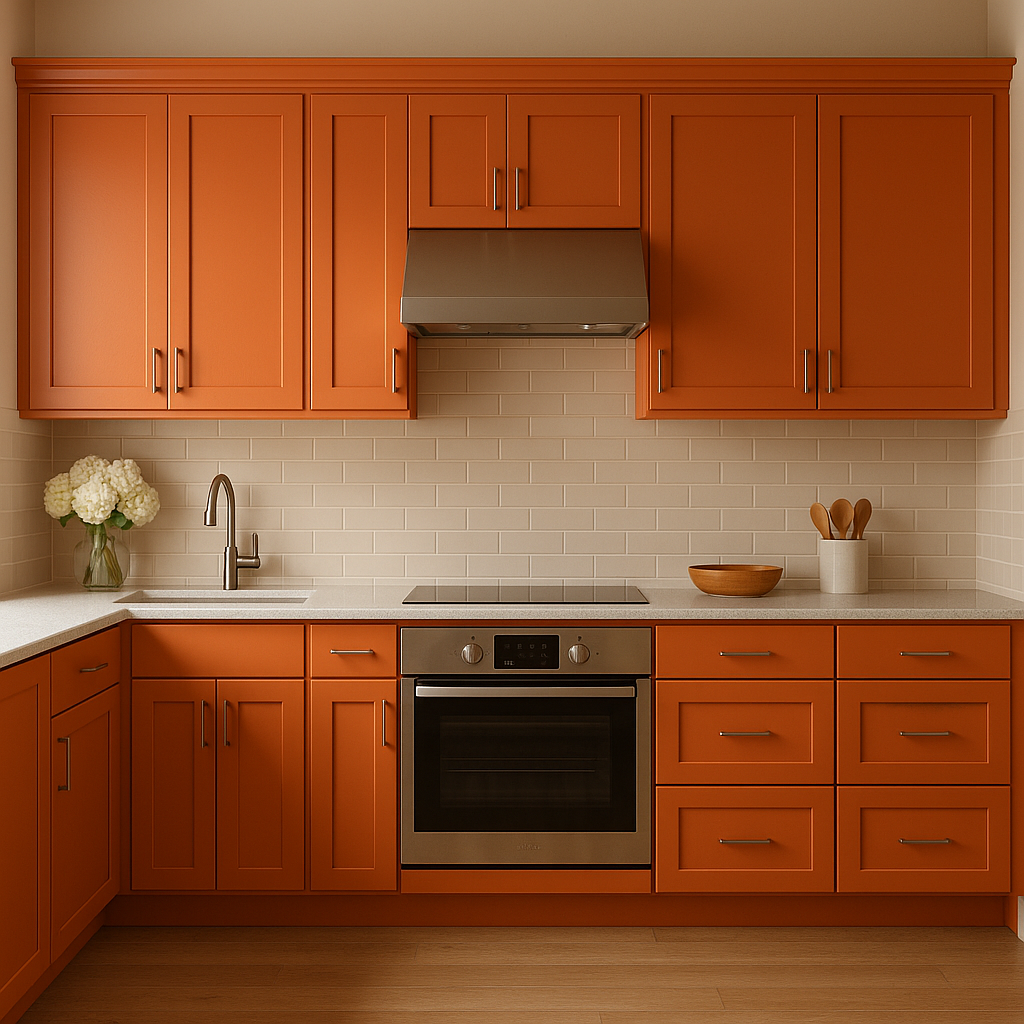
Incorporate Knockout Orange into your design with painted furniture, cabinetry, or decorative pieces. A painted console table, accent chair, or even kitchen island in this shade can act as a bold focal point without overwhelming the space.
Knockout Orange is an excellent choice for commercial interiors, including retail spaces, restaurants, or creative studios. Its vibrant energy can evoke excitement and engagement, making it ideal for environments that thrive on movement and interaction.
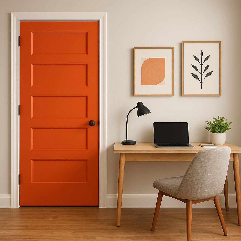
This bold hue works wonderfully for exterior doors, shutters, or even patio furniture. Knockout Orange adds a cheerful pop of color that pairs beautifully with greenery and natural surroundings, making it perfect for outdoor spaces.
For a modern and playful look, use Knockout Orange alongside contrasting colors like teal or navy in a color-blocking design. This technique works well for contemporary interiors and offers a youthful, dynamic aesthetic.
Knockout Orange shifts slightly depending on lighting conditions. In spaces with ample natural light, the color appears bright, lively, and energetic. In dimmer settings or under artificial lighting, its rich red undertones become more pronounced, lending a deeper and more dramatic feel. Consider the type of lighting in your space to ensure the desired effect is achieved.
Sherwin-Williams Knockout Orange (6885) is more than just a paint color—it's a declaration of boldness and creativity. With its unwavering vibrancy, subtle undertones, and versatile uses, this hue can transform any space into a lively and captivating environment. Whether paired with neutrals for a balanced look or contrasted with deeper tones for added drama, Knockout Orange brings a fresh perspective to modern design.
Note: These images were all generated with AI, there may be inaccurate color results. Please only use a general reference to get a rough idea of what a color may look like, we will continue to generate new images to improve accuracy.
View Colors Only by Brand (No Imagery):
Sherwin-Williams
|
Benjamin-Moore
|
Behr
|
Valspar
Live on the Eastern Slope of Colorado and looking for a local painting professional, check out all our painting services and reach out for a free estimate.
Copyright © 2026 : Wild Fox Painting Inc. : 12435 Mead Way, Littleton, CO 80125


