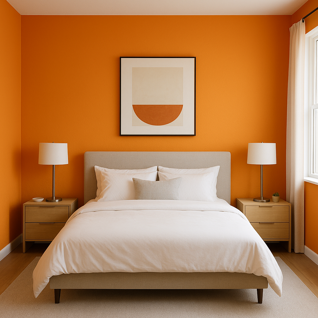
Sherwin-Williams Carnival 6892 is a bold and energetic pink that injects life and personality into any space it graces. Radiating warmth and playfulness, this vivid hue is perfect for creating a cheerful atmosphere while making a confident design statement. Whether you're looking to create a focal point or infuse a space with a dose of fun, Carnival 6892 is an unforgettable choice that refuses to blend into the background.
Carnival 6892 is a striking pink with distinct red undertones that give it a rich, saturated appearance. These undertones make the color lean closer to the warmer side of the spectrum, making it feel inviting and stimulating rather than overly sweet. The slight red influence adds depth, preventing the color from feeling flat or juvenile. It’s this dynamic blend of vibrancy and warmth that makes Carnival 6892 so appealing in both modern and eclectic design styles.
When designing with bold hues like Carnival 6892, choosing the right coordinating colors is essential to create balance and harmony. Here are some versatile options to pair with this lively shade:
Neutrals: To let Carnival 6892 shine as the star of the show, pair it with soft, neutral tones like Sherwin-Williams Pure White (7005) or Agreeable Gray (7029). These muted shades provide a calming backdrop that allows the pink to pop without overwhelming the space.
Complementary Hues: For a high-energy, complementary pairing, consider a rich teal or turquoise like Sherwin-Williams Waterscape (6470). These blues create a striking contrast that enhances the vibrancy of Carnival 6892.
Analogous Colors: For a harmonious, monochromatic feel, pair Carnival 6892 with softer pinks like In the Pink (6583) or deeper reds like Heartthrob (6866). This creates a layered, cohesive look that feels dynamic yet unified.
Earthy Accents: For an unexpected twist, pair this bold pink with earthy greens like Clary Sage (6178) or muted browns like Poised Taupe (6039). These tones can ground the vibrancy of Carnival 6892 while adding a sense of sophistication.
Carnival 6892 is a versatile shade that can be used in a variety of design applications, from accent walls to statement pieces. Below are some ideas for incorporating this vivacious color into your home or commercial space:
Carnival 6892 makes an exceptional choice for an accent wall in spaces like living rooms, bedrooms, or even creative workspaces. Its boldness draws the eye and creates a focal point, instantly energizing the room. Pair it with white or light neutral walls to keep the overall look balanced.
If you’re not ready to commit to a full wall of Carnival 6892, consider using it on furniture or décor items. Painted chairs, side tables, or even a bookshelf in this hue can add a pop of personality to an otherwise subdued space.
This playful shade is perfect for children’s bedrooms, playrooms, or nurseries. Its cheerful energy encourages creativity and joy, making it a perfect choice for a space designed for fun.
For businesses, this color can be used to create a dynamic and inviting environment. Think pink feature walls in boutiques, cafes, or salons. Carnival 6892’s high-energy vibe makes it a great choice for spaces where you want to captivate attention and evoke positivity.
Note: These images were all generated with AI, there may be inaccurate color results. Please only use a general reference to get a rough idea of what a color may look like, we will continue to generate new images to improve accuracy.
View Colors Only by Brand (No Imagery):
Sherwin-Williams
|
Benjamin-Moore
|
Behr
|
Valspar
Live on the Eastern Slope of Colorado and looking for a local painting professional, check out all our painting services and reach out for a free estimate.
Copyright © 2026 : Wild Fox Painting Inc. : 12435 Mead Way, Littleton, CO 80125


