Sherwin-Williams Daffodil 6901 is a vibrant, cheerful yellow that instantly brings warmth and energy to any room. Like the blooming flower it’s named after, this color exudes a sense of optimism, joy, and renewal, making it an excellent choice for homeowners and designers looking to create a lively and inviting atmosphere. Whether used as a bold accent or a primary wall color, Daffodil 6901 is sure to transform your home into a space bursting with personality.
Daffodil 6901 is a true yellow with subtle golden undertones, giving it just the right amount of warmth without veering into neon or overly bright territory. These golden undertones soften the hue, making it versatile enough to work in a variety of spaces, from modern to traditional interiors. Its sunny yet grounded nature ensures the color feels uplifting without being overpowering.
Pairing Daffodil 6901 with the right coordinating colors can elevate your design and create a harmonious palette. Here are some suggestions:
Daffodil 6901 is a versatile hue that can be used in various ways throughout your home. Here are some ideas on where and how to incorporate this sunny shade:
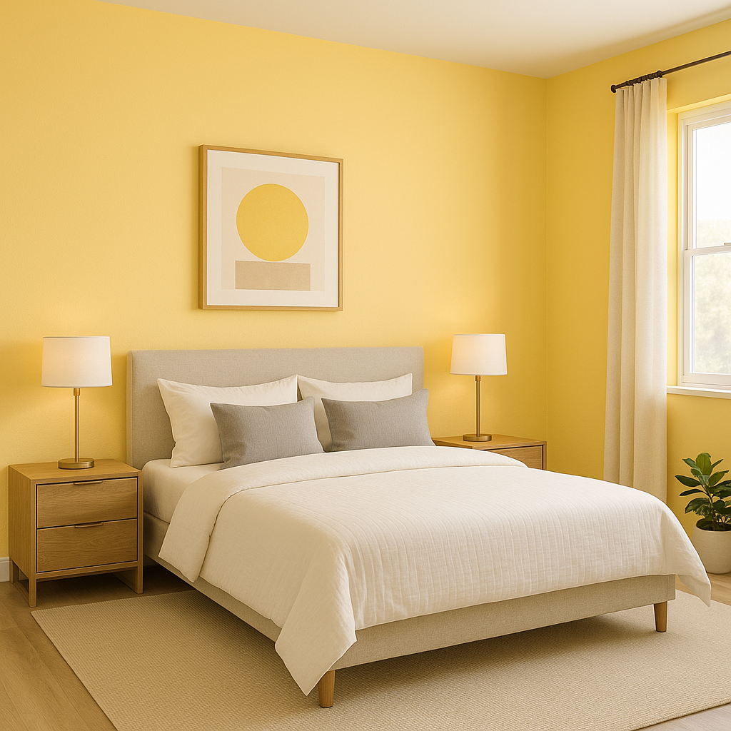
Daffodil makes for a stunning accent wall in living rooms, bedrooms, or dining spaces. Its bold nature creates a focal point, drawing the eye and adding character to the room. Pair it with neutral walls for a balanced look.
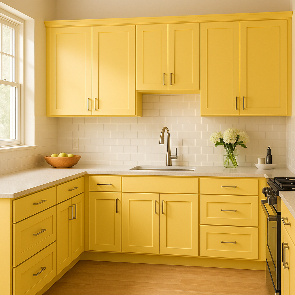
Bring a sense of warmth and happiness to your kitchen by using Daffodil on cabinets, backsplashes, or even a kitchen island. It pairs beautifully with white or light gray countertops for a clean and modern aesthetic.
Daffodil’s bright and playful energy makes it a natural choice for kids' spaces. It encourages creativity and joy while maintaining a timeless look that can grow with the child.
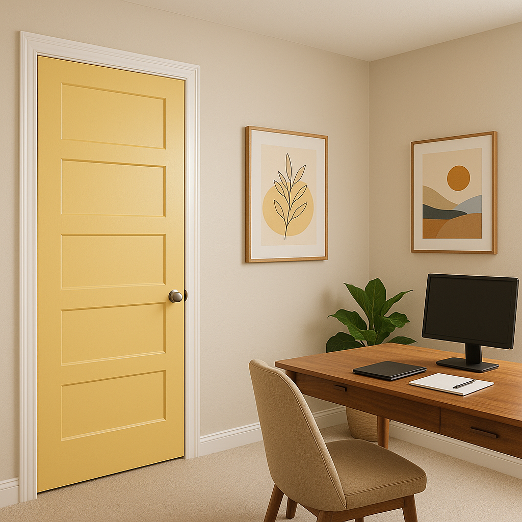
Make a bold statement by painting your front door in Daffodil. Its sunny disposition is welcoming and instantly boosts curb appeal. For exteriors, pair it with white trim and gray siding for a cheerful yet sophisticated look.
If committing to yellow walls feels like too much, try incorporating Daffodil on furniture, such as a painted dresser, or through accessories like throw pillows, rugs, or artwork. This allows you to bring energy into the space without overwhelming it.
Note: These images were all generated with AI, there may be inaccurate color results. Please only use a general reference to get a rough idea of what a color may look like, we will continue to generate new images to improve accuracy.
View Colors Only by Brand (No Imagery):
Sherwin-Williams
|
Benjamin-Moore
|
Behr
|
Valspar
Live on the Eastern Slope of Colorado and looking for a local painting professional, check out all our painting services and reach out for a free estimate.
Copyright © 2026 : Wild Fox Painting Inc. : 12435 Mead Way, Littleton, CO 80125


