Sherwin-Williams Goldfinch (SW 6905) is a radiant and cheerful yellow that brings a joyful energy to any space. This color evokes the warmth of golden sunlight and the playful vibrancy of nature, making it a delightful choice for homeowners and designers seeking a lively, uplifting atmosphere. With its bold presence, Goldfinch is a perfect way to infuse personality into your interiors while maintaining a polished and sophisticated look.
Goldfinch carries subtle warm undertones, often leaning toward orange-gold. These undertones give the color a rich depth, making it feel more grounded than brighter, cooler yellows. Unlike pastel yellows, which can sometimes appear pale or washed-out, Goldfinch is saturated and full-bodied, offering a distinct sense of vitality. This warm yellow is ideal for spaces where you want to create a sunny and welcoming environment.
Goldfinch pairs beautifully with a variety of complementary and contrasting shades, allowing you to create versatile color palettes for your home. Here are some coordinating colors to consider:
Neutrals: Pair Goldfinch with soft, neutral tones like Sherwin-Williams Alabaster (SW 7008) or Pure White (SW 7005). These whites provide a clean backdrop that allows Goldfinch to shine as the focal point. For a warmer neutral, consider Agreeable Gray (SW 7029), which balances Goldfinch’s brightness with subtle sophistication.
Greens: To highlight Goldfinch's natural vibrancy, pair it with earthy greens like Sherwin-Williams Clary Sage (SW 6178) or Basil (SW 6194). These shades evoke a garden-inspired aesthetic, bringing a harmonious blend of warmth and freshness.
Blues: Contrast Goldfinch with cooler tones such as Sherwin-Williams Naval (SW 6244) or Tidewater (SW 6477). The deep navy of Naval creates a dramatic and sophisticated pairing, while Tidewater offers a breezy coastal vibe.
Accent Colors: For bold accents, try Sherwin-Williams Show Stopper (SW 7588), a vivid red, or Tricorn Black (SW 6258), a timeless and striking black. These shades amplify Goldfinch’s energy and create a dynamic visual impact.
Goldfinch is a versatile color that works well in a variety of settings, whether you’re looking to make a statement or subtly uplift a room. Here are some creative ways to incorporate Goldfinch into your home:
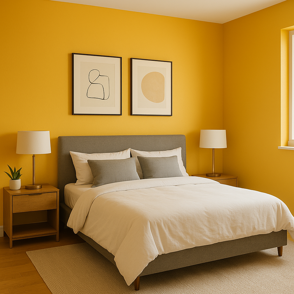
Accent Walls: Goldfinch is an ideal choice for an accent wall in living rooms, dining areas, or bedrooms. Its sunny hue instantly energizes the space and draws attention to key architectural features.
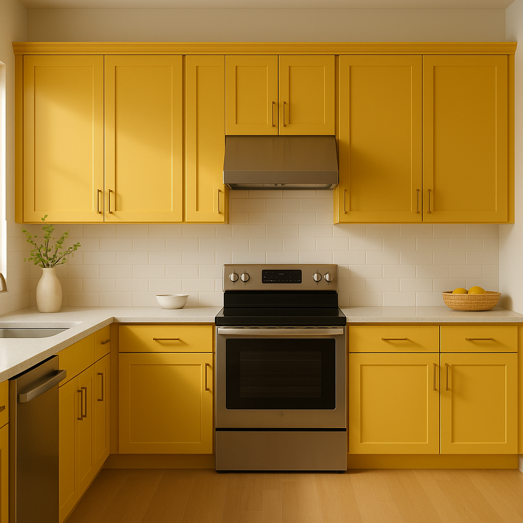
Kitchen & Dining Spaces: Brighten up your kitchen or breakfast nook with Goldfinch as a wall color or cabinet finish. Pair it with white subway tiles and wooden accents for a warm and welcoming farmhouse-inspired look.
Children’s Rooms: Transform playrooms or bedrooms into cheerful spaces with Goldfinch as the main color. Its lively energy promotes creativity and joy, making it perfect for kids.
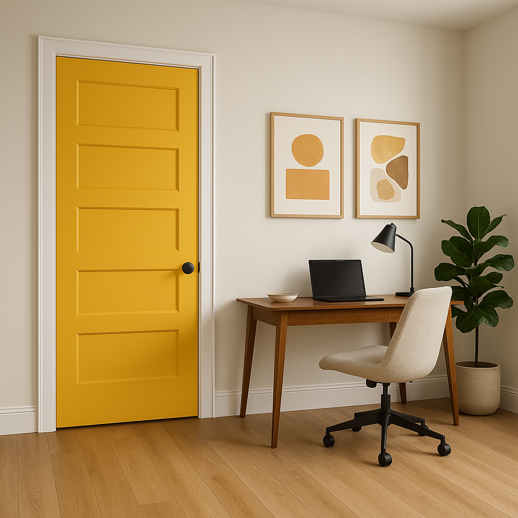
Entryways: Make a bold first impression by using Goldfinch in entryways or foyers. Its vibrant tone creates an inviting atmosphere and sets the mood for the rest of your home.
Decorative Accents: For a subtler approach, use Goldfinch in smaller doses, such as furniture pieces, throw pillows, or artwork. It’s a fantastic way to add warmth and personality without overwhelming the room.
Goldfinch’s appearance can shift depending on the lighting in your space. In natural daylight, its golden warmth radiates brightly, while under soft, incandescent lighting, the color takes on a cozier, amber-like glow. Be mindful of how your room’s lighting influences the color, and consider testing it with paint samples on different walls at various times of the day.
Sherwin-Williams Goldfinch (SW 6905) is a color that embodies optimism and energy, making it an excellent choice for spaces that need a boost of brightness and warmth. Whether you choose to use it as a statement shade or an accent, Goldfinch has the power to transform a room into a lively and inviting retreat.
Note: These images were all generated with AI, there may be inaccurate color results. Please only use a general reference to get a rough idea of what a color may look like, we will continue to generate new images to improve accuracy.
View Colors Only by Brand (No Imagery):
Sherwin-Williams
|
Benjamin-Moore
|
Behr
|
Valspar
Live on the Eastern Slope of Colorado and looking for a local painting professional, check out all our painting services and reach out for a free estimate.
Copyright © 2026 : Wild Fox Painting Inc. : 12435 Mead Way, Littleton, CO 80125


