Sherwin-Williams Nifty Turquoise (SW 6941) is a dynamic, vivid shade that transforms ordinary spaces into extraordinary ones. This captivating color is reminiscent of tropical waters and precious gemstones, offering a bold yet approachable aesthetic. Whether used as a feature color or an accent, Nifty Turquoise brings energy, personality, and a touch of sophistication to any interior or exterior project.
Nifty Turquoise has striking blue and green undertones, creating a balanced, medium-toned turquoise hue. The green undertones lend it a slightly earthy edge, while the blue undertones evoke a fresh, airy vibe. Depending on the lighting, it can appear cooler or warmer, making it incredibly versatile. In spaces with natural sunlight, the blue tones become more prominent, while artificial lighting can emphasize its softer green qualities.
Pairing Nifty Turquoise with complementary and coordinating colors can enhance its vibrancy and create harmonious designs. Whether you're aiming for a bold statement or subtle sophistication, here are some excellent combinations:
Neutrals:
Complementary Colors:
Accent Colors:
Nifty Turquoise is a versatile hue that can be used across a wide range of design styles, from contemporary coastal to eclectic bohemian. Here are some inspiring ways to incorporate this lively shade into your space:
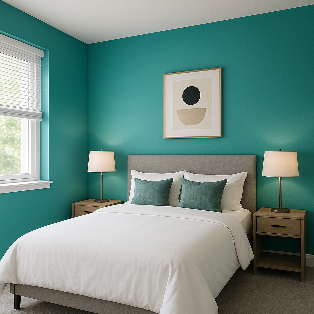
Create a focal point in living rooms, bedrooms, or home offices by painting an accent wall in Nifty Turquoise. Its bold character draws attention and breathes life into neutral spaces.
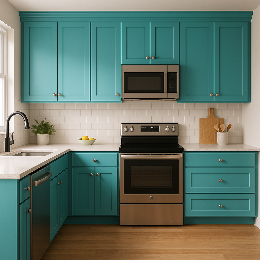
For homeowners seeking a refreshing twist on cabinetry, Nifty Turquoise is an eye-catching option. Pair it with brass or matte black hardware for a modern, high-contrast look.
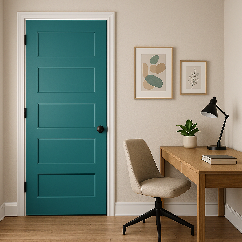
Transform your porch, patio furniture, or exterior doors with Nifty Turquoise for a tropical, welcoming vibe. When paired with lush greenery or neutral stucco, it evokes the feeling of an island retreat.
Infuse joy and creativity into kids' spaces by using this turquoise shade. Its vibrant energy sparks imagination and makes the room a fun, engaging environment.
If painting walls feels like too much commitment, consider using Nifty Turquoise in smaller doses. Incorporate it through throw pillows, area rugs, artwork, or lampshades to give your room a playful pop of color.
As with any color, lighting plays a crucial role in how Nifty Turquoise appears. In north-facing rooms with cooler light, the blue undertones may dominate, giving the color a more tranquil vibe. In south-facing rooms with warmer sunlight, the green undertones shine through, creating a slightly earthy appearance. Pair it with soft, warm lighting fixtures for a cozy ambiance or cooler LED lights for a crisp, modern feel.
Nifty Turquoise works exceptionally well in coastal-inspired interiors, where its oceanic tones complement sandy beiges and weathered woods. It also thrives in bohemian spaces, especially when paired with vibrant textiles, natural fibers, and global accents. For a more contemporary approach, combine it with sleek metallics or monochromatic palettes to achieve a chic, polished look.
Sherwin-Williams Nifty Turquoise (SW 6941) is not just a paint color—it’s a design statement. Whether you’re looking to revitalize an understated room or add a playful twist to your home, this versatile hue delivers charm, energy, and elegance every single time.
Note: These images were all generated with AI, there may be inaccurate color results. Please only use a general reference to get a rough idea of what a color may look like, we will continue to generate new images to improve accuracy.
View Colors Only by Brand (No Imagery):
Sherwin-Williams
|
Benjamin-Moore
|
Behr
|
Valspar
Live on the Eastern Slope of Colorado and looking for a local painting professional, check out all our painting services and reach out for a free estimate.
Copyright © 2026 : Wild Fox Painting Inc. : 12435 Mead Way, Littleton, CO 80125


