Sherwin-Williams Splashy (SW 6942) is a bold, eye-catching hue that brings an undeniable sense of energy and dynamism to any space. This lively, medium-toned teal is a perfect blend of blue and green, creating a refreshing color that feels both adventurous and balanced. Whether you're looking to make a statement or subtly infuse depth into your palette, Splashy offers versatility with a touch of playfulness.
Splashy carries cool undertones of blue, which lend it a calming and serene vibe despite its vibrant appearance. The green undertones add warmth and vitality, making it feel approachable and fresh. These dual undertones give Splashy its unique ability to bridge the gap between invigorating and soothing, making it equally suitable for upbeat modern spaces and tranquil retreats.
To create a harmonious design, pair Splashy with complementary or contrasting hues that enhance its bold personality. Sherwin-Williams offers a range of coordinating colors to elevate the look:
Sherwin-Williams Splashy is versatile enough to work in a variety of spaces and design styles. Here are some creative ways to incorporate this dynamic color into your home or commercial environment:
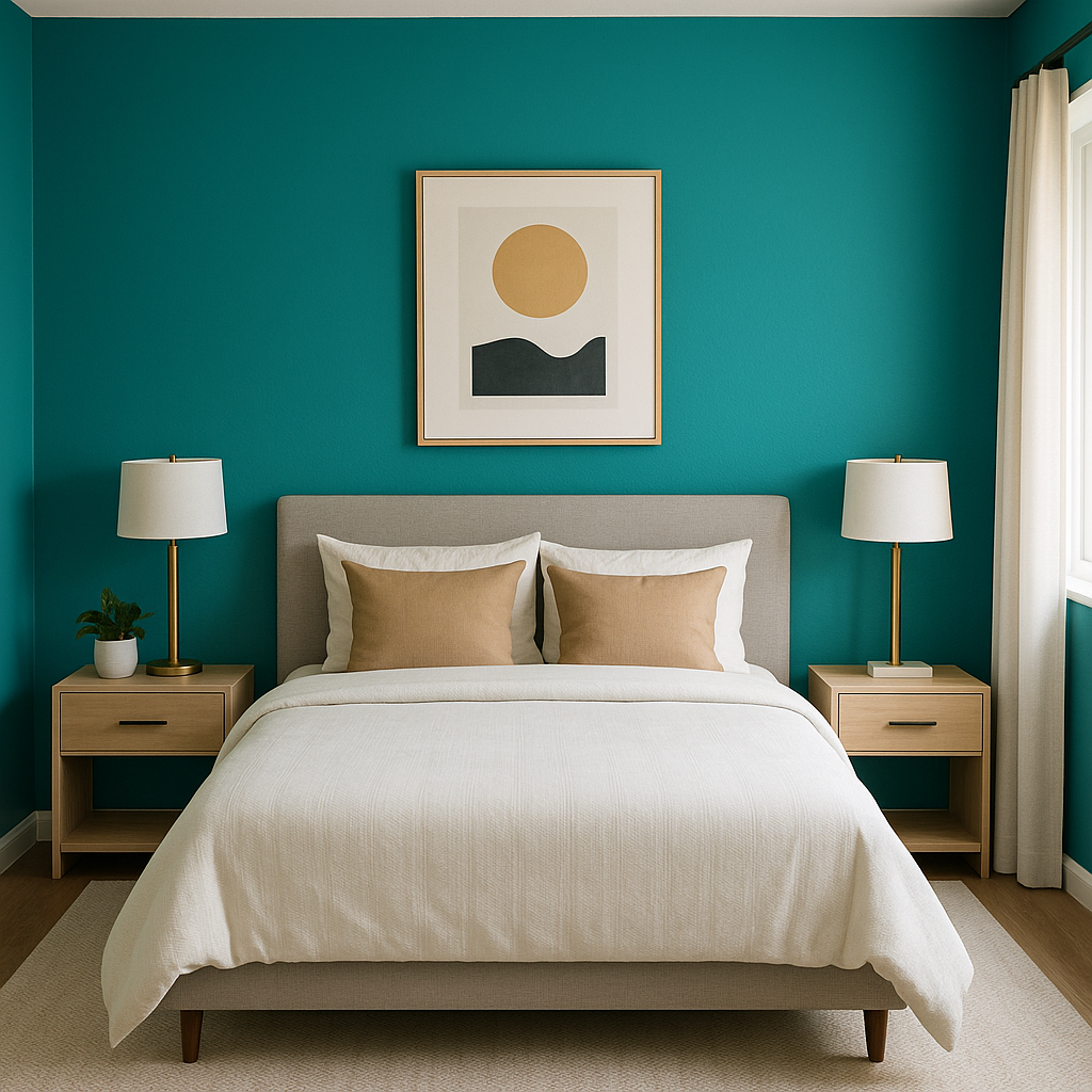
Use Splashy for a statement-making accent wall in living rooms, bedrooms, or dining areas. Its vibrant quality draws the eye and creates a focal point, perfect for spaces that need a dramatic pop of color.
Splashy works beautifully in bathrooms, especially when paired with crisp white tiles or fixtures. Its aquatic-inspired tones evoke a spa-like atmosphere, making it an excellent choice for creating a refreshing retreat.
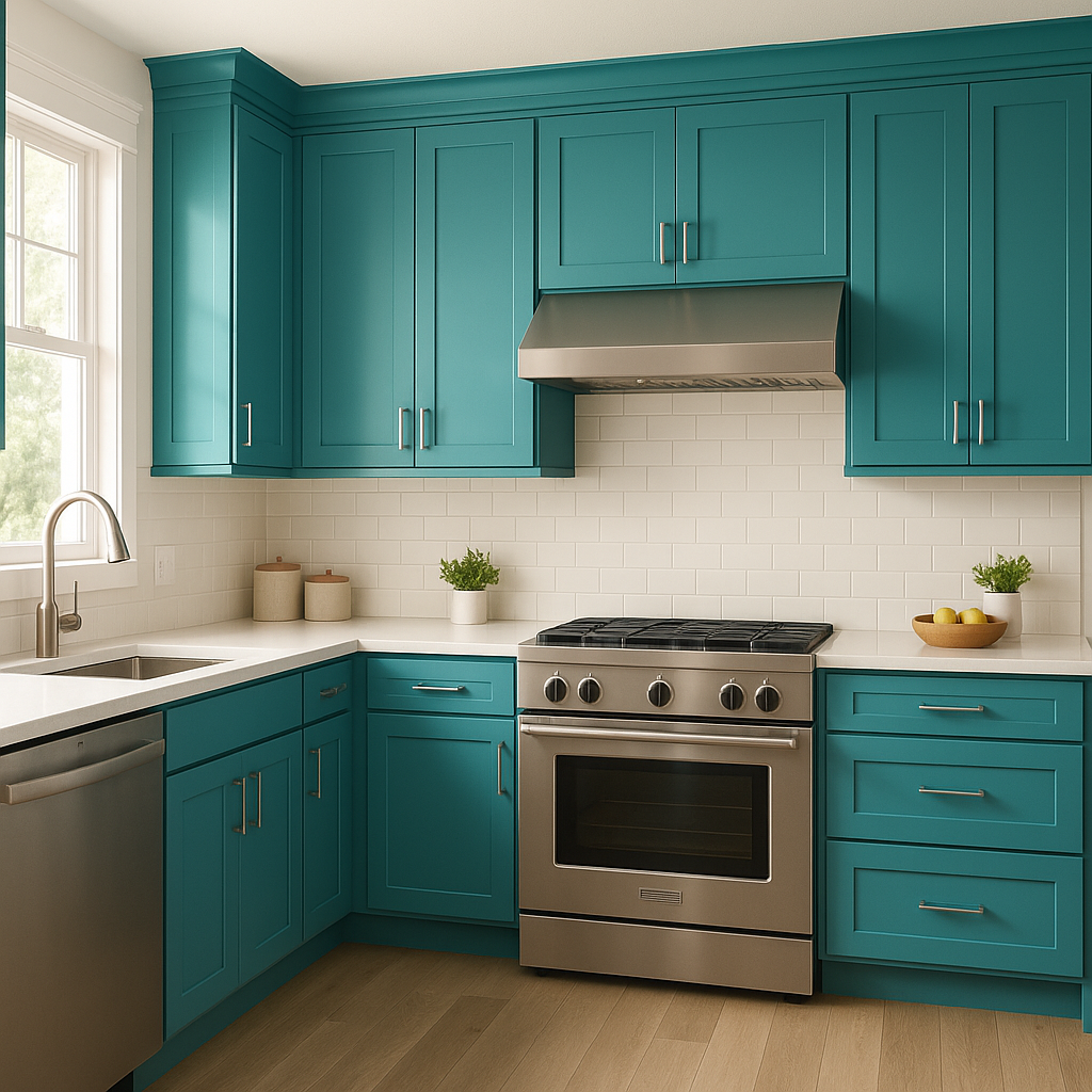
Infuse personality into your kitchen by using Splashy on cabinetry or as a backsplash color. Pair it with neutral countertops and metallic hardware for a modern, stylish look.
Its playful and energetic vibe makes Splashy a fantastic option for kids’ spaces. Combine it with warm yellows or soft grays for a cheerful yet balanced palette.
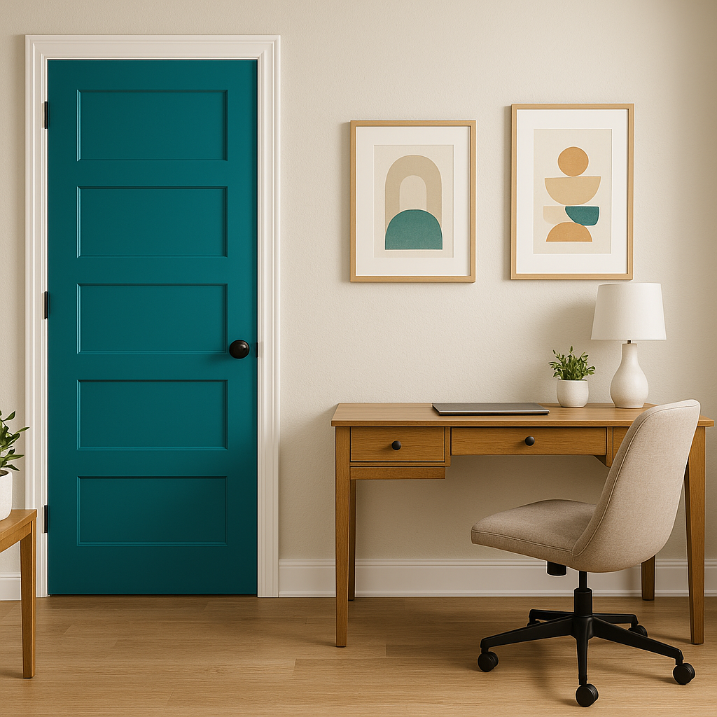
Splashy isn’t limited to interiors—it’s also a striking option for exterior doors, shutters, or trim. Paired with neutral siding colors, it adds a distinctive curb appeal that sets your home apart.
When incorporating Splashy into your design, balance its vibrancy with neutral or muted tones to avoid overwhelming the space. Incorporate natural materials like wood, rattan, or stone to ground the color and create a cohesive look. Metallic finishes, such as brushed nickel or gold, can also enhance Splashy’s modern appeal and introduce a touch of glamour.
Sherwin-Williams Splashy (SW 6942) is more than just a paint color—it's a statement. Whether you’re designing a chic modern home or a playful eclectic space, Splashy brings energy, creativity, and a touch of sophistication to your palette.
Note: These images were all generated with AI, there may be inaccurate color results. Please only use a general reference to get a rough idea of what a color may look like, we will continue to generate new images to improve accuracy.
View Colors Only by Brand (No Imagery):
Sherwin-Williams
|
Benjamin-Moore
|
Behr
|
Valspar
Live on the Eastern Slope of Colorado and looking for a local painting professional, check out all our painting services and reach out for a free estimate.
Copyright © 2026 : Wild Fox Painting Inc. : 12435 Mead Way, Littleton, CO 80125


