Sherwin-Williams Downy (7002) is a timeless, soft off-white paint color that exudes warmth and elegance. It’s a versatile choice, perfect for homeowners and designers seeking a neutral backdrop that complements various design styles. With its delicate balance of warmth and coolness, Downy offers an inviting aesthetic that feels effortlessly chic.
Downy features subtle peach and beige undertones that add a gentle warmth to the color without overpowering the space. These undertones make it an excellent choice for rooms where you want a cozy yet refined ambiance. Unlike stark whites, Downy softens the edges of a room, creating a more approachable and lived-in feel. This warmth makes it particularly well-suited for spaces with natural light, as the color will radiate a soft glow throughout the day.
Sherwin-Williams Downy pairs beautifully with a variety of complementary shades, making it highly adaptable for any palette. Here are some coordinating colors to consider:
The flexibility of Downy allows it to work seamlessly in various design styles, whether you're aiming for a minimalist, coastal, farmhouse, or traditional aesthetic.
Downy’s soft and inviting nature makes it suitable for a wide range of applications. Here are some ideas for where this color can shine:
Downy is an excellent choice for living rooms, where comfort and versatility are key. Pair it with warm wood tones, textured fabrics, and accent colors like muted blues or greens to create a relaxing yet stylish environment.
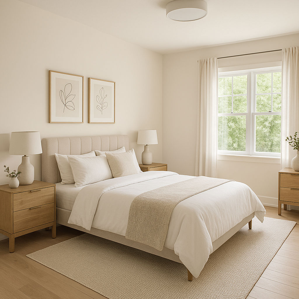
The calming qualities of Downy make it ideal for bedrooms. Use it as a wall color to set a soothing tone, and complement it with soft linens and warm metallics like brass or gold for a serene retreat.
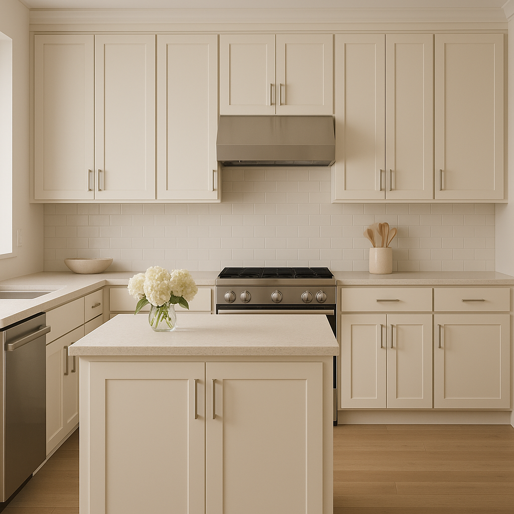
For a fresh and airy kitchen, Downy works beautifully on walls or cabinetry. Pair it with white subway tiles, natural stone countertops, and coordinating neutrals for an understated yet polished look.
Downy’s gentle warmth is perfect for bathrooms, where it can create a spa-like atmosphere. Combine it with pale gray tiles, white trim, and brushed nickel fixtures for a timeless and tranquil space.
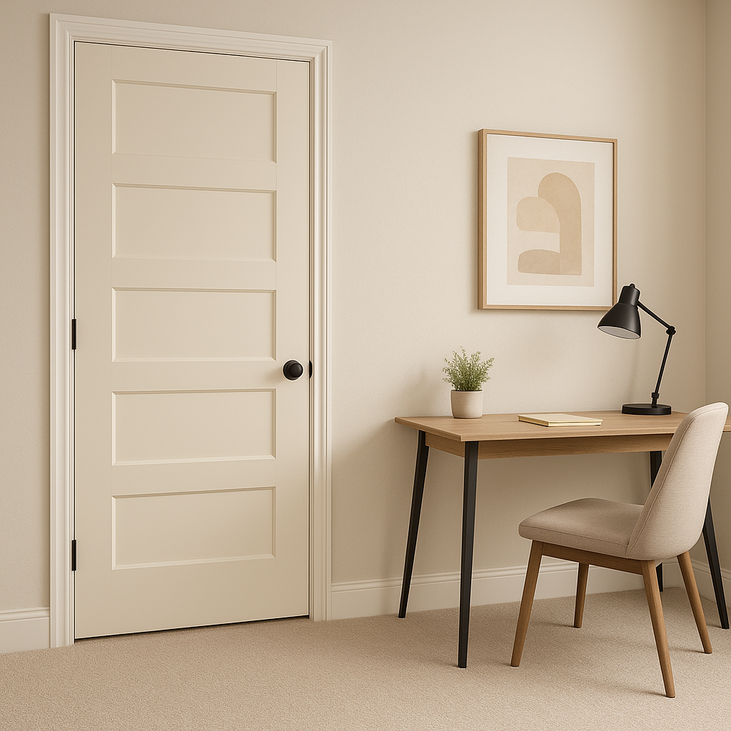
In transitional spaces like hallways and entryways, Downy serves as the perfect neutral backdrop. Its subtle undertones add depth to these often-overlooked areas without overwhelming the space.
Downy isn’t limited to interior spaces; it’s equally stunning as an exterior paint color. Its soft neutral tone works beautifully with darker accents like charcoal or deep green shutters, creating a sophisticated curb appeal.
Sherwin-Williams Downy (7002) is more than just a paint color—it's a design element that brings warmth and versatility to any space. Its balanced undertones, compatibility with coordinating colors, and ability to adapt to various uses make it a go-to choice for homeowners and designers alike. Whether you’re updating a single room or transforming your entire home, Downy is the perfect canvas for creating a welcoming and harmonious environment.
Note: These images were all generated with AI, there may be inaccurate color results. Please only use a general reference to get a rough idea of what a color may look like, we will continue to generate new images to improve accuracy.
View Colors Only by Brand (No Imagery):
Sherwin-Williams
|
Benjamin-Moore
|
Behr
|
Valspar
Live on the Eastern Slope of Colorado and looking for a local painting professional, check out all our painting services and reach out for a free estimate.
Copyright © 2026 : Wild Fox Painting Inc. : 12435 Mead Way, Littleton, CO 80125


