Sherwin-Williams Extra White (SW 7006) is a timeless, versatile white paint color that radiates freshness, clarity, and simplicity. Its bright and crisp appearance makes it a favorite among interior designers seeking to create light, airy spaces with modern elegance. Whether you're refreshing a single room or designing an entire home, Extra White offers unmatched versatility for walls, trim, ceilings, and cabinetry.
Extra White has cool undertones with just a hint of blue. These subtle undertones give it a modern, clean appearance, making it an ideal choice for spaces where brightness and neutrality are key. Unlike warm whites that lean creamy or beige, Extra White maintains a sharper and more vivid profile. This makes it perfect for pairing with cooler color palettes and for creating contrast in designs that demand crisp edges and clarity.
It’s important to remember that lighting plays a significant role in how Extra White appears. In natural light, it reads as a pure, clean white. However, under artificial lighting, especially warm bulbs, its faint blue undertones may become more noticeable. This quality makes it especially popular for contemporary or minimalist homes, where cool tones are predominant.
Extra White is incredibly versatile and pairs beautifully with a wide variety of colors. Here are some coordinating options to consider:
Gray and Charcoal Tones: To create a modern aesthetic, pair Extra White with soft gray shades such as Sherwin-Williams Repose Gray (SW 7015) or darker options like Peppercorn (SW 7674). These colors provide a sophisticated contrast and enhance the crispness of Extra White.
Bold Accent Colors: For vibrant pops of color, try pairing Extra White with deep navy tones like Naval (SW 6244) or rich greens such as Isle of Pines (SW 6461). These striking hues stand out beautifully against the clean backdrop of Extra White.
Soft Pastels: For a gentler look, consider coordinating with muted pastels like Sea Salt (SW 6204) or Windowpane (SW 6210). These colors complement Extra White’s refreshing brightness while maintaining an airy, serene vibe.
Warm Tones for Contrast: If you want to add warmth to your space, try coordinating Extra White with beige or taupe tones like Accessible Beige (SW 7036) or Balanced Beige (SW 7033). This combination creates a balanced, transitional look that works well in both contemporary and classic settings.
Extra White thrives in spaces where light and brightness are essential. Here are some of the most common and effective uses for this versatile color:
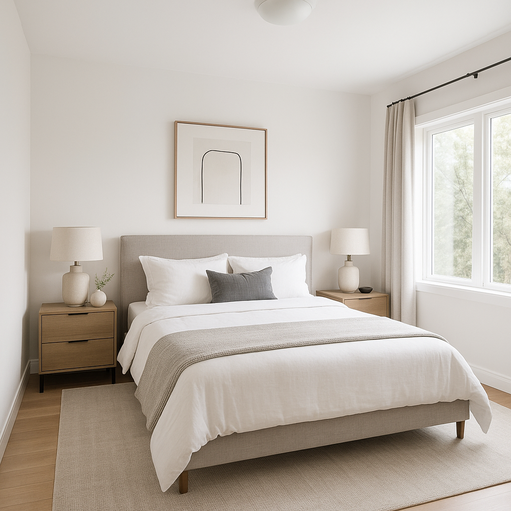
Walls and Ceilings: Extra White is a go-to choice for creating a fresh, clean canvas in living rooms, kitchens, and bathrooms. It works particularly well in spaces with ample natural light, as it enhances the brightness and openness of the area. On ceilings, it helps to reflect light and make rooms feel taller and airier.
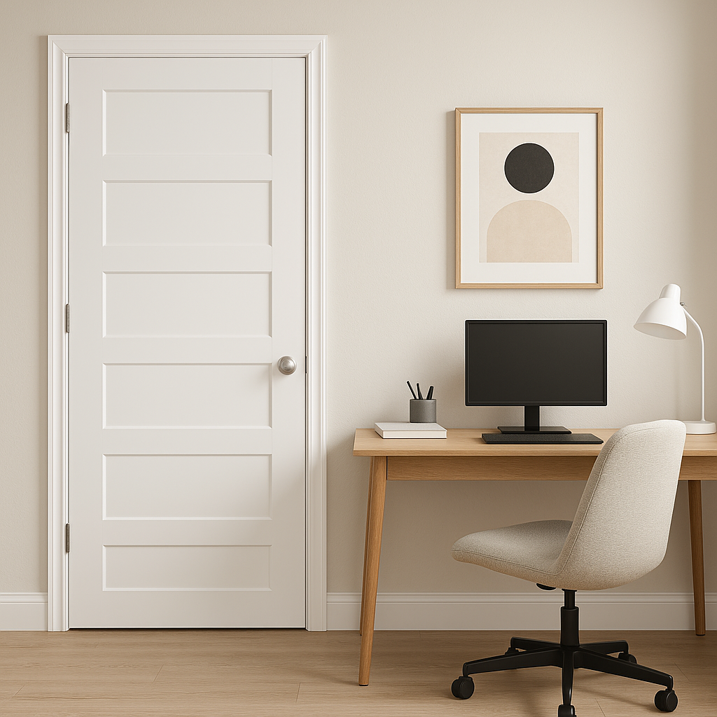
Trim and Molding: For a polished, refined look, use Extra White on trim, doors, and moldings. Its clean profile provides a sharp contrast against darker walls or accent colors, highlighting architectural details without overwhelming the design.
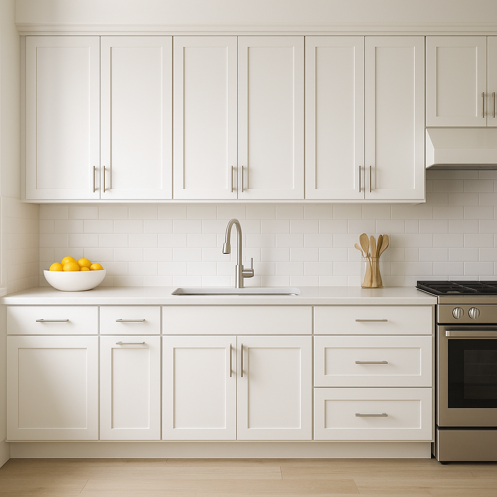
Cabinetry and Furniture: Extra White is a favorite for modern kitchens and bathrooms, especially on cabinets. It pairs beautifully with stainless steel appliances and quartz countertops, lending a sleek and sophisticated vibe.
Exterior Applications: While Extra White is primarily celebrated for interiors, it can also be a striking choice for exteriors. Use it to give your home a fresh, modern curb appeal, especially when paired with dark shutters or bold front door colors.
Sherwin-Williams Extra White (SW 7006) is the epitome of clean simplicity, offering a crisp, balanced white for virtually any design style. Its cool undertones and versatility make it ideal for creating light-filled spaces, modern aesthetics, and timeless designs. Whether you’re designing a contemporary loft, a cozy seaside retreat, or a minimalist office space, Extra White delivers the clarity and brightness needed to bring your vision to life.
Note: These images were all generated with AI, there may be inaccurate color results. Please only use a general reference to get a rough idea of what a color may look like, we will continue to generate new images to improve accuracy.
View Colors Only by Brand (No Imagery):
Sherwin-Williams
|
Benjamin-Moore
|
Behr
|
Valspar
Live on the Eastern Slope of Colorado and looking for a local painting professional, check out all our painting services and reach out for a free estimate.
Copyright © 2026 : Wild Fox Painting Inc. : 12435 Mead Way, Littleton, CO 80125


